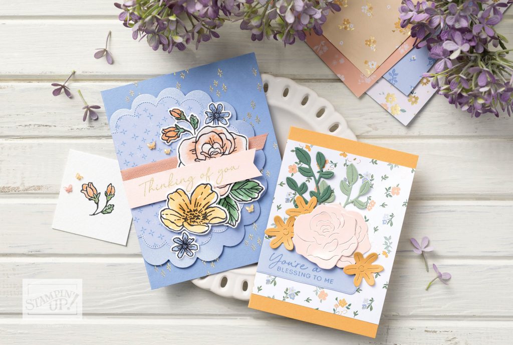
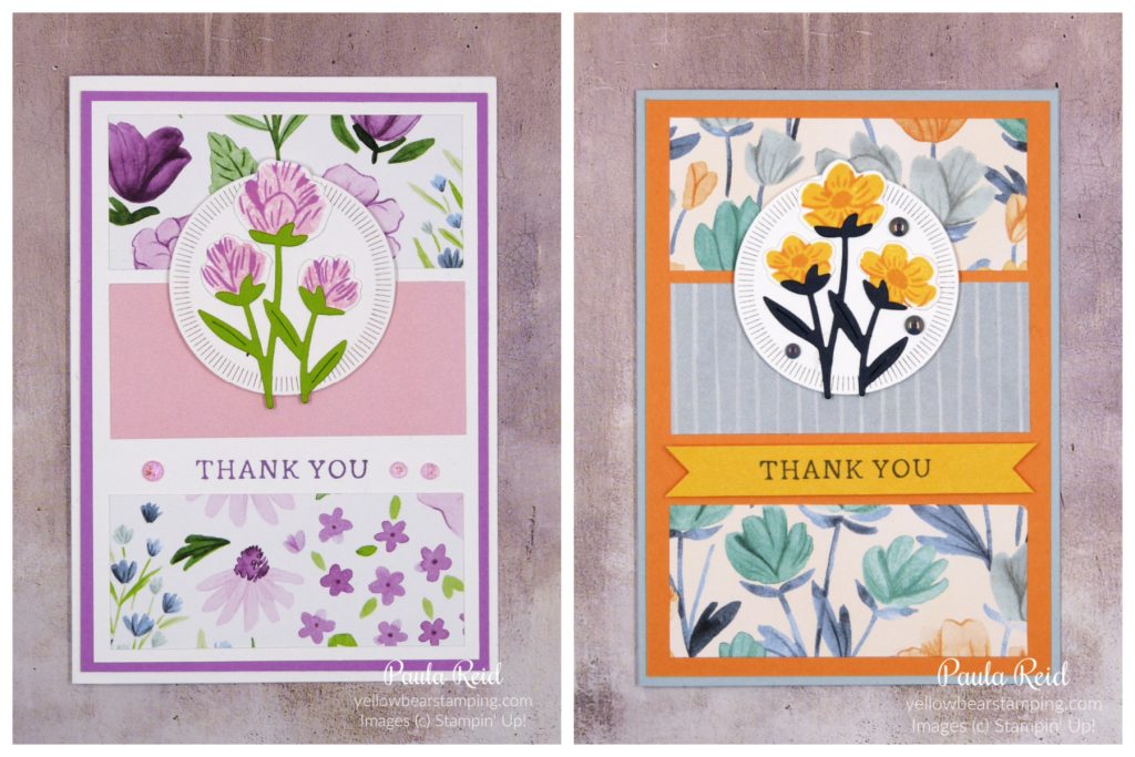
This is the final card in my CASEing the Catalogue series. The sample on page 17 of the May-August Catalogue features the Bloom Boutique Suite.
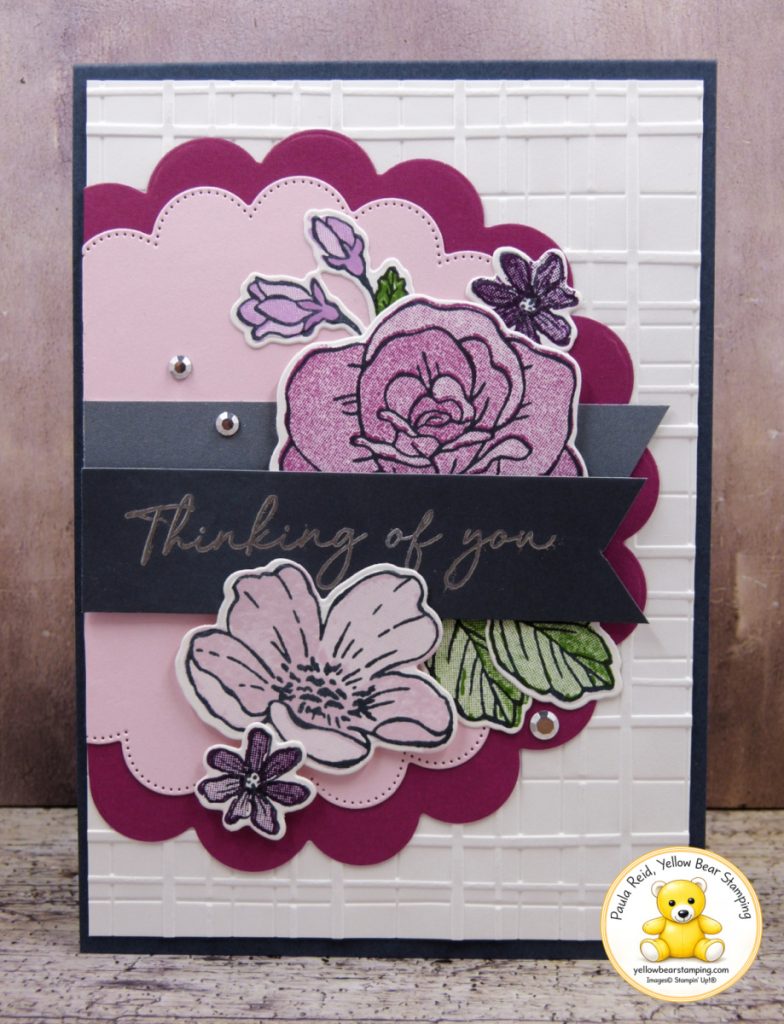
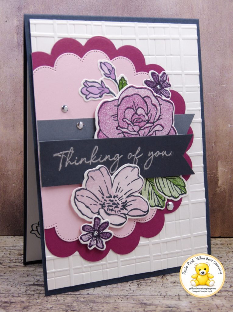
I kept the layout the same as the sample but changed the colour combination and some of the textures. My colours are Berry Burst, Bubble Bath, Blackberry Bliss, Fresh Freesia and Garden Green.
For the background, I used the Perfectly Plaid 3D Embossing Folder, with the scalloped layers die cut from Berry Burst and Bubble Bath Two-Tone Cardstock. Instead of ribbon, I used the reverse side of Secrect Sea Two-Tone Cardstock.
I created different shades by double stamping some of the images for a darker colour. For the Fresh Freesia flower at the top, I double stamped the image and then used a Blender Pen to pick up ink from the ink pad to add extra colour to the lower part of the flower. A few Adhesive-Backed Metallic Gems add the finishing touch.
And that’s the final card in my CASEing the Catalogue series. If you’d like to see the video of this card being made check out my YouTube channel. I hope you’ve enjoyed seeing how the catalogue can provide inspiration while still giving you plenty of scope to put your own spin on a design.
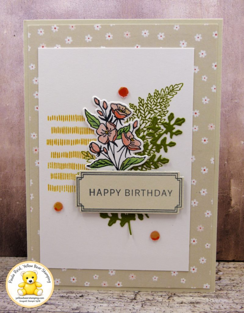
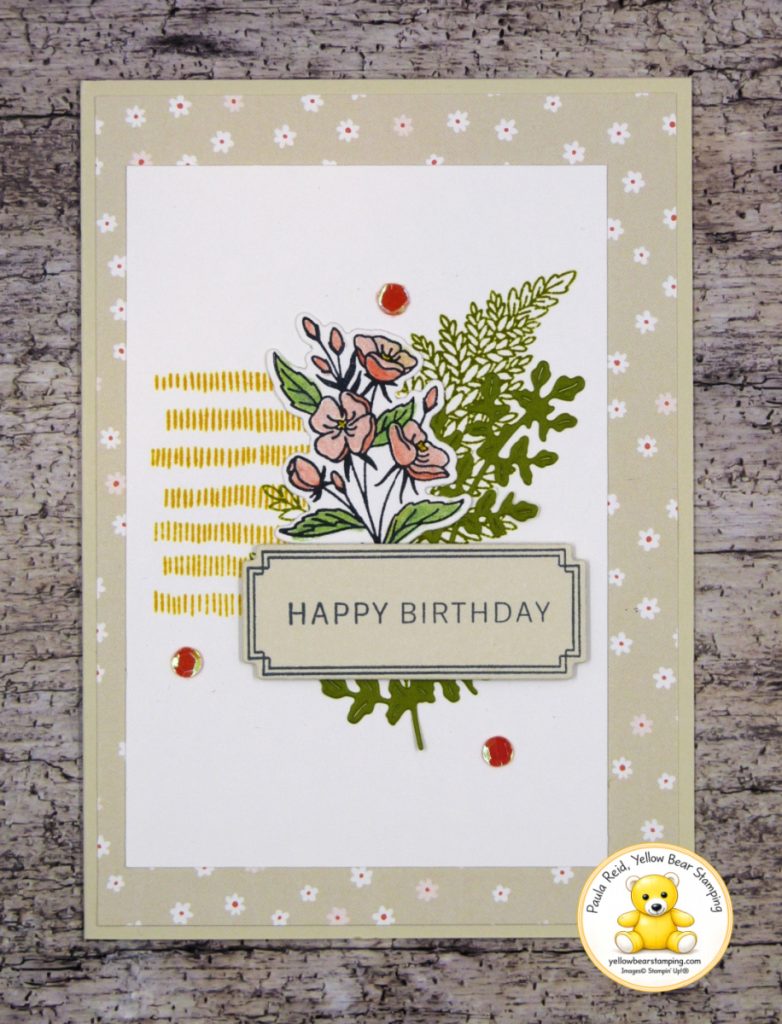
I’m back with another project from my CASE the Catalogue series! This time I’ve taken inspiration from the beautiful Fern & Flora card on page 51 of the May–August Catalogue (see below). I really enjoy CASEing the catalogue because it gives me a starting point for a card design, while still leaving plenty of room to make it my own. And, as usual, I’ve made a few changes to the original.
The catalogue sample uses Designer Series Paper from the Moonlit Flora Designer Series Paper pack as the background. For my version, I decided to use the Paper Medley pack instead. I love the soft, pretty pattern of this particular sheet and thought it worked really well with the botanical elements from the Fern & Flora Bundle. I used Basic Beige cardstock for the card base, which keeps the overall colour palette soft and neutral.
For the flowers, rather than colouring them with Stampin’ Blends as shown in the catalogue sample, I used Watercolour Pencils. If you don’t have a large collection of Stampin’ Blends, Watercolour Pencils are a great alternative for adding colour to your stamped images.
There are two assortment packs of Watercolour Pencils, giving you 23 different colour options between them. That’s a great range of colours and, in my opinion, really good value for money. I used the pencils to add colour to the floral image, keeping the colouring fairly simple so that the line-art of the stamped image remains the star of the show.
The Fern & Flora Bundle does a lot of the work for you here. The combination of stamped and die-cut foliage creates plenty of dimension without needing lots of different elements. I finished the card with a few Sunset Sparkle Sequins for a little extra sparkle.
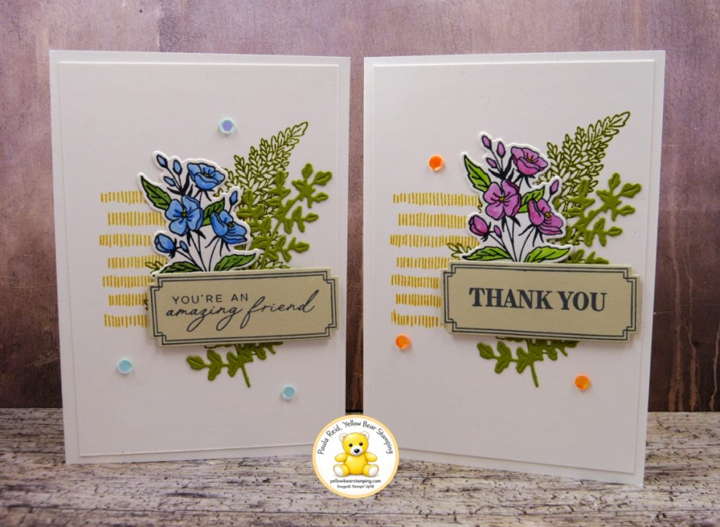
By simply changing the colours of the flowers and the sentiment, you can create cards for completely different occasions while keeping the same basic design. I also used the layout for Notecards. I think this is a great example of how a card layout doesn’t have to be limited to one particular size or style of card. Sometimes you find a design that just works.
That’s one of the things I love about CASEing the catalogue — you don’t have to copy the project exactly. Take the elements you like, change the colours, swap the Designer Series Paper, try a different colouring technique and make the design your own.
You can see more of my CASE the Catalogue projects here on my blog, and over on my YouTube channel, where I share projects and demonstrate many of the cards I make.
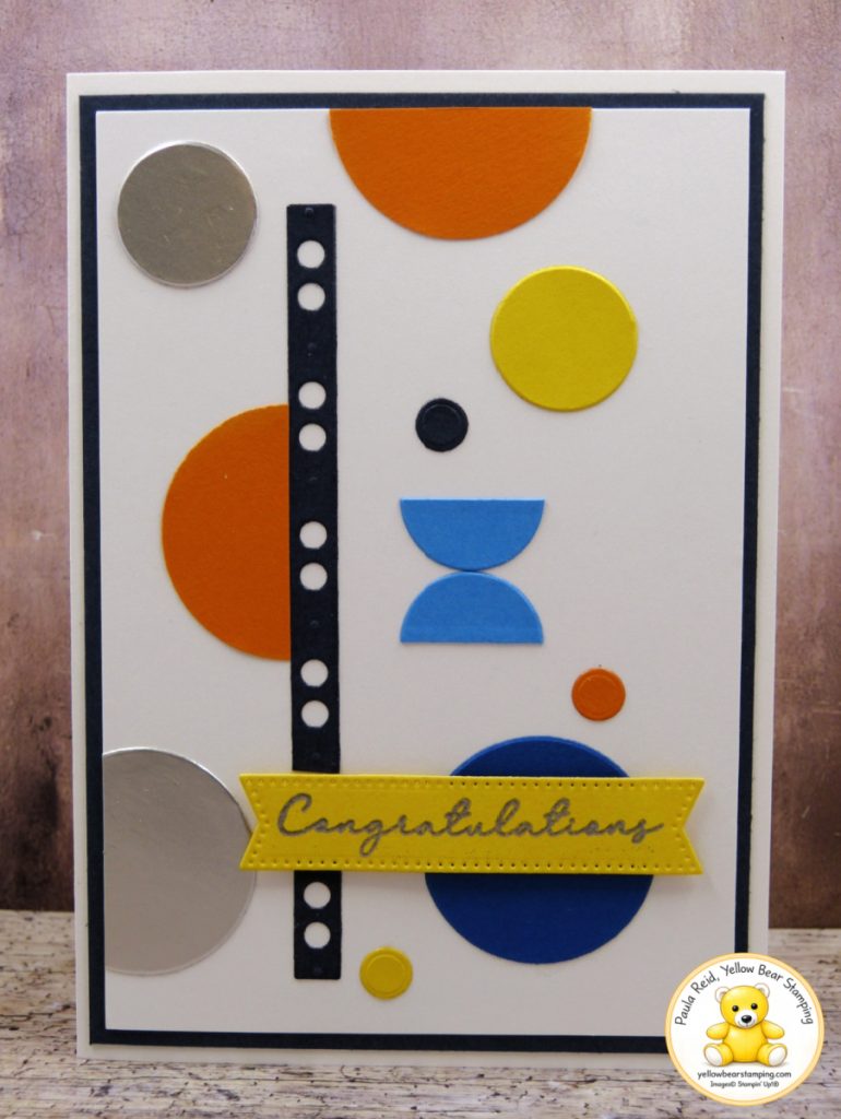
Sometimes inspiration appears when you least expect it. This card is a CASE (Copy And Share Everything) of a fellow Stampin’ Up! demonstrator, who in turn was inspired by another creator. I love how ideas evolve as they’re shared within our crafting community, with each person adding their own twist.
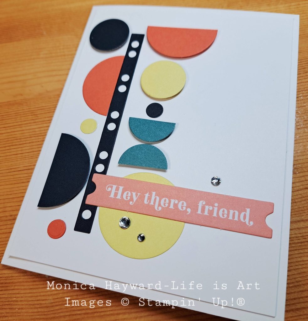
When this design by Monica Hayward popped up on social media it immediately caught my eye.
The clean, modern layout and bold geometric shapes really appealed to me. Then I looked over at my desk and realised I already had most of the die-cut pieces sitting there as leftovers from previous projects. It was the perfect opportunity to put those spare pieces to good use. For my version I used Blueberry Bushel, Azure Afternoon, Pumpkin Pie, Daffodil Delight, Secret Sea and Silver Foil.
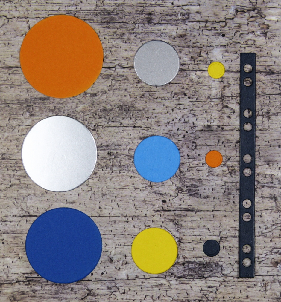
The circles and decorative strip were all die cut using the Gears & Textures Dies, proving that this bundle isn’t just for masculine or industrial-style cards. With a fresh colour palette and a simple layout, it creates a completely different look.
The sentiment comes from the Sending Salutations stamp set. The original stamp reads “Congratulations on your achievement”, but I only wanted the word “Congratulations.” Thankfully, there is an easy technique to customise a sentiment. Simply cover the part of the stamp you don’t want with a some Washi Tape, ink the stamp with VersaMark, then remove the Washi Tape before stamping onto your cardstock. (That last step is very important!) Once stamped, apply Silver Embossing Powder, heat emboss, and die cut using one of the Stylish Shapes Dies. It’s a quick technique that gives you even more versatility from the stamp sets you already own.
I also love how this card shows that you don’t always need to start from scratch. Keeping leftover die cuts and embellishments from previous projects can make creating a card like this incredibly quick. Sometimes all you need is a little inspiration and a handful of scraps waiting on your desk.
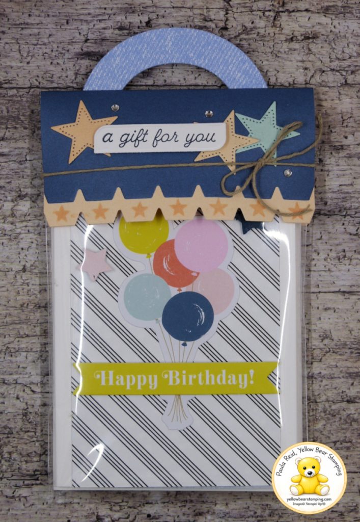
One of the things I love about Stampin’ Up! products is how easy they are to adapt to suit your own ideas. Today’s project is a perfect example. This fun gift packaging is a CASE (Copy And Share Everything) of the sample on page 48 of the May–August Catalogue, created using the Playful Packaging Bundle. While the catalogue sample is filled with yummy yoghurt-covered pretzels, I decided to use mine to package something a little different – the set of five Mix & Match Notecards & Envelopesthat I shared recently. It turns a simple set of handmade cards into a lovely gift that’s ready to give.
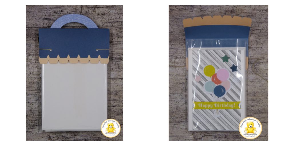
One small change I made was to the way the topper is attached. Rather than sealing the topper closed, I punched two holes in the back section, threaded some Crumb Cake Baker’s Twine through the holes and wrapped it around to the front, finishing it with a bow. This means the recipient can simply untie the bow and remove the cards without damaging the packaging, making it easy to reuse if they’d like. To see how I assembled this topper – check out my YouTube channel here.
The Playful Packaging Bundle makes decorating the topper quick and easy. The stamp set includes four small decorative images, and I chose the sweet little star stamp to add a subtle pattern to the Petal Pink border. I then layered a few die-cut stars for extra dimension. The coordinating dies include three fun shapes – hearts, flowers and stars – making it easy to customise your packaging for different occasions. There are also three sentiments included in the stamp set, so whether you’re creating a birthday gift, party favour, thank you treat or just a little surprise, you’ll have the perfect finishing touch.
I love that this project combines beautiful packaging with handmade cards. The packaging makes the gift feel extra special before it’s even opened, and because it can be untied rather than torn apart, it’s practical as well. The Playful Packaging Bundle isn’t just for sweet treats—it can also be used for small gifts, stationery, gift cards, craft supplies and so much more.
I hope this project inspires you to look beyond the catalogue sample and think about other creative ways you could use this versatile bundle.
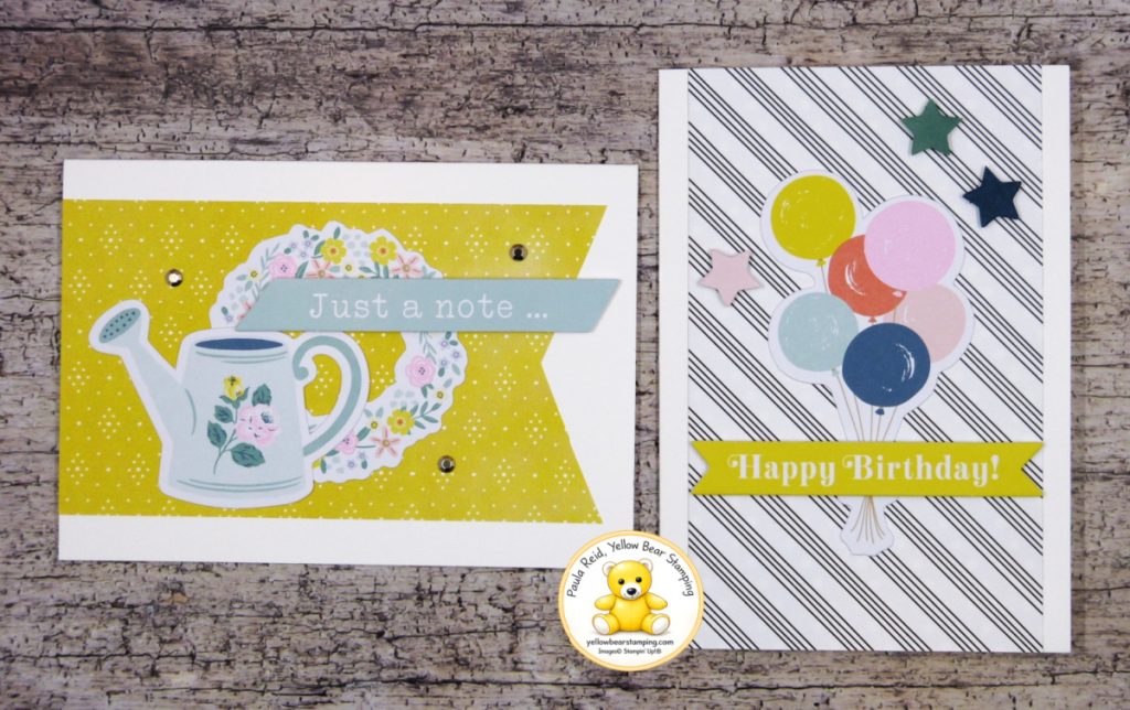
Today’s cards is the fourth in my CASE (Copy And Share Everything) series and is from page 68 of the May–August Catalogue. I love the clean, simple layouts in the catalogue, so I’ve kept the same design elements but have added my own twist by changing the background papers.
Notecards & Envelopes are a fantastic option when you want to make a quick card, and because they’re already cut and scored, you can have a finished card in no time. For the background layers, I swapped the original papers for designs from the Paper Medley Pack. I love how just changing the Designer Series Paper gives the cards a completely different look while still staying true to the original design.
Both cards feature pieces from the Mix & Match Ephemera Packs. If you haven’t tried these yet, they’re such a fun way to create cards quickly. The die-cut images are printed on a slightly heavier cardstock and have adhesive on the back. Simply choose your pieces, peel off the backing, and stick them straight onto your project—no liquid glue required.
The watering can and floral wreath make a lovely everyday “Just a Note” card, while the colourful balloons create a cheerful birthday card that’s ready in minutes.
A Little Tip for Tiny Die Cuts
The only change I made to the balloon card was the stars. The catalogue sample used two white stars, but against my black and white striped paper they just disappeared. Instead, I coloured the stars using ink and a blending brush so they stood out beautifully.
Because the stars are so small, I used one of my favourite little tricks. Rather than removing them from the sheet first, I left them in the surrounding cardstock while I blended the ink over the top. It makes them much easier to hold and gives you even coverage. Once coloured, simply pop them out and adhere them to your card. Sometimes it’s the smallest tips that make crafting so much easier.
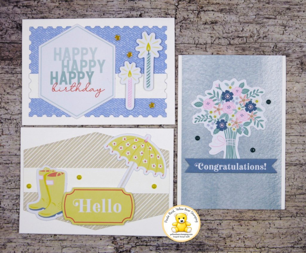
I had fun CASEing these samples and went on to create another three.
These cards are a great reminder that you don’t always need to reinvent a design. Changing the paper, colours or embellishments is often all it takes to make a project your own.
If you’re ever looking for inspiration, don’t forget to browse through your Stampin’ Up!® catalogue. It’s packed with beautiful samples that are perfect for CASE-ing and adapting to suit your own style.
Check out my YouTube channel to see more information on the creation of these cards.
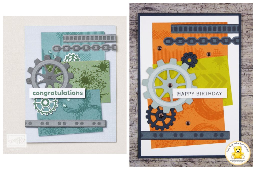
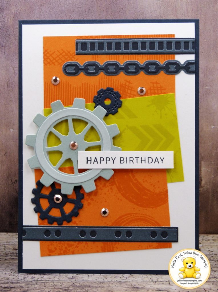
I hope you’re enjoying my series on CASEing (Copy And Share Everything) the catalogue. In this post I’ll be CASEing the Gears & Texture Bundle sample from page 39 of the current catalogue. While I’ve kept the overall layout the same, I’ve changed the colour paletter to give the design a completely different feel.
The original card uses Lost Lagoon, Basic Grey and Peaceful Pine Two-Tone Cardstock, giving it a softer, more muted industrial look. I decided to brighten things up by using Secret Sea, Cloud Cover, Timid Tiger and Darling Duckling Two-Tone Cardstock instead. I love how these colours give the card a much more cheerful, energetic feel while still complementing the mechanical theme of the Gears & Textures Bundle.
The stamped backgrounds are all created using images from the Gears & Textures Stamp Set, stamped tone-on-tone using the matching ink colours. It’s such a simple technique, but it adds plenty of texture and interest without overwhelming the design. Each of the coloured panels measures 2″ x 3″ (5cm x 7.5cm), making this an easy layout to recreate with any colour combination.
Why I Love Two-Tone Cardstock
Stampin’ Up!’s Two-Tone Cardstock is a little different from traditional cardstock. It features the true colour on one side, a lighter shade on the reverse, and a white core. That combination opens up lots of creative possibilities, whether you’re layering, stamping or adding distressed edges. It’s one of those products that is surprisingly versatile once you start using it. Here are a few of the reasons it’s become one of my favourite products to craft with:
Two shades in one sheet. Having both a lighter and darker shade of the same colour gives you instant contrast without needing to introduce another colour.
Perfect weight for layering. It’s heavier than Designer Series Paper but lighter than standard cardstock, so even cards with multiple layers don’t become overly bulky or expensive to post.
Perfect for stamping. The smooth finish gives beautifully crisp stamped images. Stamping tone-on-tone adds subtle texture without competing with the die-cut gears.
A hidden bonus. The white core means you can sand or distress the edges to reveal the lighter centre, creating even more texture and dimension—perfect for vintage or grunge-style projects.
This card is a great reminder that you don’t need to reinvent the wheel every time you sit down to craft. Sometimes simply changing the colours is all it takes to make a design your own.
Next time you’re flicking through your catalogue, choose a project that catches your eye and challenge yourself to recreate it using a completely different colour palette. You might be surprised how different the finished card looks.
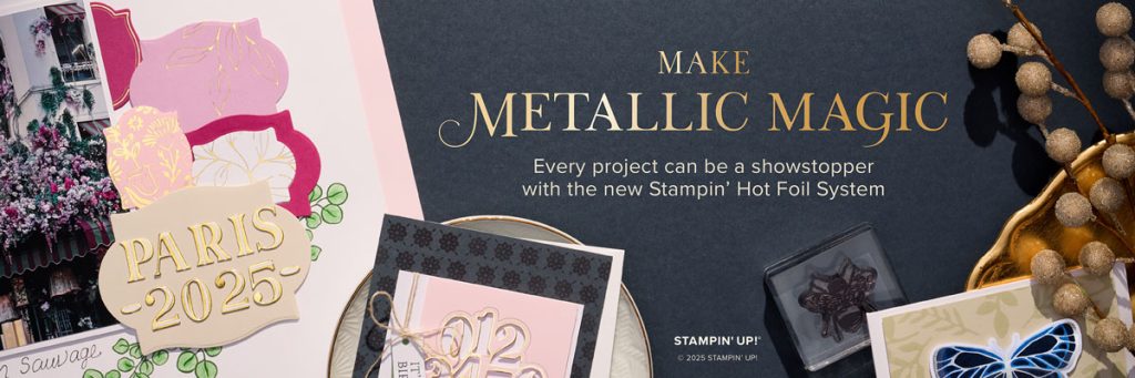
Exciting news – Stampin’ Up! have added a new product line. Introducing one of the hottest items in crafting—the new Stampin’ Hot Foil System. This product is available for purchase from Friday 10 July.
Add some shimmer to every project with the Stampin’ Hot Foil System. With this system and the Stampin’ Cut & Emboss Machine (sold separately), you can add dazzling details to all your projects and create stunning crafts using specially-made foil and hot foil dies. And the fun doesn’t stop there! Everyone who purchases the Hot Foil System until 4 January 2027, will get an email with access to the Metallic Magic Craft Class! In this technique-centric, virtual class, attendees can make unique projects and learn creative tips intended to elevate their hot foil crafting experience.
New to hot foiling? No sweat! We’ve got all the information you need. We have two videos for you to watch – an introduction to the new system and training on how it works. For user instructions and extra details on what the system does and doesn’t include, download the Meet Metallic Magic Stampin’ Hot Foil Brochure. Of course, no project would be complete without a stamped image or two, and this brochure highlights coordinating hot foil die and stamp set bundles designed specifically for this product line. We even have a bundle that includes a set of decorative masks so you can add colour alongside your shimmering foil for even more dimension.
Ready to shop the Stampin’ Hot Foil System (and earn Stampin’ Rewards at the same time)? Visit my online store to see all the products.
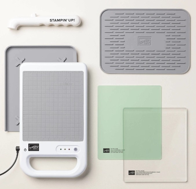
The Hot Foil System comes with the following:
1 Stampin’ Hot Foil Platform
1 Silicone Platform Station
1 Stampin’ Hot Foil Shim & Spacer
1 Silicone Cooling Pad
1 Stampin’ Hot Foil Magnetic Pick Up Tool
1 Power Cord
You’ll need a Stampin’ Cut & Emboss Machine, Stampin’ Hot Foil Rolls (gold, silver and light pink), and Hot Foil dies to complete the hot foil process. Each of these products is sold separately – don’t forget to add them to your order.
If you have any questions please don’t hestiate to contact me.
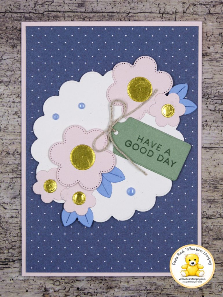
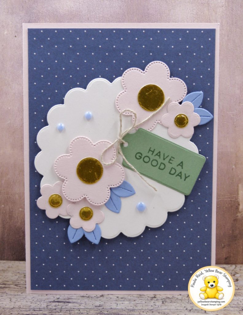
I’ve decided to keep CASEing (Copy And Share Everything) the Stampin’ Up!® Annual Catalogue, this time inspired by the card on page 38 featuring the Scalloped Blooms Bundle. I stayed fairly true to the original design but changed the background to one of the prints from the Paper Medley Designer Series Paper Pack.
I often ask myself “Which die did they used for this card?”. If you’ve ever wondered the same thing, here are the dies I used for my card.
The large Basic White scalloped circle was cut using the third largest die. The flowers were all die cut from Barely Blush Cardstock – the two larger flowers use the second smallest stitched die, while the three smaller flowers use the smallest die.
When I first got these dies, I wasn’t quite sure what the die with the six ellipse shapes was for. It turns out they are leaves that transform the scalloped circles into flowers! I’ve cut mine from Hydrangea Hue Cardstock, proving that leaves don’t always have to be green. One of the joys of card making is being able to use whatever colours you like, so don’t be afraid to step outside the box.
The dies also include some great shapes for tags and sentiments. For my sentiment, I used the light side of Peaceful Pine Two-Tone Cardstock.
The larger flower centres were die cut from Gold Foil using the circle die included in the set. The catalogue sample also used these circles on the smaller flowers, but I felt they were a little too big, so I used the small circle from the Gears & Textures Dies instead. I think they are more in proportion with the smaller flowers. A Linen Thread bow and a few embellishments complete the card.
CASE-ing the catalogue is a great way to get creating, and remember, you don’t have to copy a project exactly. Changing the colours, papers or even a small detail is all it takes to make the design your own.
One of my favourite places to look for inspiration is the Stampin’ Up! catalogue. The samples are created by incredibly talented designers and are full of ideas that can easily be adapted using your own colours and supplies. For a recent Facebook Live, I CASE’d (Copy And Share Everything, or Copy And Selectively Edit) the card on page 42 of the May–August Catalogue. CASE’ing is something we do regularly in papercrafting—it’s a wonderful way to spark creativity while putting your own personal touch on a design.
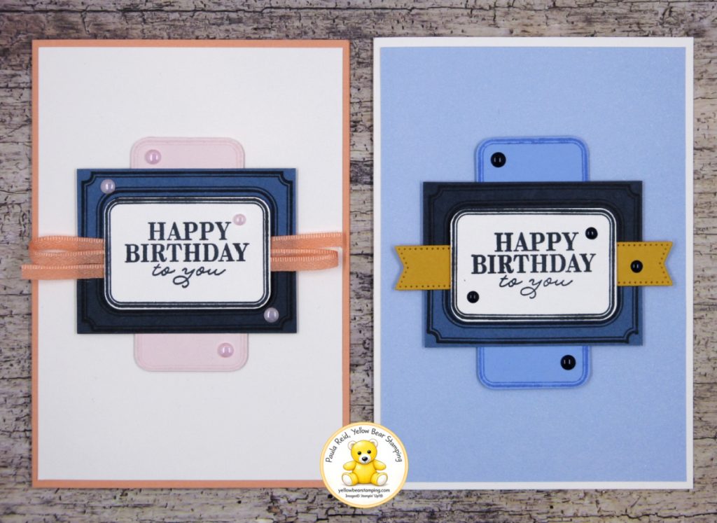
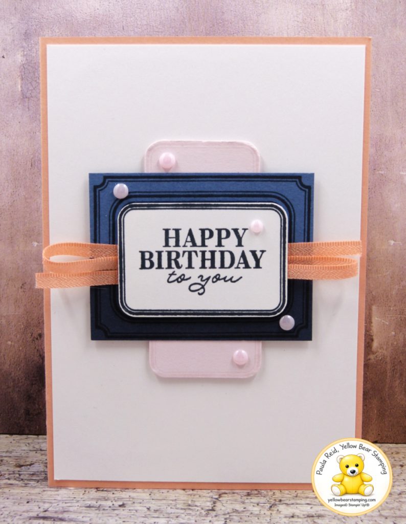
The card on the left is the one I created during the live. Afterwards, I created the card on the right with the leftover pieces. The Exciting Times Bundle, which includes the Exciting Times Stamp Set and the Rounded Rectangle Punch, makes this design so quick and easy to recreate.
To create the two-toned mat behind the sentiment, I stamped the large decorative image twice using Secret Sea ink—once onto Misty Moonlight cardstock and once onto Secret Sea cardstock. After cutting both stamped images in half, I paired one half from each colour to create a two-tone frame. The ribbon on the pink version and the banner on the blue version cleverly hide the join, giving the illusion that it was stamped as one piece.
The sentiment was stamped in Secret Sea onto Basic White, punched out with the Rounded Rectangle Punch, and popped up with Stampin’ Dimensionals to add depth.
For the vertical background feature, I stamped the same decorative image in Barely Blush and Hydrangea Hue, then punched out the centres with the Rounded Rectangle Punch. The catalogue sample cuts the stamped image in half across the short side, but I decided to cut mine along the long side instead. It creates a lovely elongated background that works beautifully with the layout.
Sometimes all it takes is a simple change of colour, ribbon or embellishments to create a completely different look. I hope these cards inspire you to have a go at CASE’ing the catalogue yourself—you might even end up with two cards instead of one.
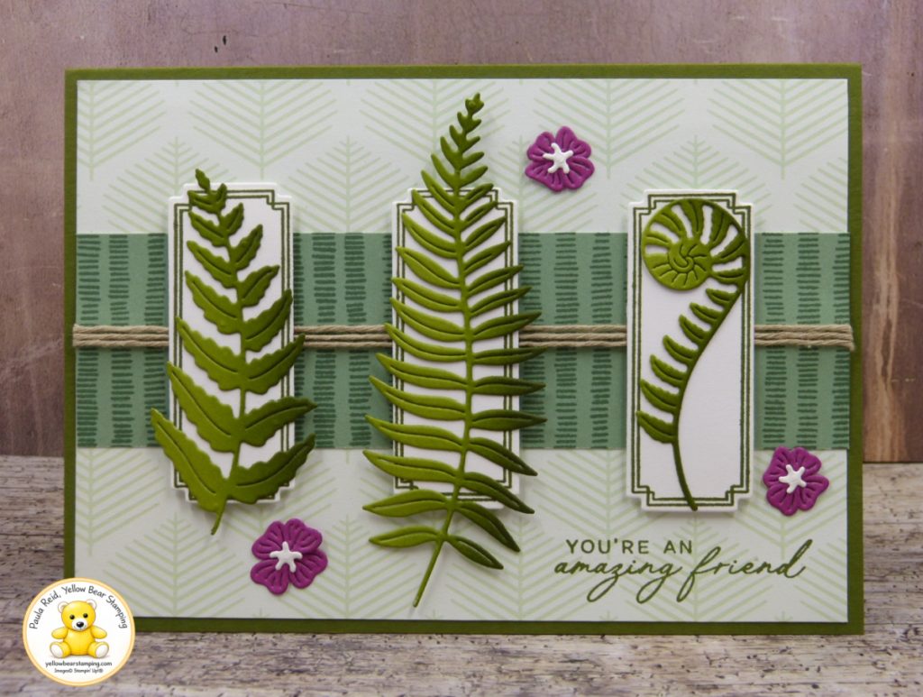
Today’s card is a variation of a layout I recently shared, this time featuring the beautiful foliage dies from the Fern & Flora bundle. The three die-cut panels showcase ferns (very Kiwi) cut from Old Olive cardstock, with ink blending added to create depth and dimension.
The card is built on a Mossy Meadow card base with a subtle patterned paper from the Moonlit Flora Designer Series Paper in the background. Across the centre, a strip of Peaceful Pine Two-Tone Cardstock has been stamped with Peaceful Pine ink using one of the Fern & Flora stamps, adding texture and interest to the design. Linen Thread wrapped around the strip adds another touch of nature.
Because the fern dies are quite intricate, I applied Adhesive Sheets to the back of the Old Olive cardstock before die cutting. This makes adhering the finished die cuts so much easier and eliminates the mess of liquid glue or the challenge of applying adhesive to delivate pieces. The delicate flower embellishments are constructed from three separate die-cut pieces, so once again I reached for Adhesive Sheets to simplify the assembly process and avoid the fuss of applying adhesive to such small elements.
Another tip is to leave the die cuts in the surrounding cardstock after cutting and do the ink blending before removing them. The surrounding cardstock acts like a mask, protecting the delicate edges and preventing them from catching or tearing while blending.
To finish the card, I added the flower embellishement cuts from Berry Burst Cardstock, providing a lovely pop of colour against the green foliage. The result is a clean and elegant friendship card that celebrates the beauty of nature-inspired elements.
I hope seeing a variation on the same layout inspires you to have a go with this design. Check out my YouTube channel to see the videos of these cards and more.
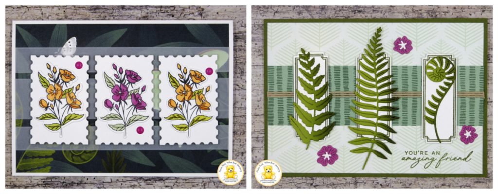
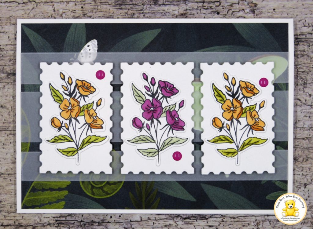
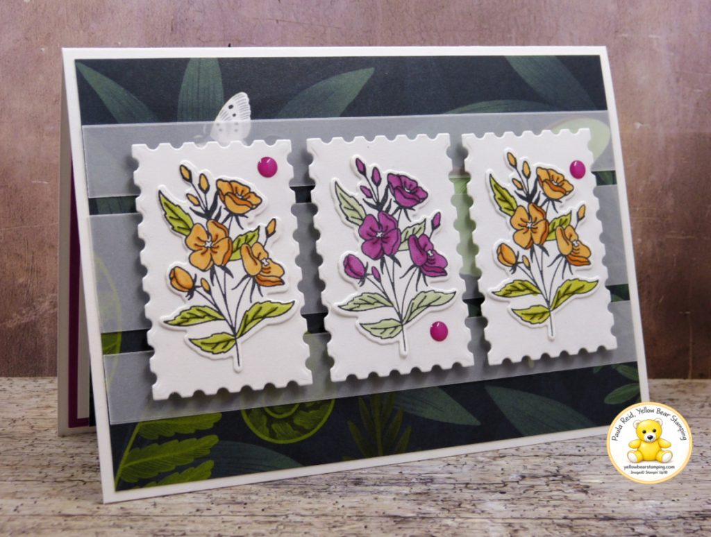
For the focal point, I stamped three of the floral images and using Stampin’ Blends (Pumpkin Pie, Berry Burst, Old Olive and Soft Sea Foam), created two coordinating colourways that stand out beautifully against the darker background. The images were then die cut and mounted onto panels created with the Perennial Postage Dies. I love how the postage stamp edges add texture and interest while framing each floral arrangement perfectly.
To soften the design, I added strips of Vellum across the centre of the card which also helps to lighten the DSP. This simple addition helps separate the focal elements from the busy background without hiding the gorgeous details of the Moonlit Flora paper. It’s a great technique to use when working with dark or busy patterned paper, as it allows the DSP to remain visible while ensuring the focal images take centre stage.
A few embellishments complete the design, adding just the right amount of detail without overwhelming the card.
This card would work beautifully for a variety of occasions, from birthdays and thank you cards to thinking of you greetings. By simply changing the colours of the flowers or adding a sentiment, you can easily adapt the design to suit your needs.
I hope this project inspires you to mix and match products from your craft stash and experiment with layering vellum over patterned paper. Check out my YouTube channel for the measurements of this card.
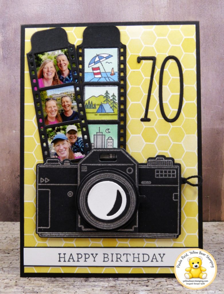
Yesterday was a very special day in our house as Phil and I both celebrated our birthdays. Milestone birthdays deserve something extra meaningful, so I created this personalised card especially for Phil, combining one of his hobbies — photography — with some favourite memories we’ve shared together.
Phil loves capturing special moments, beautiful scenery and everyday memories through the lens of his camera, so the Capturing Smiles bundle was the perfect choice for this project.
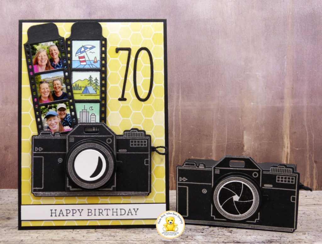
I designed the card using a bold black camera – heat embossed in silver – layered over the bright Daffodil Delight patterned paper from Beautiful Ordinary Life to create a fun and striking contrast. The film strips were my favourite part of the design because they allowed me to include photos of the two of us alongside the stamped scenes that represent adventures and happy memories together.
The large ’70’ keeps the focus on this very special milestone while the overall design celebrates the joy of looking back on happy memories.
To complete the card I created a cute 3D ‘camera’ box thanks to inspiration from fellow demo Barbara Bicknell.
Handmade cards become even more meaningful when they are created with the recipient in mind, and this one was extra special to make. I hope this card inspires you to personalise your projects with photos and meaningful details.
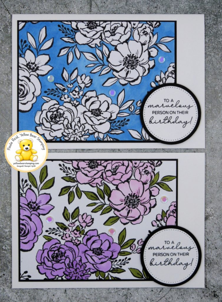
There’s something satisfying about taking a beautiful black-and-white design and bringing it to life with colour — and that’s exactly what we did with the gorgeous Artisan Sketched Garden Designer Series Paper for our Make & Takes at OnStage Sydney in March.
These cards reminder us that Designer Series Paper can be so much more than just a background layer. By colouring directly onto the DSP with Stampin’ Blends or Watercolour Pencils, the floral images become completely transformed, and each card ends up looking hand-painted and unique.
For the blue version, I used Azure Afternoon Stampin’ Blends to create a bold monochromatic look. I love how striking the bright blue background is against the crisp black outlines — it really makes the florals pop while still keeping the card design simple and elegant.
The second card was coloured using a combination of Fresh Freesia and Bubble Bath Stampin’ Blends for the flowers, with Old Olive added to the foliage. This version has a pretty, delicate feel and shows how versatile this paper can be depending on your colour choices.
I love how versatile this DSP is – great on it’s own, colouring the image or the background. It’s a fantastic way to personalise your Designer Series Paper and coordinate it with your favourite colour palette. If you enjoy colouring, this is definitely a technique worth trying with your patterned papers.
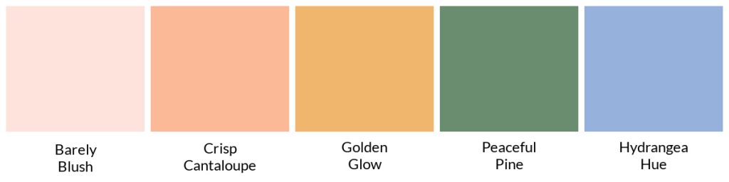
The new 2026-2028 In Colors have now arrived – Barely Blush, Crisp Cantaloupe, Golden Glow, Peaceful Pine and Hydrangea Hue. They are a softer palette of colours this year.
Along with the new In Colors we have a new catalogue. This year, Stampin’ Up! is refreshing the way it shares products in print, with a new, streamlined catalogue strategy designed to make shopping from our catalogues easier and more intuitive. Instead of an annual catalogue and multiple minis, we are moving to three beautifully designed catalogues per year—each one complete, current, and easy to use on its own. No more overlapping catalogues. Catalogues will be released every four months: January-April, May-August and September-December. Each catalogue will introduce new products alongside a selection of customer-favourite staples—such as stamps, ink, paper, tools, and adhesives—bringing the feel of a mini catalogue and an annual catalogue together in one place. This balanced approach creates a well-rounded, easy-to-shop print experience that supports confident ordering.
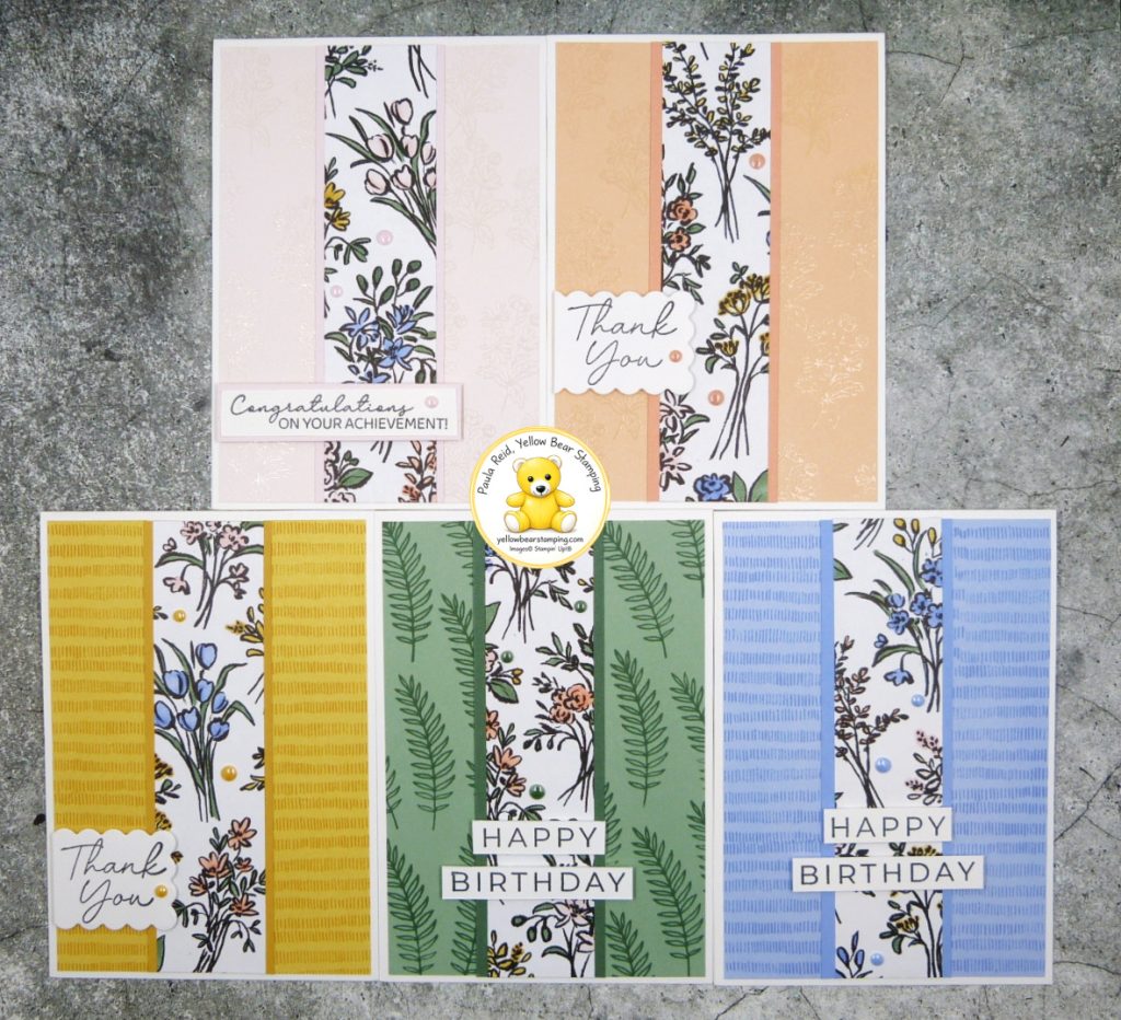
One of the new Designer Series Papers is the Artisan Sketched Garden DSP (167752). This DSP is the first of the rank to be cut into – a new motto for this year – cut and use my DSP. I’ve created five cards of the same design to showcase the new In Colors – do you have a favourite? Check out my YouTube channel to see measurements and how I created these cards.
Another of my aims for this year is to get back into blogging and share more of my creations, tips and techniques with you.
One of my favourite Suites in the 2025-2026 Annual Catalogue is Florals in Bloom (pg 40-47). It highlights all the new 2025-2027 In Colours – Strawberry Slush, Timid Tiger, Darling Duckling, Cloud Cover and Secret Sea.
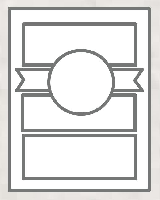
Our catalogues are full of inspiration and the 2024-2025 catalogue included a new feature – 22 sketch designs – to help inspire us with our creations. I decided to use #18 as my base – changing the order of the elements so that the design worked for me.
Don’t feel you have to keep exactly to the sketch – change the orientation, order or add/remove a layer. The Florals in Bloom DSP has a mix of floral designs on one side with the reverse being a more solid pattern design. I’ve mixed and matched my papers for one card and added Two-tone cardstock for the other. This suite is a ‘mega’ suite with two stamp/die bundles. I have used the Pretty Florals bundle which is a two step image only set and my ‘go to’ sentiment set – Simply Said.
Sketches are a great way to craft so don’t forget to check out the other designs on page 22 of the 2024-2025 Annual Catalogue.