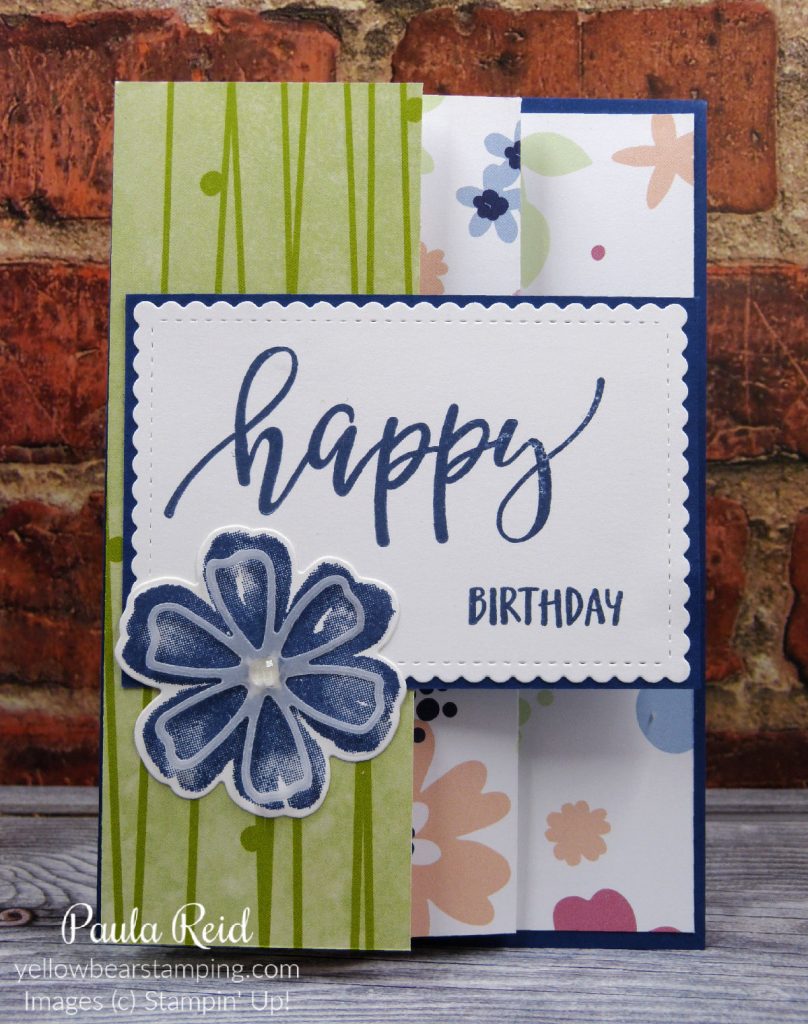
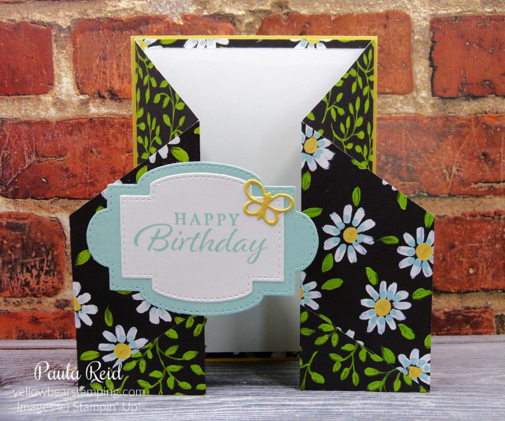
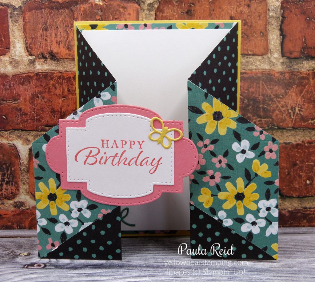
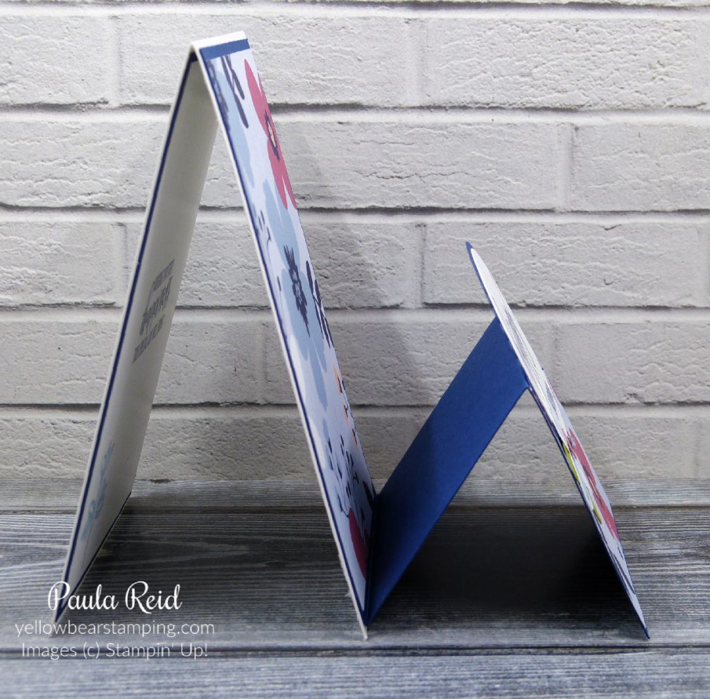
I wasn’t sure what to call the fold on this card – so went with Concertina Fold – not very original :). I’ve loved the papers that were on offer during Sale-A-Bration – Paper Blooms, Flower & Field and Oh So Ombre. This card style requires a long piece of DSP so I went with Paper Blooms.
How often do you stamp images or sentiments and then not use them on the original project? Well this card uses items that have been sitting on my desk for some time. The sentiment was originally going to be used on this card and the flower was from this card but ended up being too big.
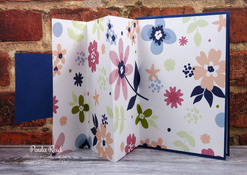
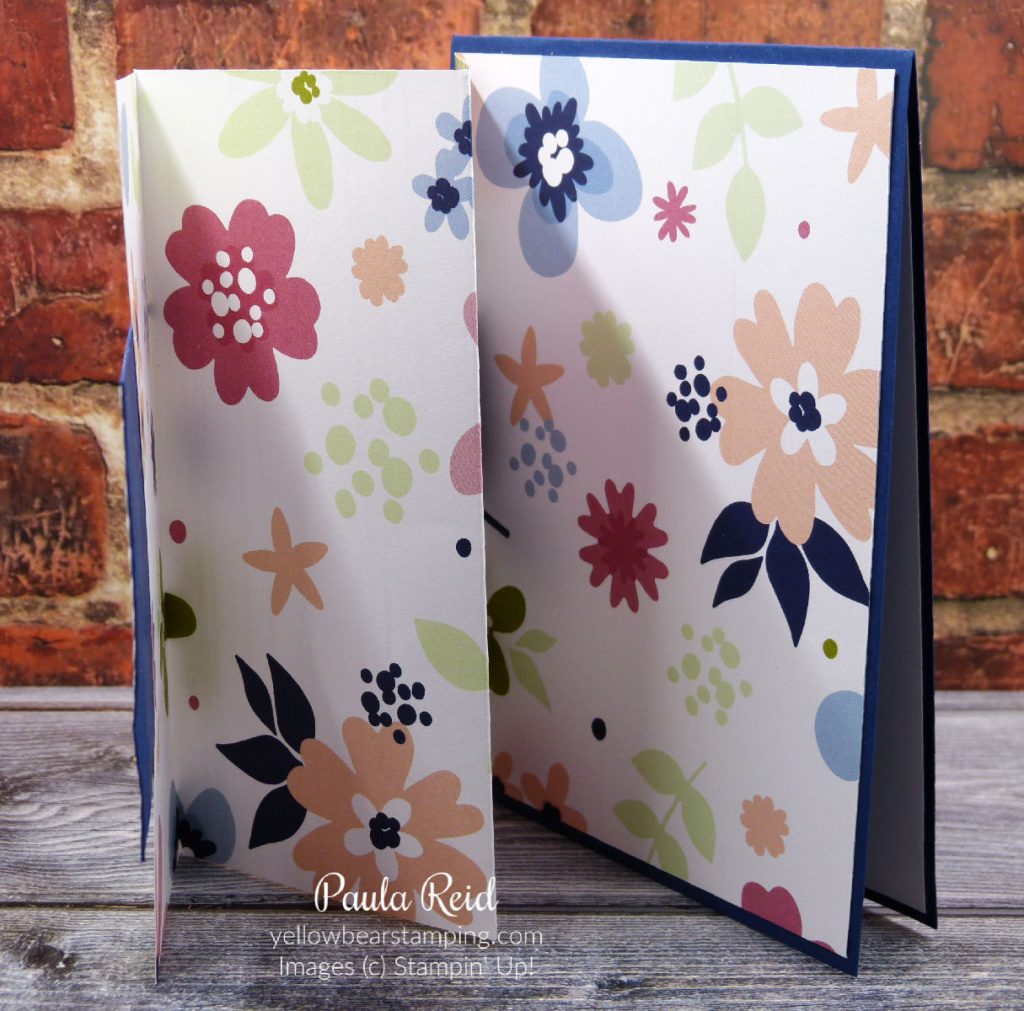
The DSP measures 14.4 cm x 29 cm and is scored at 10, 17 and 24 cm. The DSP is then folded (from left to right) Valley, Mountain, Valley.
I love the pattern of this paper and decided to leave it in full view to be enjoyed. I adhered the DSP to a standard card base so it will stand up.
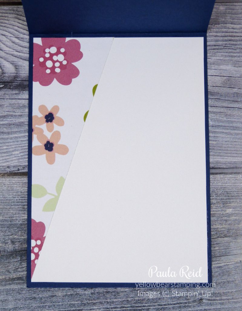
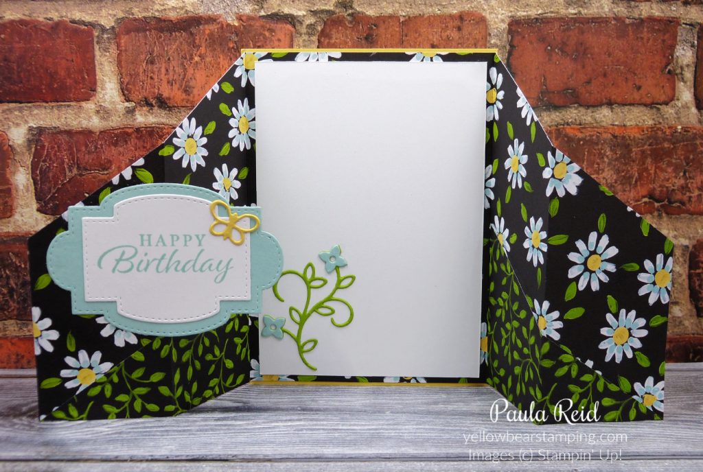
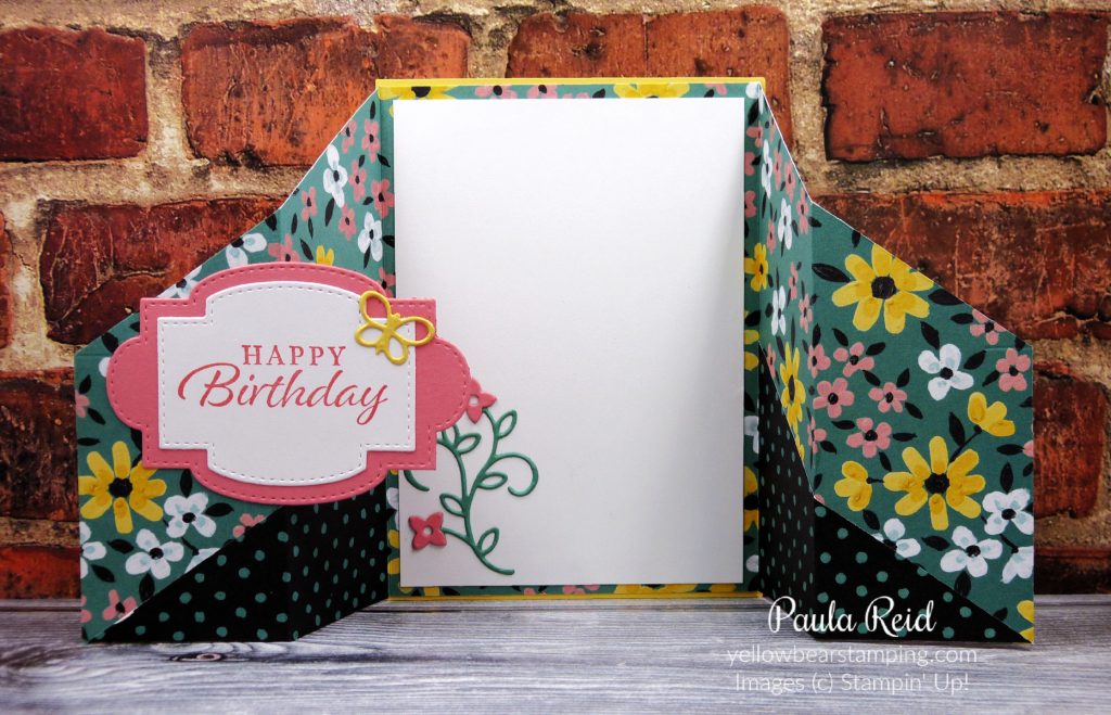
I found a piece of the same DSP on my desk left over from a previous project so used that to decorate the inside of my card.
You never know when those ‘reject’ items will come in handy – so don’t discard them.
I hope everyone has a great weekend – not long till we’re able to meet up with family and friends again – roll on Level 2.
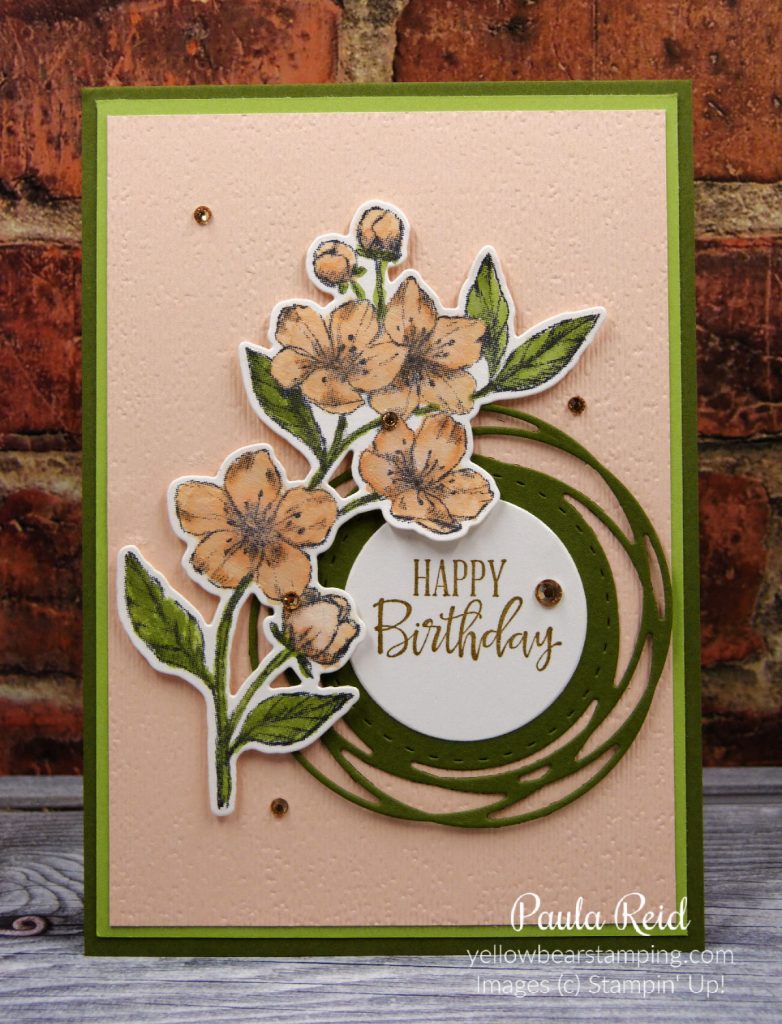
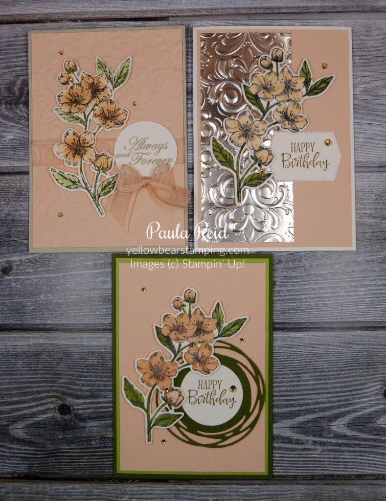
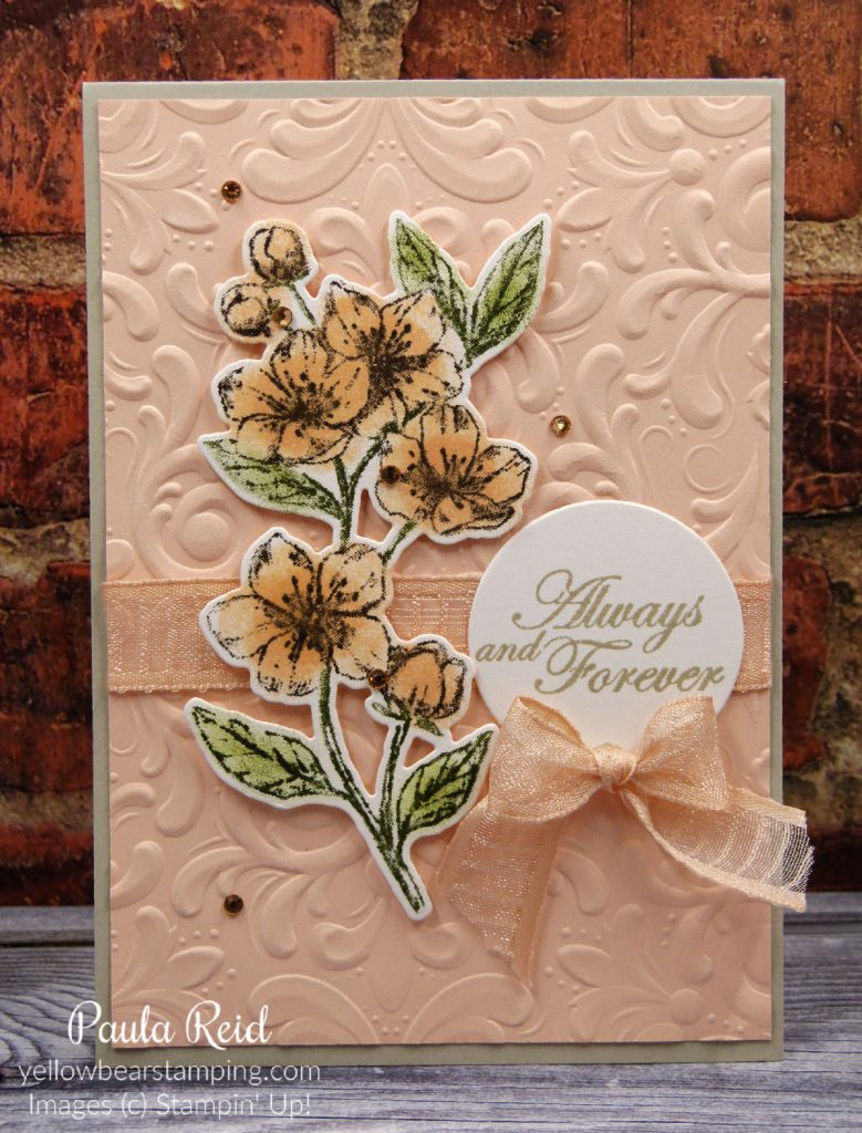
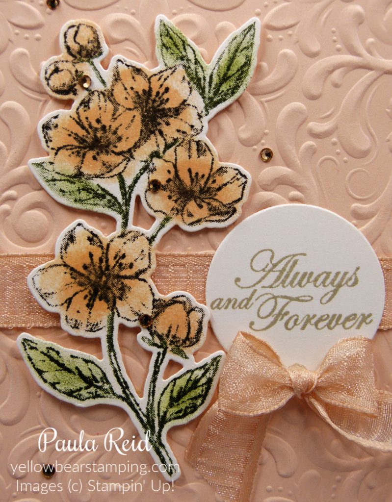
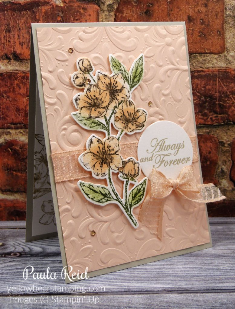
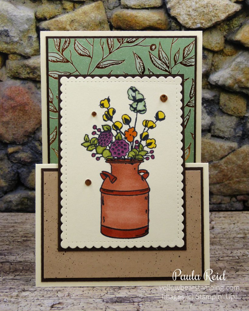
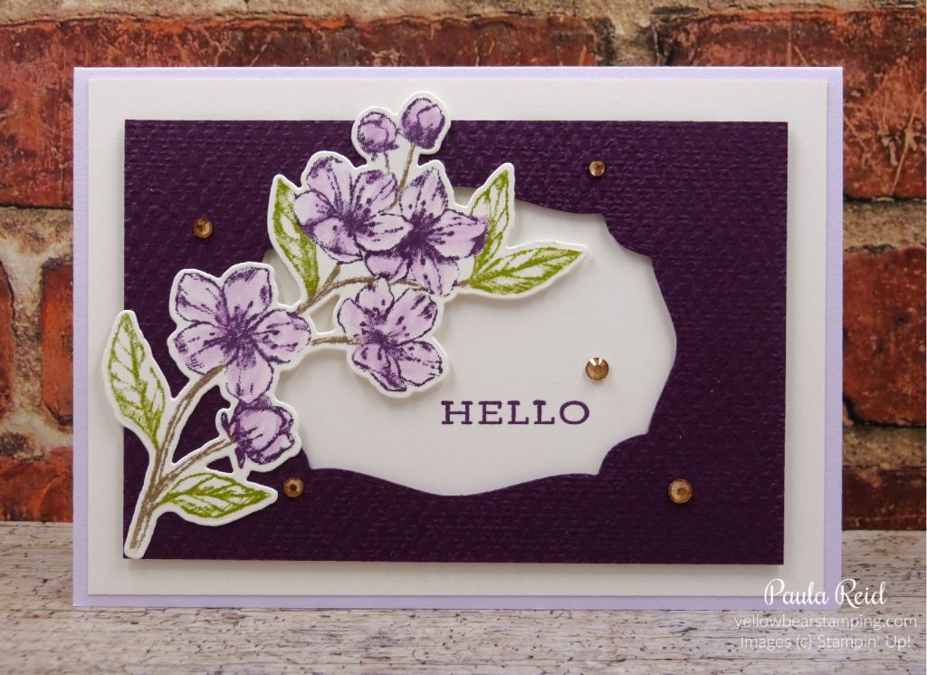
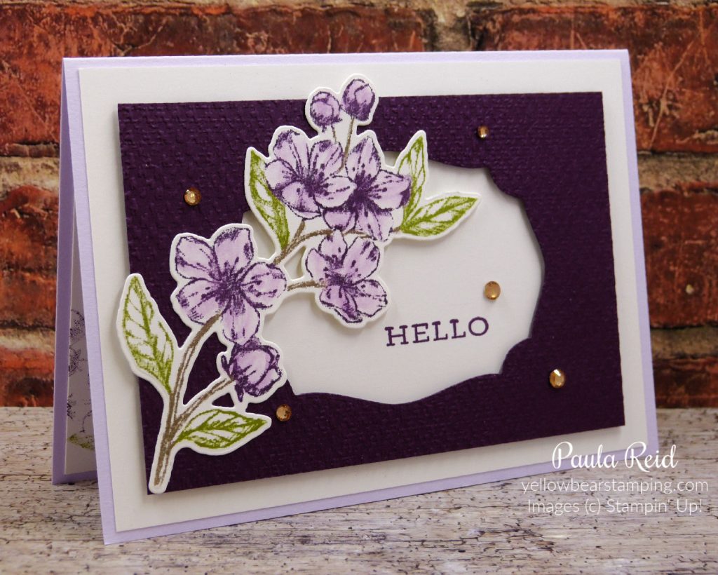
For the last two weeks I’ve shared projects created with the same stamp set – Forever Blossoms – but coloured in with different methods – Daubers and Stampin’ Blends. Today’s card has been coloured in using ink and our new style Water Painters.
When water colouring an image in you need to use a non watered base ink for the outline image. If you stamp the outline image with a water based ink it will then ‘bleed’ when you start colouring in with the Water Painter. I’ve used Black StazOn for the outline image and then used our standard ink pads to colour in. I’ve found it easiest to ‘stamp’ your ink pad onto a clear block and then use this as your palette. It makes it easy to pick up the right amount of ink onto your Water Painter. Use your Water Painter just as you would for colouring in with a marker. When water colouring you can use Water Colour paper, Shimmery White or Thick Cardstock.
The colour combo for this card is Mossy Meadow for the stems and leaves, Petal Pink for the flowers. I die cut the ‘swirly’ label from the Painted Labels dies in Mossy Meadow – this is a great shape to use for matting sentiments. I like the stitching around the edge. The sentiment – from Peaceful Moments – has been stamped in Soft Suede on Shimmery White cardstock then die cut using the 3rd smallest Layering Circle die. The card base is Mossy Meadow with a Pear Pizzazz mat. The Petal Pink front has been dry embossed with the Subtles 3D Embossing Folder – a must have for any crafter.
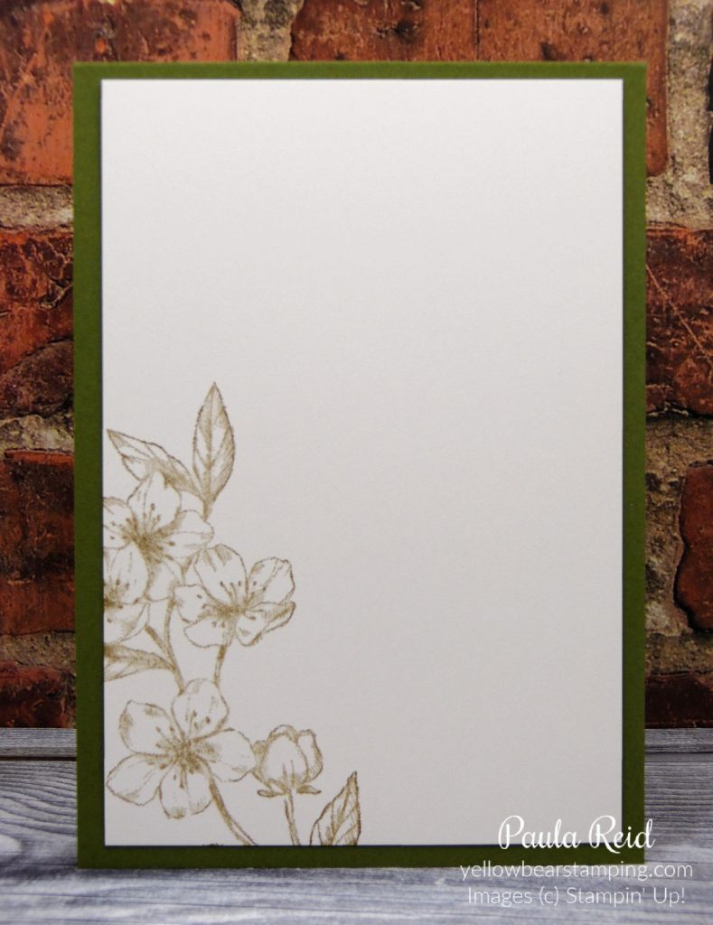
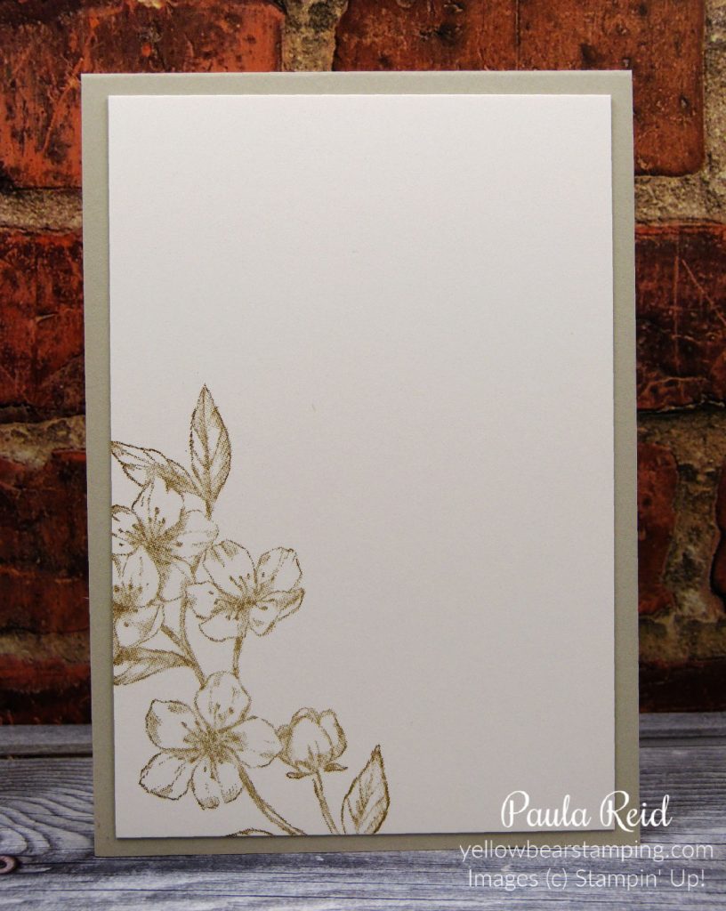
I’ve kept the inside simple by partially stamping the image in Soft Suede on Shimmery White Cardstock.
And here you have all three styles of colouring – do you have a favourite? I hope you’ve enjoyed seeing the different ways you can colour an outline image.
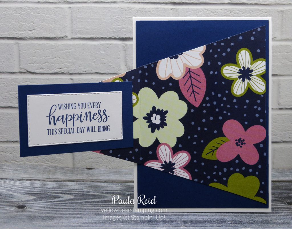
Today’s card style is one that I used for my first ever workshop back in 2012. I haven’t created this card for some time – it’s another great card fold that uses our Designer Series Paper (DSP). As Sale-A-Bration is coming to an end I thought I’d use some of the Flower and Field DSP. It has a colourful design on one side and a plainer one on the other side.
I CASED this design from Dawn Olchefske. It uses a half sheet of DSP and is best used with papers that don’t have a definite pattern direction. If you do have a direction you just need to double check the direction before cutting. Hopefully you can see what I mean in this card here – I had to make sure my words were going across and not up and down 🙂
The paper measures 5 1/2″ x 12″ and is scored at 2, 4, 8 and 10″. The card base is 4 1/8″ x 5 3/4″ with the insert being 3 5/8″ x 5 1/4″.
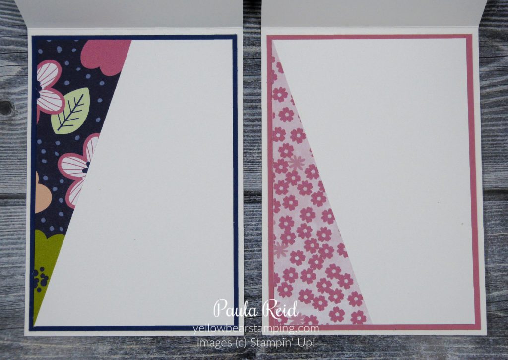
To decorate the inside I used a die set that I have really only used the words in the set. The Well Written dies also include some images and it goes perfectly with this paper. The image is die cut in Granny Apple Green with Pool Party flowers to coordinate with the sentiment on the front. The Daffodil Delight butterfly image is also from this die set.
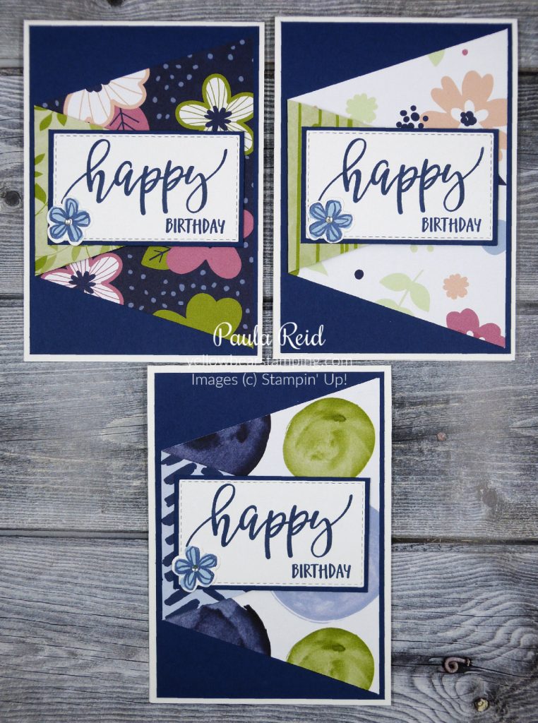
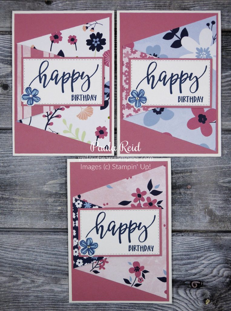
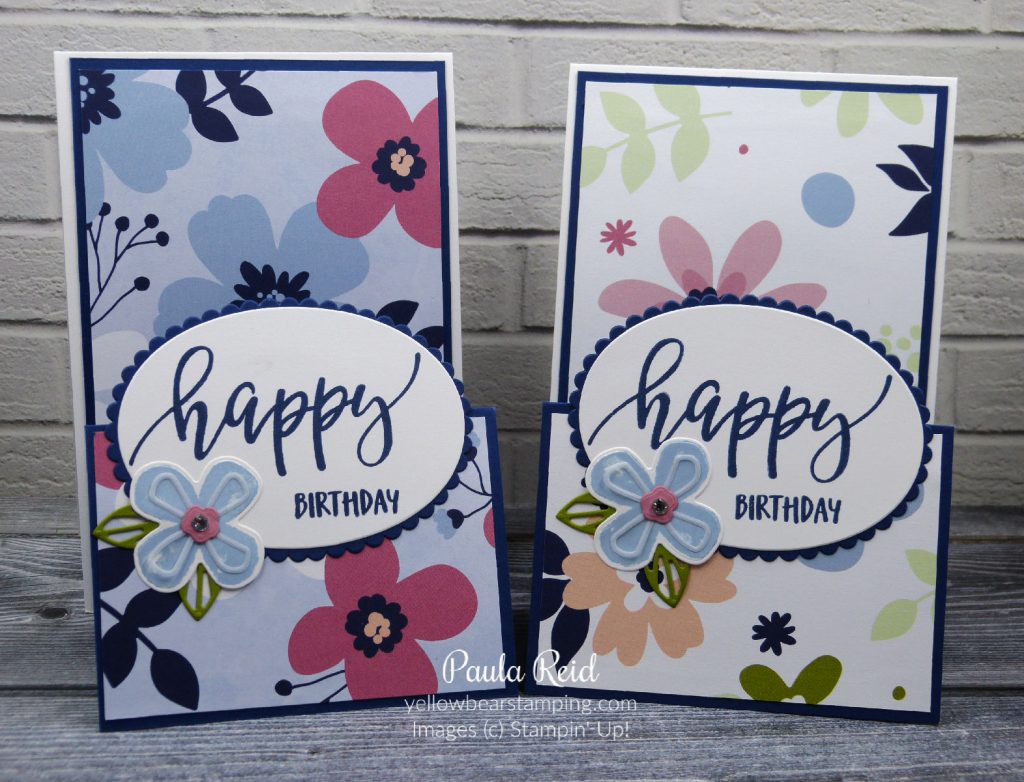
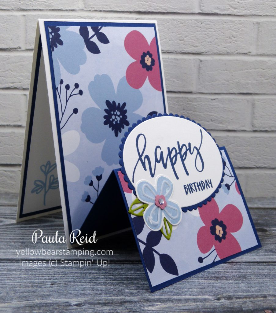
I decided to make a second card – you can never have too many birthday cards. I’ve kept the base as Daffodil Delight but used the Flirty Flamingo from the paper as my accent. The ‘Happy Birthday’ sentiment is from the new set Happy Thoughts.
The inside decoration uses the same die but die cut in Just Jade which is the background colour for this paper design. The sentiment and mat have been die cut using the Stitched So Sweetly dies – these are also part of my ‘go to’ dies.
If you are interested in making a card in this style why not get some friends together and we can make it. Contact me for more information if you’re interested.
Carrying on from last weeks technique – different colouring methods – today we will be using our Stampin’ Blends for colouring in our outline stamp.
When using alcohol markers to colour in you need to stamp your outline image with water based ink – my ‘go to’ ink for this is Memento. Don’t forget to reink your pad regularly so that you get a good clear stamped image. I good rule to follow is whenever you buy an ink pad always purchase the coordinating ink refill. Ink refills are not only good for reinking your pad but there are a number of techniques that use the reinker – watch this space.
The large image from Forever Blossoms is again my focal point of the this card. I normally let my ink dry for a few minutes before I start colouring. I’ve kept with the same colour combo as last week’s card – Petal Pink for the flowers and Mossy Meadow for the leaves and stem. I start off with the light Stampin’ Blend then add some of the dark for shading and then go back in with the light for the blending part.
The Concept Artists at Stampin’ Up! have done a lot of the hard work for us when they designed these stamps – they have given us the areas where the shading needs to go.
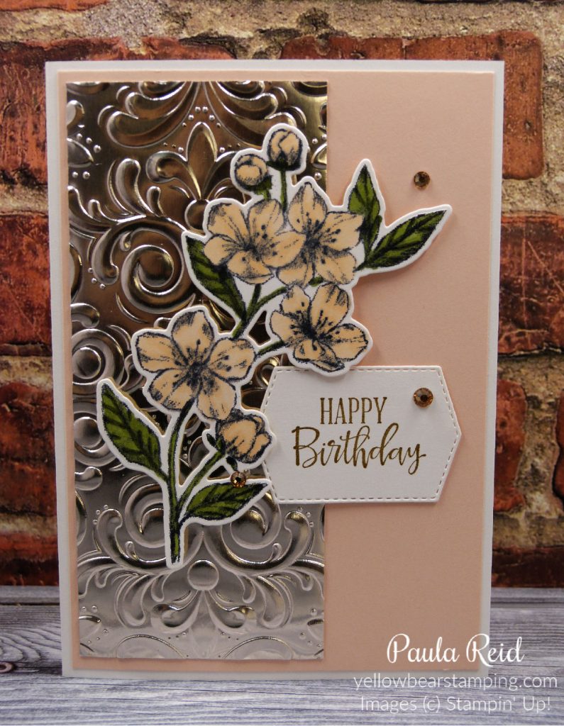
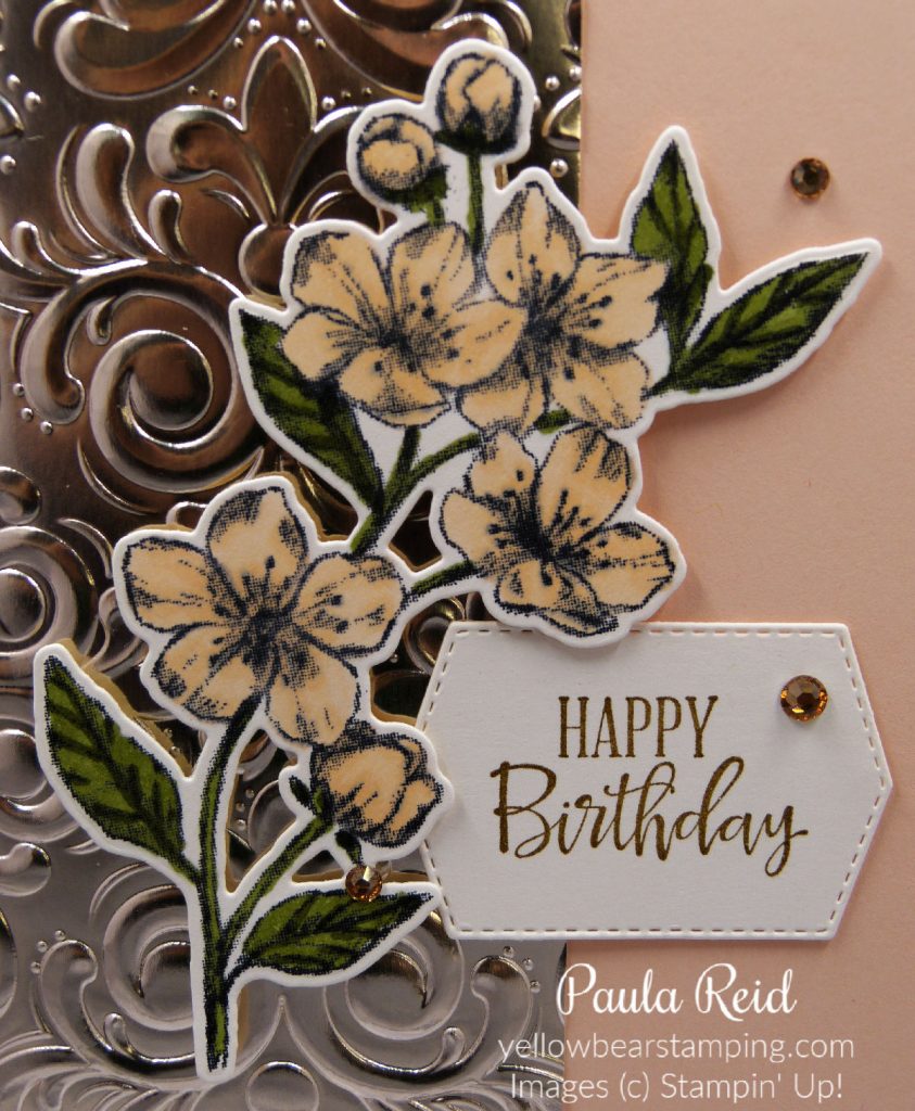
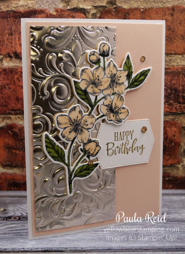
The panel of Champagne Foil has been dry embossed with the Parisian Flourish 3D Embossing Folder – it really highlights the design of this folder. The sentiment is from Peaceful Moments and has been stamped with Soft Suede and die cut from the Tasteful Labels die. The mat is Petal Pink and some Champagne Rhinestones have been added to finish off the card.
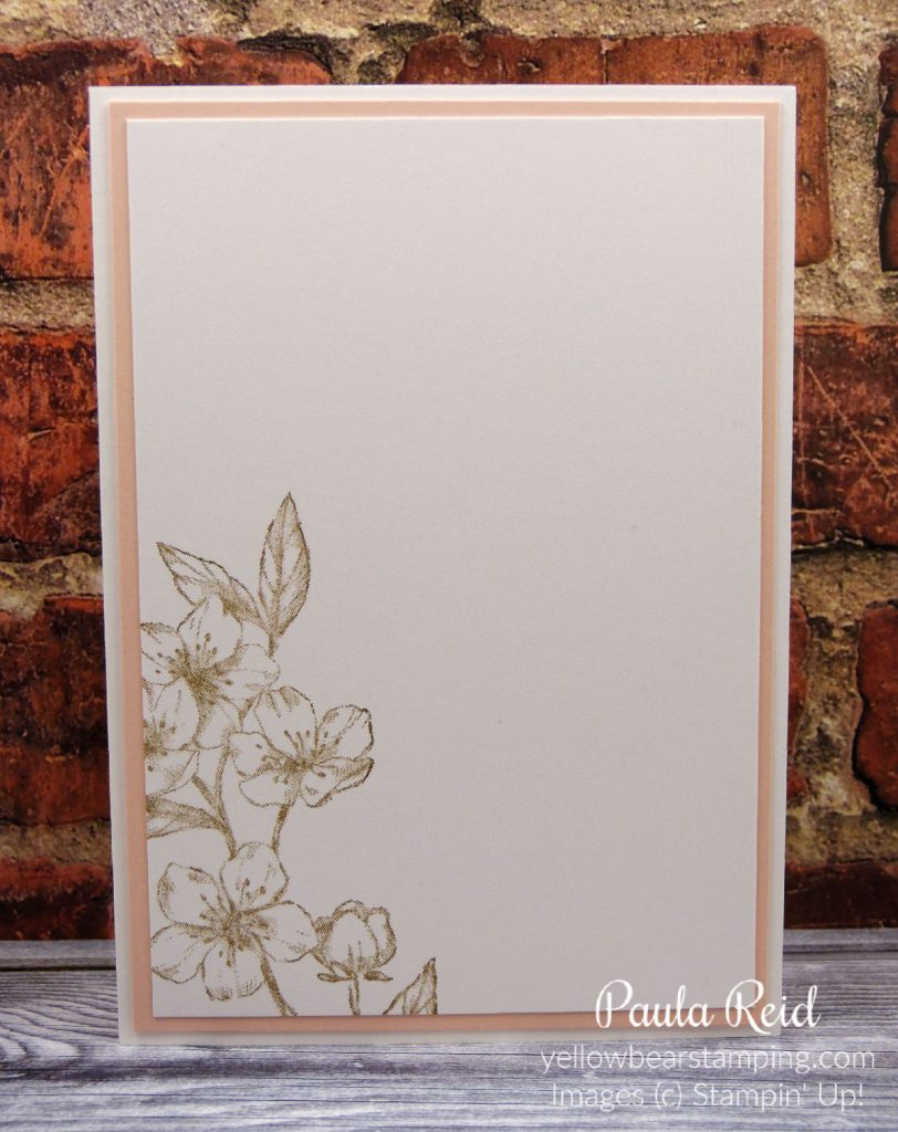
The same image has been partially restamped on the inside in Soft Suede and adhered to a Petal Pink mat. The card base is Thick Basic White.
I have one more colouring technique to share next week so check back same time for another installment.
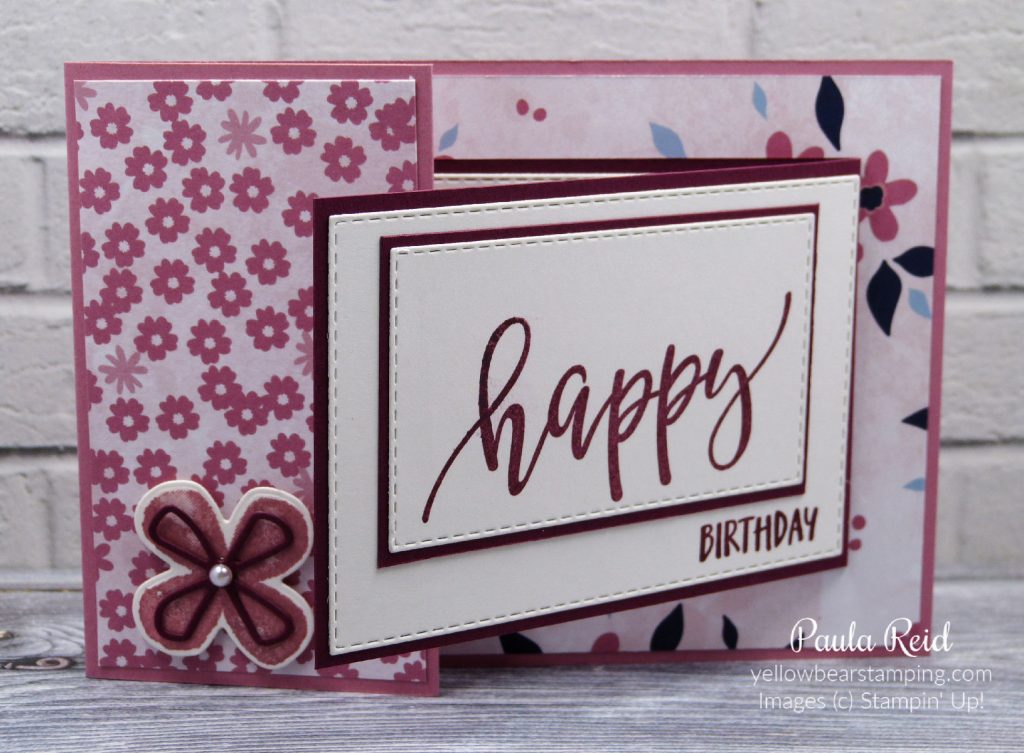
It’s been ages since I made a Joy Fold card – I’m not sure why I haven’t made more of these as they’re an easy fold to do and a great way to use our lovely Designer Series Paper. I have two cards to share – the first one I did in blue tones suitable for a guy and then one using the beautiful Paper Blooms paper from the Sale-A-Bration brochure.
The In Good Taste Designer Series Paper is a great pack that has papers suitable for masculine and feminine cards. I chose this paper as I like the texture look it gives – you can almost feel the raised paint on the background paper and feel the fibres on the front paper.
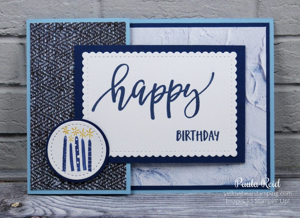
My sentiment is from my favourite set in the January to June mini – Pretty Perennials on page 31. The Stitched So Sweetly dies are one of my favourite dies and my sentiment – stamped in Night of Navy – fits perfectly within then stitched border. The candles are from the Sale-A-Bration set ‘Approaching Perfection’ and have been ‘inked’ using Night of Navy and Mango Melody Stampin’ Write markers. The image is die cut using the second smallest Stitched Shapes circle then adhered it to a 1 1/2″ circle. Dimesionals are adhered to the back around the lower left hand side – when adhered to the card this will allow the corner of the fold out flap to tuck in behind it.
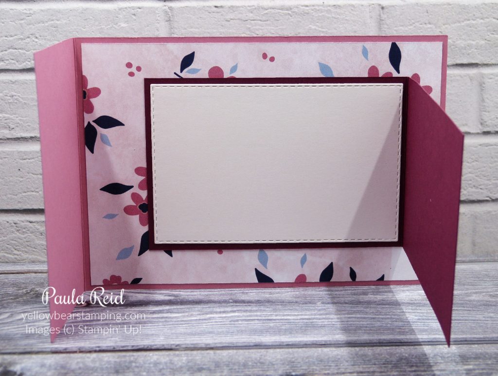
The card base – Balmy Blue – measures 10.5cm x 21cm (scored at 14.8) and the fold out flap – Night of Navy – measures 7cm x 20cm (scored at 10cm). The Night of Navy mat on the base measures 10cm x 14.4cm. The DSP for the front measures 5.7cm x 10cm and the piece for the base measures 9.5cm x 13.8cm.
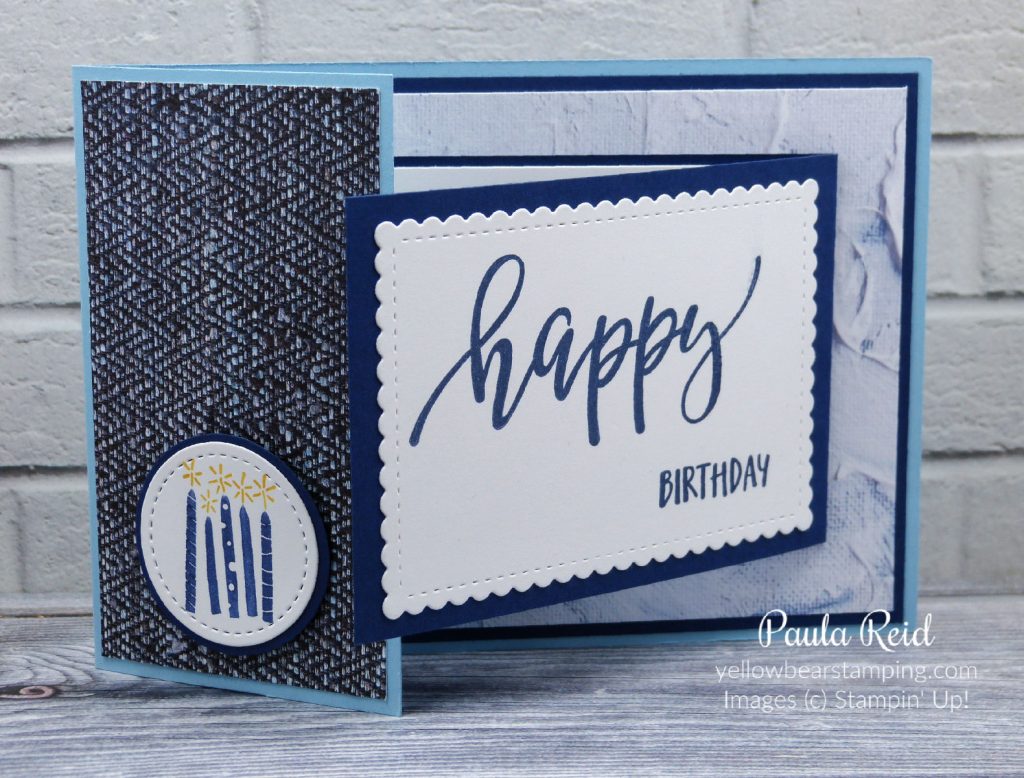
Here’s a quick tip – when stamping the ‘happy’ make sure you double check which way the p’s are going before you stamp it on to your cardstock :). For the next card the ‘happy’ was meant to have been stamped at the top of the card stock and not the bottom and used on a different design :). Not to worry we came up with ‘version two’ of the Joy Fold.
The measurements for this card are the same as above with a couple of additional layers. The ‘happy’ has been stamped on the third smallest Stitched Rectangle and the ‘birthday’ has been stamped on the fifth smallest die. The mat for the smaller die measures 5cm x 8.2cm
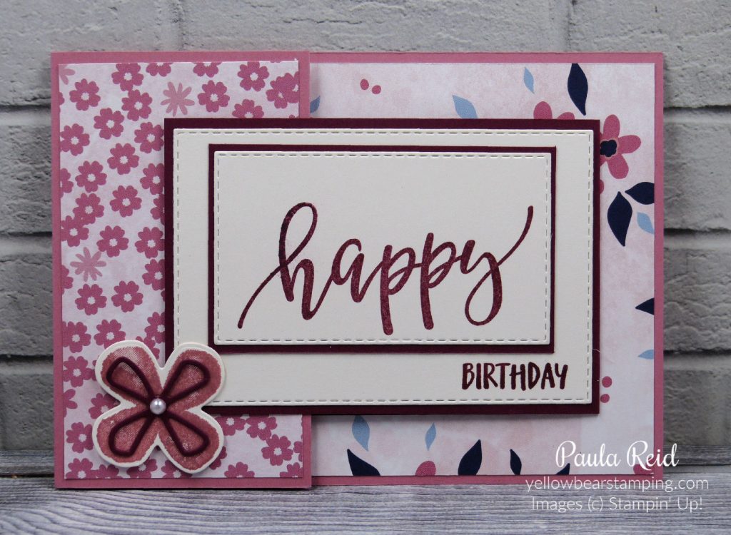
The Paper Blooms DSP from the Sale-A-Bration brochure goes really will with the Pretty Perennials Bundle. I used one of the stamps and coordinating dies from this bundle to create the closure. Again dimensionals have been added under three of the petals to give it height allowing the fold to fit underneath.
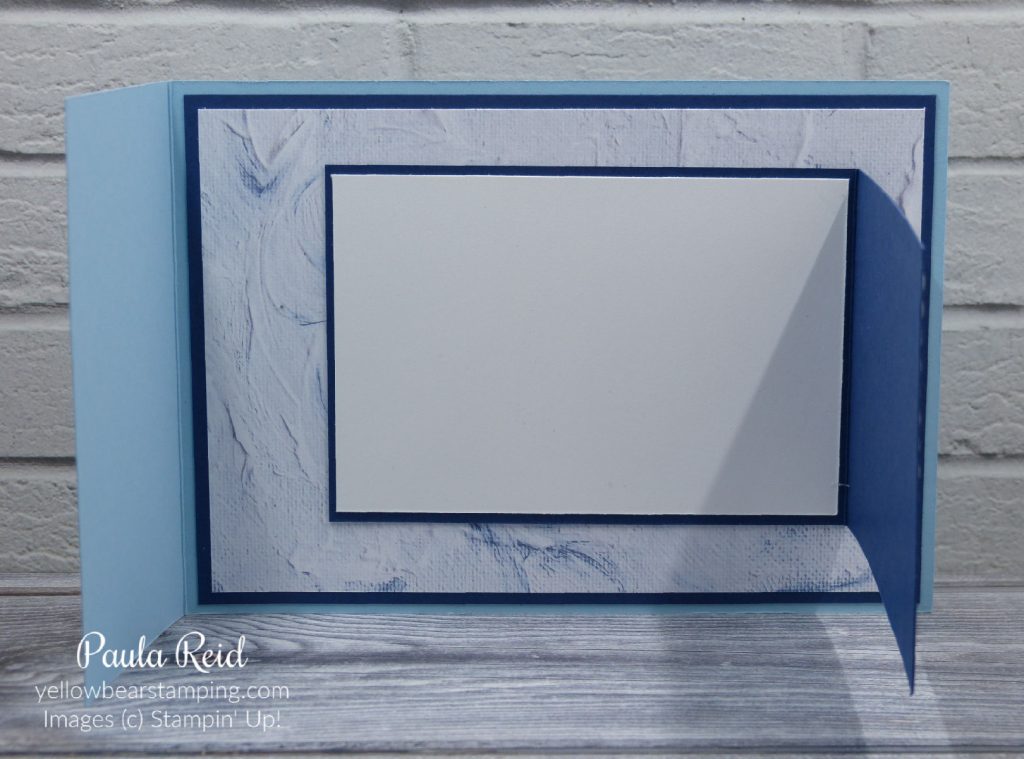
The card base is Rococo Rose and I’ve teamed it up with Merry Merlot for the fold out flap and stamping. The inside writing section has also been die cut with the fifth largest die. These have all been done using the Shimmery White cardstock. It’s a bit hard to see in the photos but Shimmery White is a bit warmer in colour than Basic White and has a lovely subtle shimmer to it.
Well I hope you’ve enjoyed seeing these Joy Fold card – I encourage you to have a go at recreating some of these folds.
I thought I’d share the versatility of our outline/line art stamps and the different methods of colouring you can use. Today’s card is a mix of Stampin Write Markers, Ink and Sponge Daubers.
To get the outline of the image I used the Direct to Rubber technique which I shared here. I used the Early Espresso Stampin Write Marker (brush tip) for the flowers and Mossy Meadow for the stems and leaves. I then stamped my image from Forever Blossoms (page 68 AC) on Shimmery White cardstock.
To apply colour to fill in the outline I used Petal Pink and Mossy Meadow ink applying it with our Sponge Daubers. This allows you to get some depth to the colour of your flowers by applying the dauber directly to the centre of the flower then ‘tapping’ the daubers again to finish coverage of the image. You may need to use the side of the dauber so that you don’t go too far over the outline. Repeat the same for the leaves. This stamp set has a coordinating die set – Cherry Blossoms (page 180 AC) so no ‘fussy’ cutting required. I die cut my image after colouring.
The Petal Pink mat that has been dry embossed using the Parisian Flourish 3D Embossing Folder (page 185 AC). The sentiment has been stamped in Sahara Sand and die cut from the Layering Circle Dies. The ribbon is the beautiful Petal Pink 5/8″ Organdy Stripped ribbon and to finish off this card I used the Champagne Rhinestones.
For the inside I partially restamped the image in Soft Suede. Again this is on Shimmery White cardstock. The card base is Sahara Sand.
Be sure to check back over the coming weeks to see more ways to colour our outline/line art stamps.
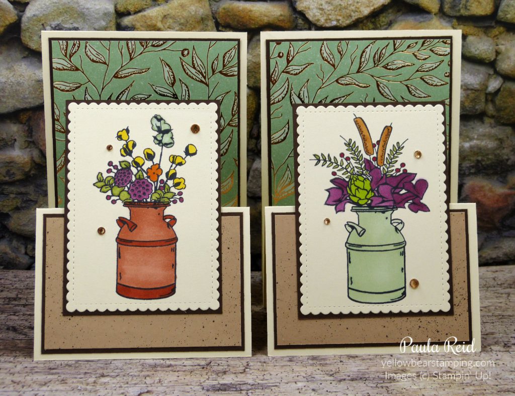
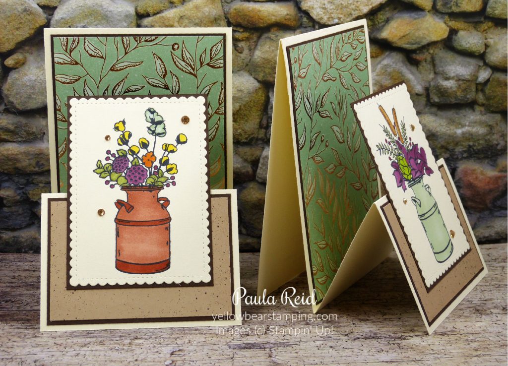
I have another version of the Double Easel Card similar to the one I shared here. For that card I started with the base and then built the ‘easel fold’ and attached it to the base. Today’s card starts the other way – I built the ‘easel fold’ then attached a piece of cardstock to create the base.
The previous card used one piece of cardstock measuring 10.5cm x 29.7cm (scored at 14.8cm) and one piece measuring 10cm x 29.7cm (scored at 7.2cm and 14.4cm). Today’s card uses a piece of Thick Very Vanilla measuring 10.5cm x 29.7cm (scored at 7.4cm and 14.cm) another piece of Thick Very Vanilla measuring 10.5cm x 17.5cm (scored at 14.8). This second piece becomes the back of the card base and the small section is adhered to the main card.
I then added Early Espresso cardstock to the base (3 7/8″ x 5 1/2″) and a piece of the Gilded Autumn Specialty Designer Series Paper (3 3/4″ x 5 3/8″). The front Early Espresso cardstock measures 2 5/8″ x 3 7/8″ and another design of the same DSP measures 2 1/2″ x 3 7/8″.
The images are coloured in with our Stampin Blends using a variety of colours that teamed with the papers I’d chosen. After finishing the cards I felt they needed something else so I added some Champagne Rhinestones – a little bit of bling really finishes them off.
The reason I created the card this way was that I wanted a Very Vanilla mat to be showing around the outside of the Early Espresso and this was the only way I could get the look I wanted. It uses around the same amount of cardstock as my first sample did.
This past weekend was a long one here in New Zealand – we were celebrating our national day – Waitangi Day. It was a nice relaxing weekend and I managed to make 20 cards for staff who have birthday’s in March.
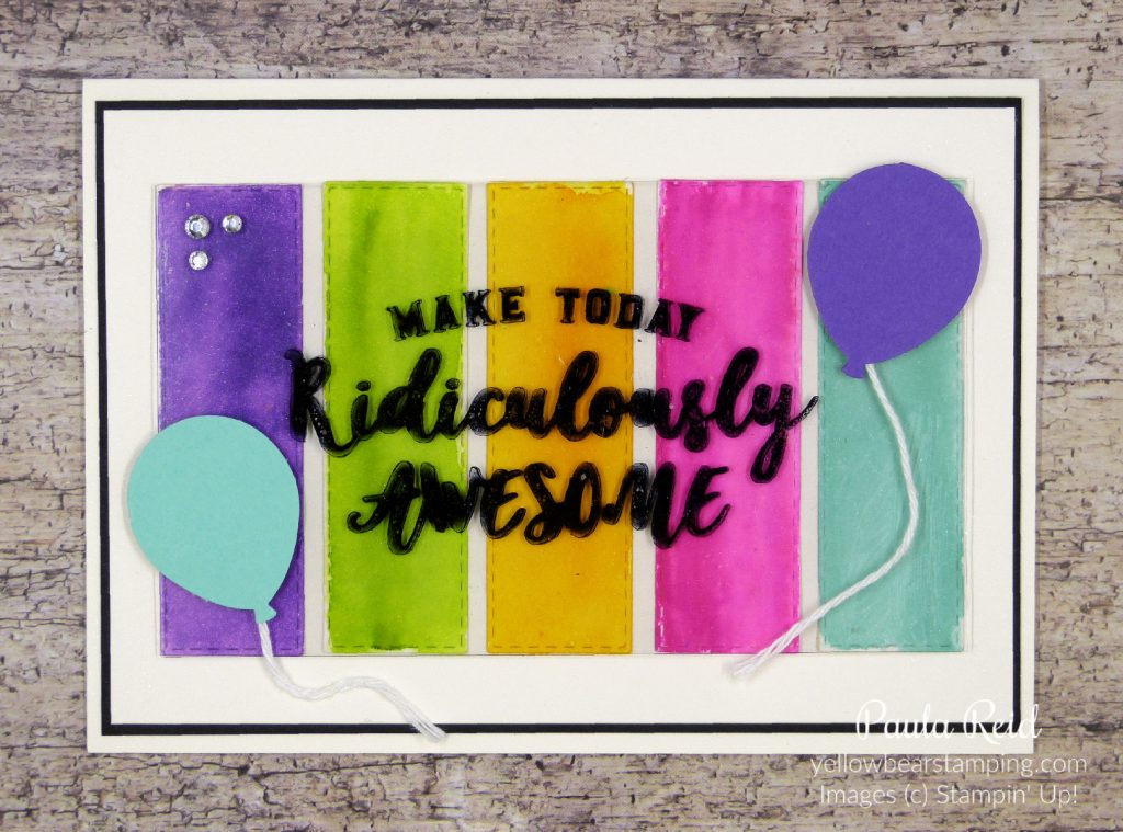
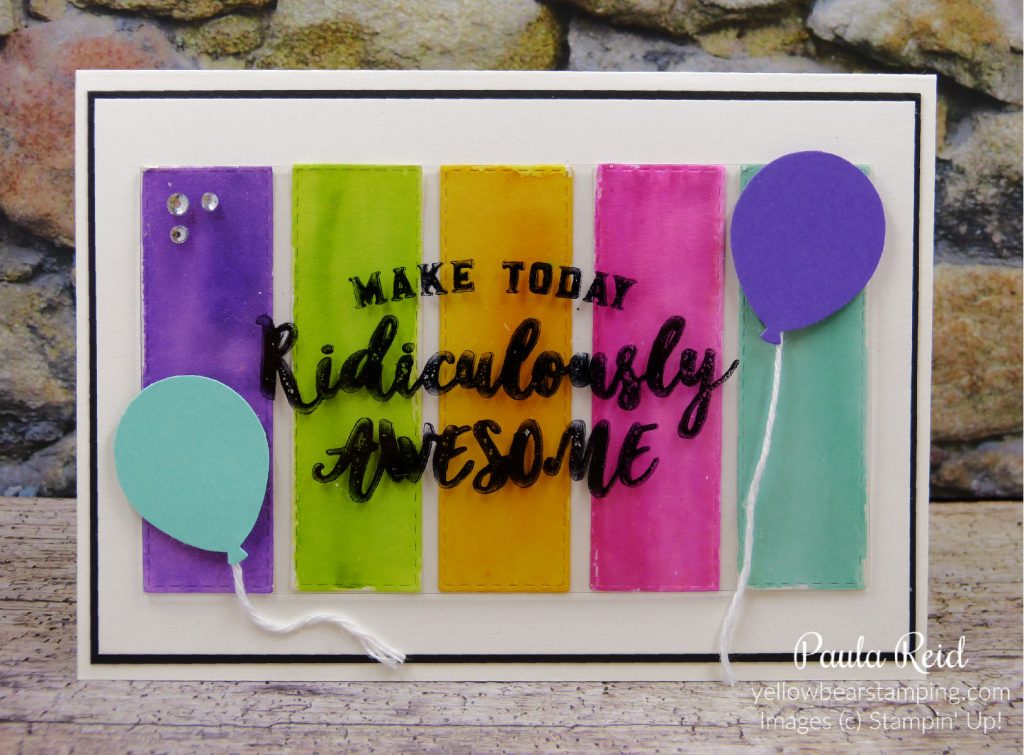
Today’s card has a couple of techniques – a watercolour wash and stamping on window sheets.
My inspiration came from a card I received that had Designer Series Paper panels on the front and I also wanted to use this stamp from Ronda Wade’s Million Dollar stamp set – Ridiculously Awesome.
To start I die cut five Stitched Rectangles using Shimmery White cardstock and using an aqua painter gave them a light wash of water. I have a little painters tray that I put a couple of drops of reinker in and then squeeze some water from the aqua painter to dilute the ink. I then ‘wash’ over the cardstock with some ink using the aqua painter. You don’t want the colour too strong. Put the strips aside to dry or you can give them a quick dry with the heat tool.
I went with bright colours – Gorgeous Grape, Granny Apple Green, Mango Melody, Magneta Madness and Coastal Cabana.
I cut a piece of Window Sheet the height of my strips and wide enough to cover them and then stamped my sentiment with Jet Black StazOn. When you use StazOn make sure you clean your stamps straight away with StazOn Cleaner. If your image smudges you can wipe the Window Sheet clean with Isopropyl Alcohol and then start again 🙂
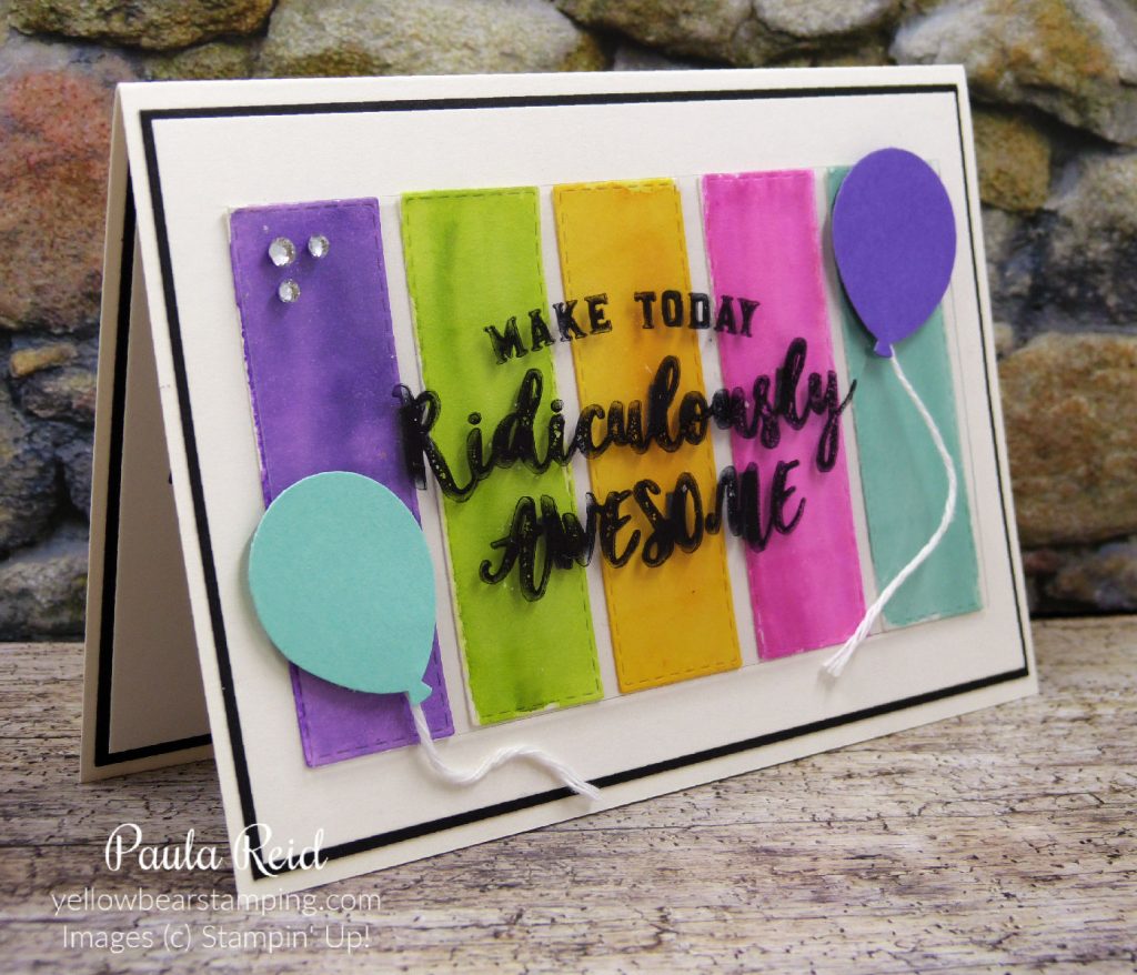
Once the wash strips have been adhered to the Shimmery White mat I added black dimensionals cut in half to the back of the Window Sheet. The lettering is wide enough to conceal the dimenisonals. The balloons are adhered directly to the Window Sheet and then I was also able to add more dimensionals to the back of the Window Sheet which got covered by the balloons.
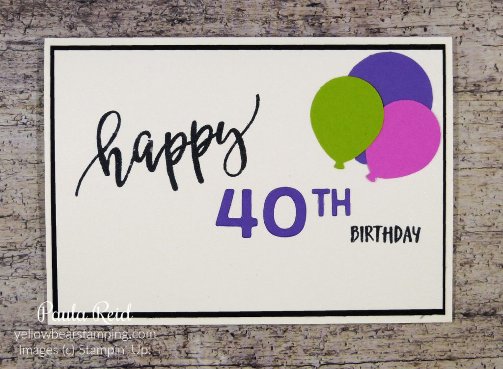
One of my favourite sets in the new January – June Mini is the Pretty Perennials set on page 31. I love the size and font of the ‘happy’. The 40 is die cut from Gorgeous Grape using Playful Alphabet dies and the ‘th’ is from the retired Little Numbers.
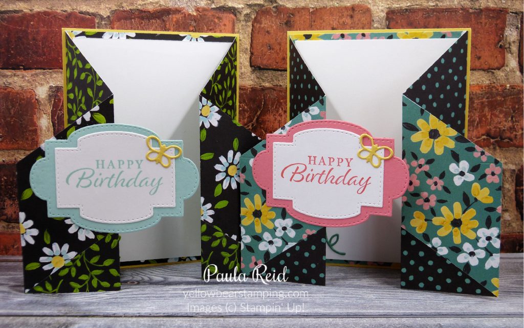
Today’s card is my ‘go to’ fun fold. You start off with a piece of 6″ x 6″ Designer Series Paper then two cuts and one score later and you’ve got a fun fold card. You can see other cards I’ve made in this design here and here. Both links share measurements to recreate this card.
The card front looks like a normal card but take a closer look and you’ll see
that the front panel opens and you get to see more of the beautiful Designer Series Paper (DSP). Don’t throw away the sections you’ve cut as I’ve used mine to decorate the inside of the card.
The card base is Thick White with a mat of either Night of Navy or Rococo Rose. The little flower on the front was stamped in Seaside Spray with the Night of Navy (stamped off) as the overlay.
The DSP is called the Paper Blooms Designer Series Paper and is one of the FREE Sale-A-Bration products on offer when you place an order of NZD$110 between now and the end of February. I’ve used the Pretty Perennials Bundle (which just so happens to coordinate with the Paper Blooms DSP) for the front sentiment and flower. If you were to purchase the Pretty Perennials Bundle and a pack of Thick Basic White cardstock you would qualify for a FREE purchase from the Sale-A-Bration brochure.
I’ve fallen in love with this paper and couldn’t stop at making just one card. I ended up making a sample in all the paper options. You can never have enough birthday cards on hand.
Well that’s it from me. If you’re in New Zealand enjoy your long weekend. Until next time …
What picture do you get when you read the title of today’s post? Daubers doing Rock ‘n’ Roll moves in the craft room? Sorry to disappoint you but it’s not that exciting 🙂
The Rock ‘n’ Roll technique allows you to get two different colours onto the one stamp so that when you stamp the image it comes out with the two colours blended together. You can use inks pads to create this effect although I’ve chosen to use daubers to add my second colour as you get better control.
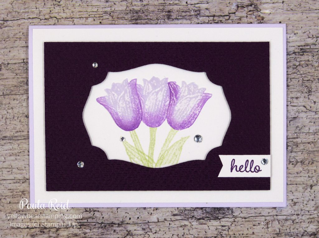
For my sample I’ve used the Timeless Tulips set. The stems have been inked with Soft Sea Foam a colour I don’t use much (not sure why that is). The Tulips have then been stamped with Purple Posy and then using a dauber inked in Blackberry Bliss I’ve lightly ‘tapped’ the edge of the stamp making sure I didn’t go too far into the stamp. You just want to get the second ‘coat’ of ink on the edge. The tulips were stamped on scrap Whisper White then ‘fussy cut’ out. Each image has slightly different colouring just like real flowers.
The card base is Purple Posy with a Whisper White mat which the stems were stamped on and then the tulips adhered directly. The top mat has been die cut with the Tasteful Lables die and then dry embossed with the Tasteful Textile 3D Embossing Folder. I had a few of these left over from a swap I did so you might see a few pop up in posts :). I didn’t take a photo of the inside of the card but I stamped a longer stem with a couple of leaves and the tulip was stamped in Blackberry Bliss.
Well that’s all for now. I hope you give this technique a try – either with ink pads or daubers.
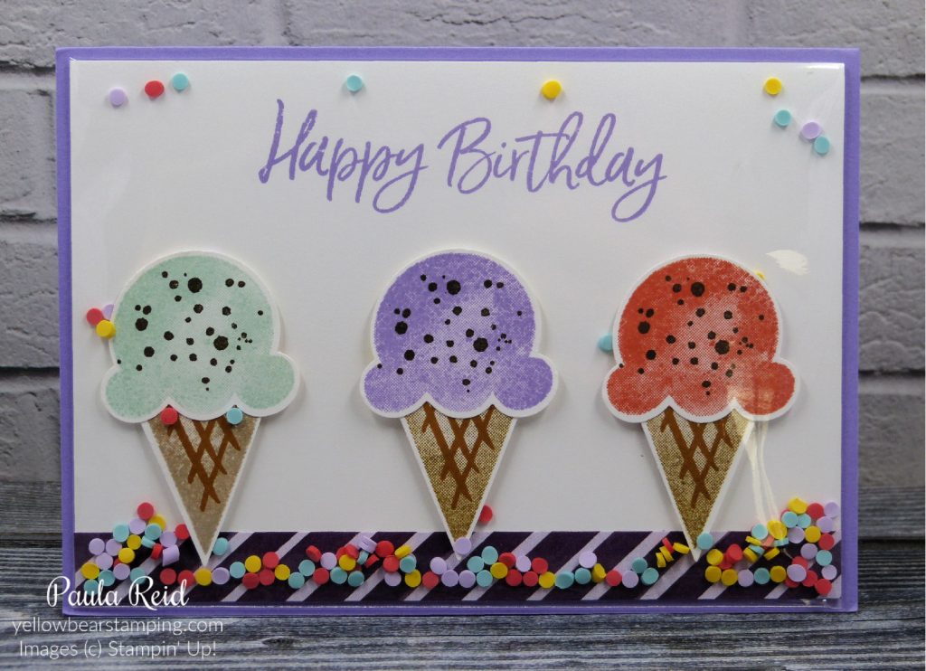
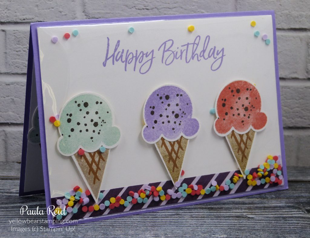
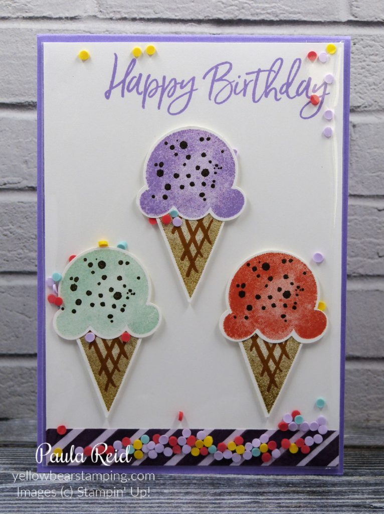
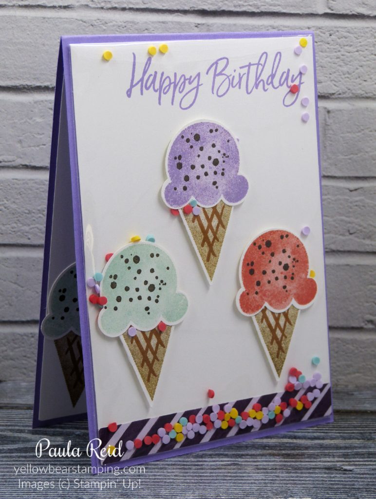
It’s summer here in the southern hemisphere and there’s nothing better than a yummy ice cream on a hot summers day. The Ice Cream Corner Suite in the January-June Mini is the perfect suite of products to use for summer projects. My first project with this suite is a new style of shaker card that uses our clear envelopes (page 153 AC). To see another style of shaker card check out an earlier post here.
To construct this card first I added a 1/2″ strip of the Ice Cream Corner Designer Series Paper to the bottom of a standard card front (10cm x 14.3cm) and stamped my sentiment in Highland Heather. I then stamped my ice cream cones in Soft Suede then Cinnamon Cider for the ‘hash’ stamp. The ice creams are stamped in Pool Party, Highland Heather and Calypso Coral with Early Espresso for the chocolate sprinkles. The stamp set is called Sweet Ice Cream and has a coordinating punch – Ice Cream Cone Builder Punch. You can purchase these as a bundle or part of the suite. The cones and ice cream are punched separately, adhered together then adhered to the card front with mini dimensionals. Then the fun begins.
Slide the card front into the clear envelope and pour some of the Ice Cream Corner Sprinkles in. You don’t need too many otherwise they won’t ‘shake’ around easily. These sprinkles are kind of like a foam and made up of Daffodil Delight, Pool Party, Purple Posy and Terracotta Tile. Once you are happy with the number of sprinkles remove the backing tape and seal the envelope. You will need to fold the excess of the long side of the envelope to the back. I taped it down with Tear and Tape. I then ran Tear and Tape on the back around the edge and adhered it to my card base. So simple but really effective.
I also made a portrait version to show the versatility of this style of card.
You could use this style of card with all sorts suites using our DSP or stamped backgrounds. For the ‘shaker’ you could use sequins – check out pages 157 and 158 of the AC for the Woven Threads and Whale of a Time sequins or the Flowers for Every Season Gems. Make sure you add a packet of Clear Envelopes to you next order.
After some ‘technical issues’ I’ve finally managed to get here.
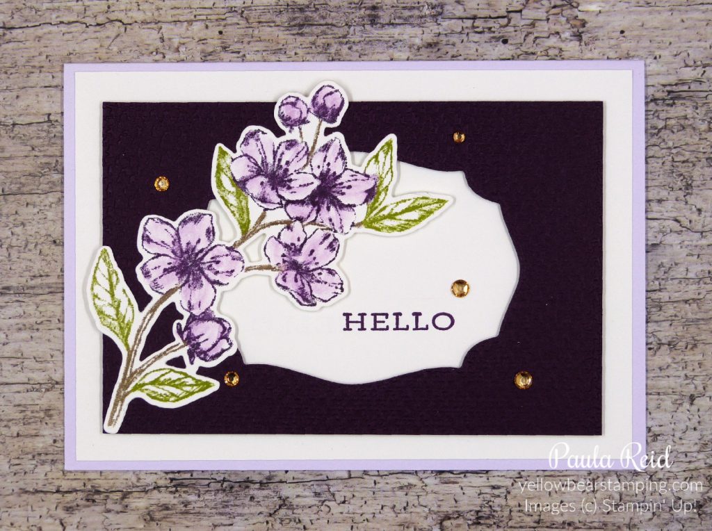
Today’s technique uses our Stampin’ Write Markers to ‘ink’ up stamps. These markers are water based compared to the Stampin’ Blends which are alcohol based. Markers are great to use when you have an image that requires multiple colours and is too hard to ink up using ink pads. By applying the markers directly to the rubber you can achieve multiple colours on the one stamp before stamping it onto your cardstock.
Here I’ve used the large floral image from Forever Blossoms (page 68 AC) which has three components – stem, leaves and flowers. This would be too hard to ink up with three different coloured ink pads and not get the colours overlapped.
Stampin’ Write Markers are dual tipped – they have a broad brush tip for colouring and a fine tip for writing. For the direct to rubber technique you want to use the broad tip. Always your the side of the tip to apply the ink to the rubber. This will help keep the tip from breaking down.
I started by colouring in the leaves with Old Olive then the flowers with Blackberry Bliss and finally the stems with Soft Suede. Now don’t laugh at this next tip – it’s an important step in this technique. Before you stamping your image onto your cardstock you need to ‘huff’ on the stamp to remoisten the colours – this will give you a good image.
The floral image has been die cut with the coordinating Cherry Blossoms die. The Blackberry mat has been die cut with the Tasteful Labels die and then dry embossed with the Tasteful Textile 3D embossing folder. The sentiment is from the Forever Fern stamp set (page 110 AC) . I wanted the flowers to have a bit of a ‘sparkle’ so I applied some Wink of Stella which actually drew some of the colour of the outline giving the flowers a light colour. The final set was to add some ‘bling’ – here I’ve used the Champagne Rhinestones.
Well I hope this has shown you a new way to use your markers – they’re not just from colouring directly onto cardstock.
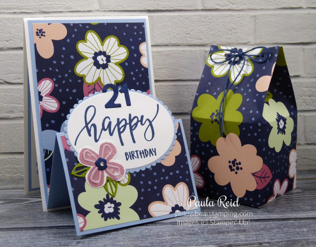
I’ve had fun making Double Easel Fold cards of late – a great way to show our beautiful Designer Series Paper (DSP). For these cards I’ve used the Paper Blooms DSP which is available for you to select as your FREE purchase with every NZD$110 order placed between now and 28 February. The Paper Blooms pack is a 12×12 pack of paper and you get 2 sheets of each design – there are 6 double sided designs. Check out my Catalogues page to view the Sale-A-Bration brochure.
The Pretty Perennials Bundle from page 31 of the Jan-June Mini coordinates beautifully with this DSP. The card base is Thick Whisper White and the mat is Night of Navy. The flower has been stamped with Seaside Spray then die cut from the Perennial Petals dies.
The overlay on the flower has been die cut from Vellum Cardstock (page 153 AC). It’s been ages since I used Vellum on my projects and it really goes well with this set. Do you have products you’ve purchased then forget to use?
To make this card you need one piece of cardstock (Thick Whisper White) measuring 10.5cm x 29.7cm and scored at 14.8cm, a second piece of cardstock (Night of Navy) measuring 10cm x 28.8cm and scored at 7.2cm and 14.4cm and then folded in a ‘mountain’, ‘valley’ formation and two pieces of DSP measuring 9.5cm x 13.8cm and 9.5cm x 6.7cm. Adhere the larger section of the Night of Navy to the Thick Whisper White then adhere you pieces of DSP. The final step is to decorate the front – I used the Layering Ovals and Pretty Perennials Bundle.
My cousins daughter turns 21 shortly and as I was on a roll with the Double Easel card I made one for her and a Milk Carton filled with chocolates to match the card (she also got another gift from us but you always have to have a chocolate gift)
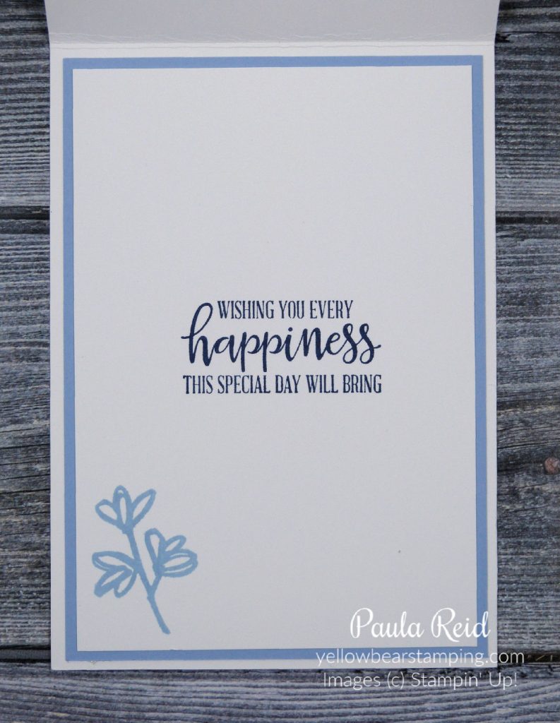
For the inside I’ve added a mat of Seaside Spray and a stamped insert of Whisper White. The sentiment is from one of my ‘go to’ sentiment sets – Peaceful Moments (Page 19 AC). Every stamper should have this set in their stash.
I hope you give this card style a go – fun fold cards are always well received.
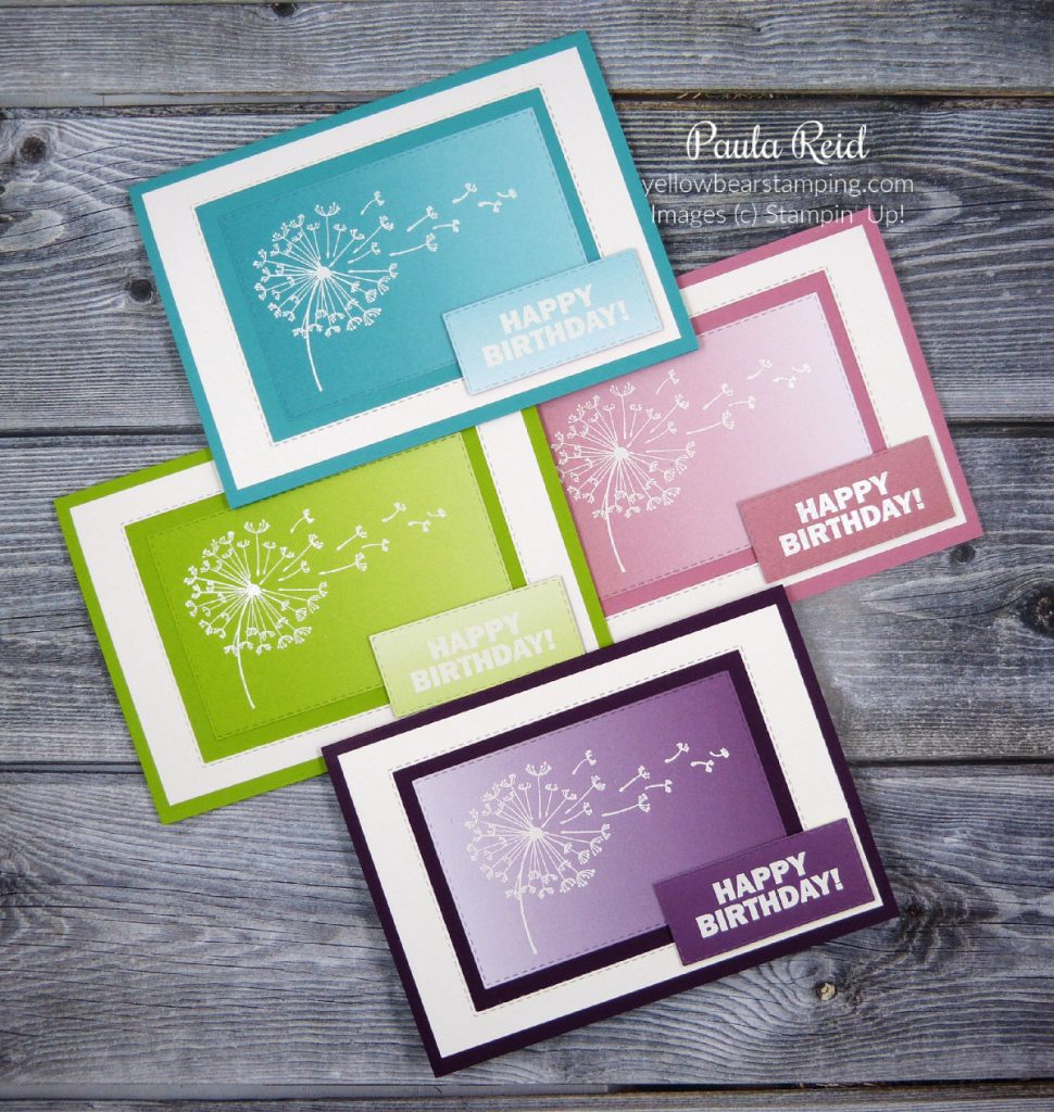
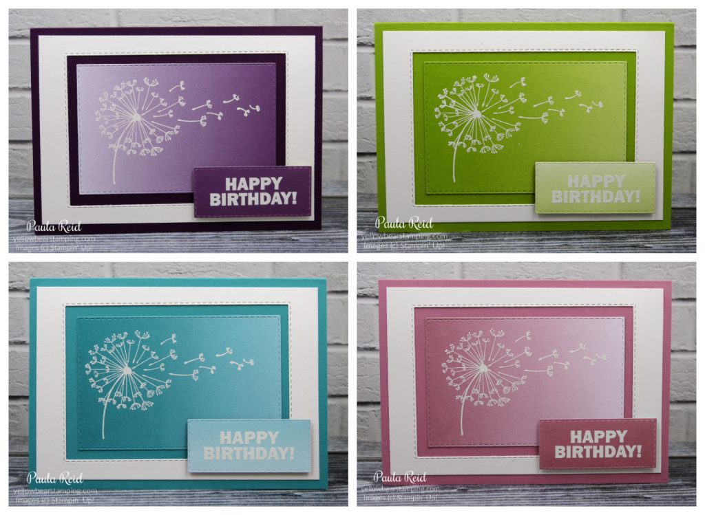
Today’s technique is heat embossing. This has got to be one of my favourite techniques. I never get sick of seeing the transformation of the embossing powder once heat is applied to it – it’s so cool.
In my earlier post I used clear embossing powder added on top of an already inked image whereas these projects use coloured embossing powder – white in this case.
White embossing creates a very striking image don’t you think?
Top Left – Blackberry Bliss, Top Right – Granny Apple Green, Bottom Left – Bermuda Bay, Bottom Right – Rococo Rose
These images from the Dandelion Wishes set have been inked in VersaMark then stamped on the Oh So Ombre Designer Series Paper (DSP) then White Embossing Powder has been added on top before being heated with the Heat Tool. By applying heat to the image the powder melts and gives a raised effect. A simple technique but very effective. The sentiment is from Approaching Perfection another FREE Sale-A-Bration item.
After the heat embossing I die cut the image using the Rectangle Stitched dies – these are one of my most used die sets. If you don’t own this set I would highly recommend you adding it to your next order – they are very versatile. I also used these dies to create my Whisper White border mat. The mat measures 10cm x 14.3cm and then I die cut the third largest die from the middle. The sentiment has also been heat embossed on a scrap of the DSP.
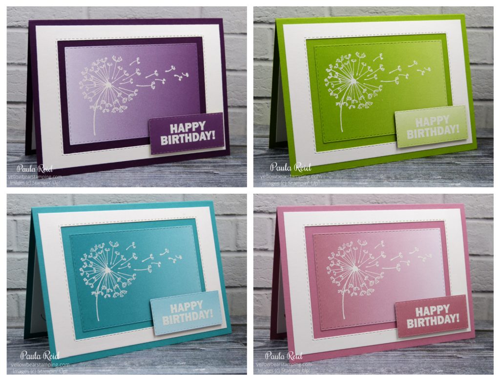
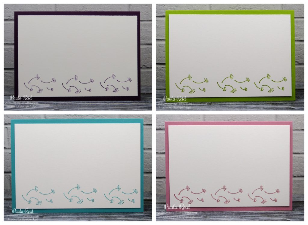
And finally the inside – this image is also from the Dandelion Wishes set and just finishes of the card.
I had fun making these cards – what images do you have that you could use with this technique?
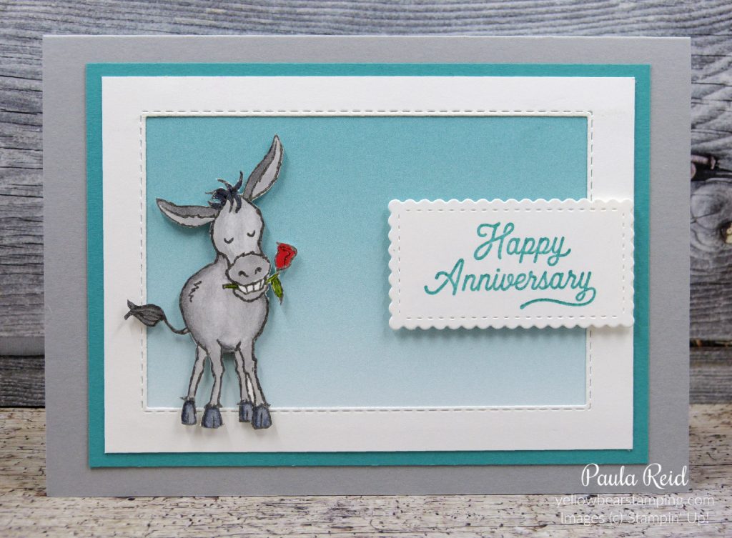
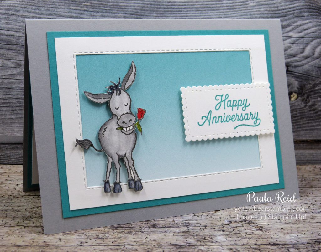
Today Phil and I are celebrating our 19th Wedding Anniversary :). I thought I’d share the card I made for him now as I have some more projects to share with you later today. He decided we’d do our card exchange at dinner so he has to wait a bit till he gets to see it.
When I saw the Darling Donkeys set in the Sale-A-Bration brochure I knew exactly what their first inking would be :). I’ve teamed it with the Oh So Ombre paper – also from the Sale-A-Bration brochure. The sentiment is from Many Mates – a great ‘go to’ sentiment set.
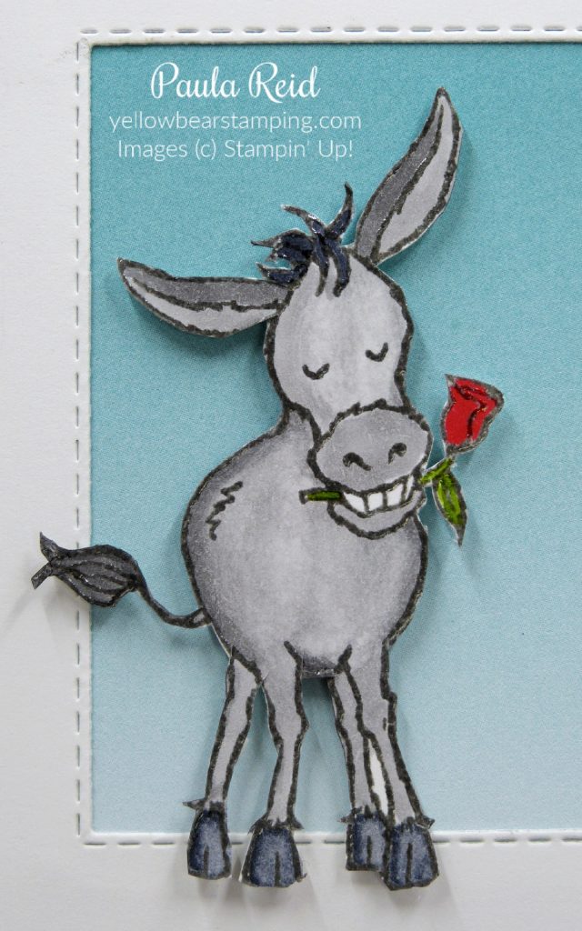
The donkey has been heat embossed then coloured in with our Smoky Slate Stampin’ Blends. To heat emboss I inked up the image with VersaMark then Basic Grey ink and stamped him on Whisper White and added Clear Embossing Powder before heating. This method allows you to have an embossed image in whatever colour you want. Check back later today for more projects using this technique.
Here’s a closeup – hopefully you can see that the image has been heat embossed. Once I’d coloured him in I used the Color Lifter blend to lighten the body and the hooves. By doing this it gives you more colour options.
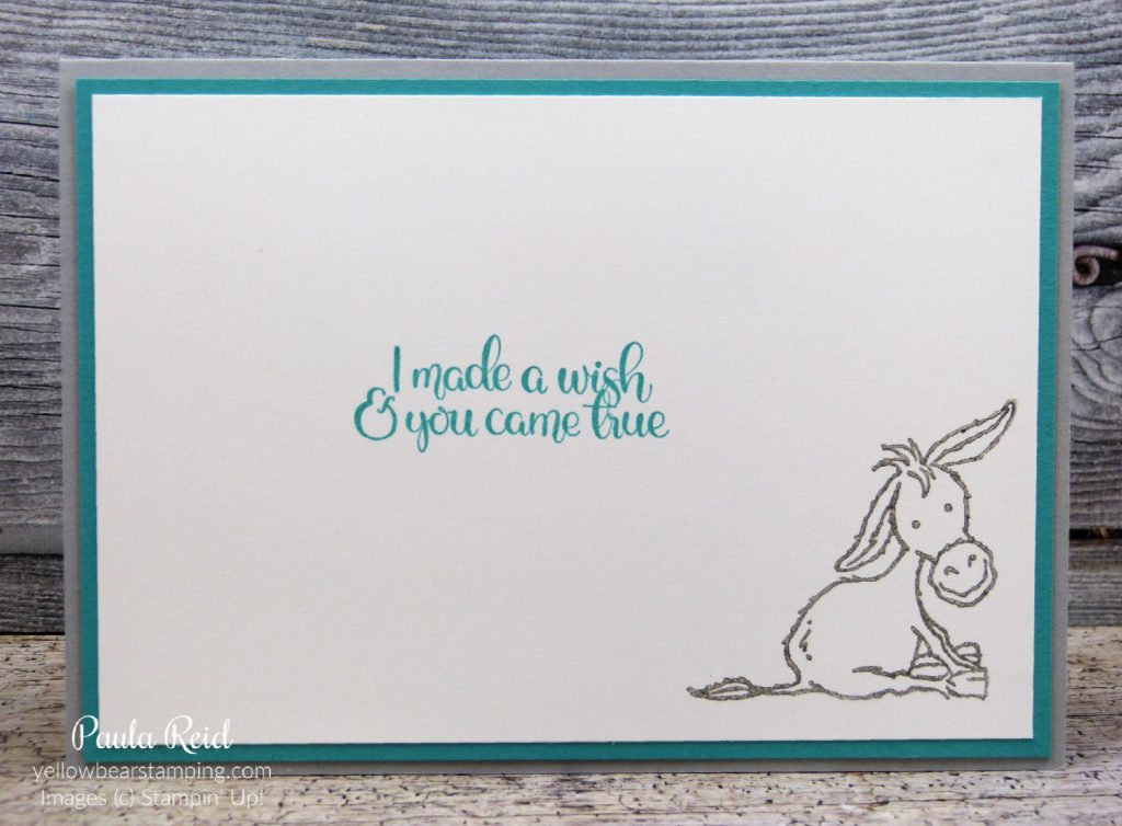
And no card is complete without stamping on the inside. Again this little donkey has been heat embossed in the same way as the front image was. The sentiment – which is perfect for my card – is from Dandelion Wishes.
Well that’s all from Mrs Reid :). Until next time …