Purple Posy and 3D Embossing Folders are here

By | September 29, 2019

Hi there

PURPLE POSY IS HERE!

We are excited to announce that Purple Posy Classic Stampin’ Pads and Purple Posy Classic Stampin’ Ink Refills are available to order.  You may now also purchase the 2019–2021 In Color Classic Stampin’ Pads (includes all five of the 2019–2021 In Colors).

  • Purple Posy Classic Stampin’ Pad (item 150084)
  • Purple Posy Classic Stampin’ Ink Refill (item 150091)
  • 2019–2021 In Color Classic Stampin’ Pads (item 150087)

Also the below 3D embossing folders are now available to order in the new style.  Don’t forget to purchase the new ‘blue’ plate – see details below:

  • TUFTED 3D EMBOSSING FOLDER (item 151785)
  • CORRUGATED 3D EMBOSSING FOLDER (item 151811)
  • LAYERED LEAVES 3D EMBOSSING FOLDER (item 152321)

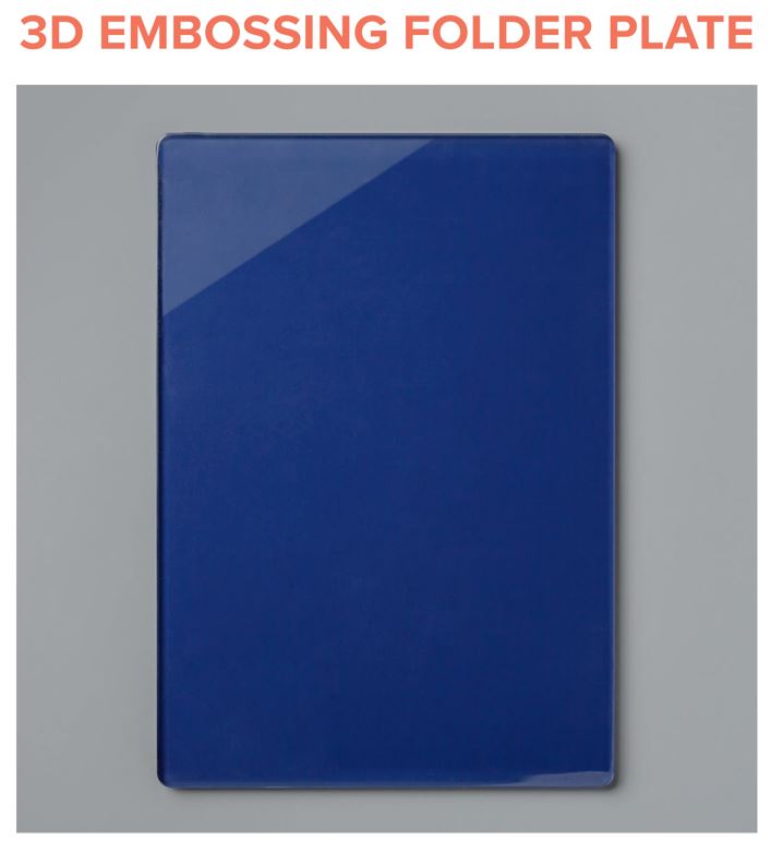
How to Use the New Plate

The new plate makes up the difference in measurement between our old-style Dynamic Folders and our new-style 3D Folders in 21 mm gap machines (similar to the machine we used to offer). The 3D Embossing Folder Plate replaces the Standard Cutting Pads in your 3D embossing folder sandwich for continued high-quality emboss results.

To create your emboss sandwich:

  • Use a die-cutting & embossing machine platform as a base; no matter which machine you’re using, use the standard platform which comes with your machine.
  • Use the 3D Embossing Folder with your paper in the middle.
  • Then use the 3D Embossing Folder Plate on top.

Given the differences in machines and platforms, you may still have to add a shim to get your desired embossing results. (You can also spritz your paper before embossing to maximise your embossed impressions.)

Without the new 3D Embossing Folder Plate, you will need to use several shims with the Standard Cutting Pad in your 3D embossing folder sandwich, depending on the die-cutting & embossing machine you use. Most machines will need between three to five sheets of cardstock to shim. Please be careful in how you shim; start out with fewer sheets first, then add sheets to get your desired results. Stampin’ Up! will not be responsible to replace products broken due to using a sandwich which is too thick for a machine.

Daisy Lane – Sympathy Card

By | September 23, 2019

Hi there

I saw a card on a Facebook group I belong too that I liked so I saved it to recreate one day.  Well that day has come.  Recently I was in need of a sympathy card and knew the layout would work really well for my sympathy card.  I changed the colours for the flower as my recipient loves blue.

Daisy Lane - Sympathy Card

The flowers and fern images are from Daisy Lane on page 23 of the Annual Catalogue.  The ‘sprinkles’ are from Brightly Gleaming – page 32 of the Holiday Catalogue.  The sentiment is from the retired Sale-A-Bration set – Lasting Lily.

The fern was stamped first in Granny Apple Green and I used the ‘stamped off’ technique for some of the ferns to get two tones of the green.  I’ve also stamped some of the images so that they go off the page to give a softer line and lead the eye right to the edge.

The small flowers have been stamped directly onto the card front in Pretty Peacock.  Two of the big flowers were stamped in Balmy Blue then punched out with the Daisy Punch.  To create a full flower I layered them together off centre and adhered to the card base covering up the middle of the ferns where they overlapped.  The ‘sprinkles’ were stamped in Crumb Cake.

The card front has been adhered to the Thick Whisper White base with dimensionals and then the final touch – a Gold Faceted Gem – was added.

Thanks Jen for your inspiration.  This card design can be used for so many occasions.

Until next time …

Advent Calendar – Christmas Countdown Project Kit

By | September 18, 2019

Hi there

The first thing that caught my eye in the new Holiday Catalogue was the Christmas Countdown Project Kit on page 38 – it was #1 on my list.

Advent Calendar

The kit includes enough supplies for you to decorate your boxes (plus some spare embellishments), the 25 boxes which are already assembled and the outer sturdy box.  You can purchase this kit on it’s own or add in the Christmas Countdown stamp set to add some stamping to the front of your boxes.  You will need to supply the inks (Cherry Cobbler, Early Espresso and Mossy Meadow).

Advent Calendar Front

Here is my completed Advent Calendar.  As I live in the Southern Hemisphere, Christmas is celebrated in summer so I left the snowflakes and Cardinal off my boxes.  I decided not to purchase the Christmas Countdown stamp set and instead used Daisy Lane, Rooted in Nature, Birch, Christmas is Gleaming and Perfectly Plaid.  The fern from Daisy Lane was perfect to add a ‘Kiwi’ touch.

I liked the idea of having the numbers mixed up and also went with different positioning of the numbers on the boxes.

Before I adhered the papers and numbers to the boxes I laid out the papers in order – there are seven different designs – so that no two same paper designs were next to each other.

This was a fun kit to assemble and allows you to be creative with the supplies given – or add in your own supplies – no two calendars will be the same.  Now to think of items to fill the boxes.

If you would like to order this kit or any of the other great products from the Holiday Catalogue please let me know or place your order directly via my Online Store.

New items have also been added to the Clearance Rack.

Until the next time …

Brightly Gleaming – Mix and Match Suite Products

By | September 15, 2019

Hi there

In my last post I shared my Brightly Gleaming cards which used the Notecards and Envelopes.  I held another class last week and decided to recreate the design for a full sized card.

Brightly Gleaming

Did you notice the shiny berries and sparkly ornament?

Brightly Gleaming

I used two new products from page 41 to create these effects.

Shimmery Crystal Effects

First up the shiny berries – after colouring in the berries with the watercolour pencil I added some of the new Shimmery Crystal Effects.  The Shimmery Crystal Effects adds a subtle sparkle to your projects – it’s a thick glue with flecks of white and silver and gives some height to your project.  You’ll need to allow it to dry once it’s been applied.

The next addition to this card is on the ornament

Ice Stampin' Glitter

Who doesn’t like a bit of glitter?  This new Ice Stampin’ Glitter will add a bit of glitz to any project.  It can be added with the Shimmery Crystal Effects or as I’ve done here and used the Fine Tip Glue.  Place a ‘dot’ of Fine Tip Glue on your stamped image where you want the Glitter to go (I covered my ornament) then apply the Ice Stampin’ Glitter and shake of any excess.  It’s not as messy as the finer Dazzling Diamonds and you don’t end up with glitter everywhere :).

Don’t forget to ‘Mix and Match’ products from different suites to create your own amazing projects.

I’ll be back soon with my #1 pick from the Holiday Catalogue.

Until then …

Brightly Gleaming Notecards

By | September 12, 2019

Hi there

The Brightly Gleaming Suite on pages 30 -32 was #2 on my top three picks from the Holiday Catalogue.

Brightly Gleaming

I used this suite for my second card from Saturday’s workshop.  The first card featured the Perfectly Plaid Suite.

Brightly Gleaming Notecards

I fell in love with this suite when I saw the papers – they are gorgeous.  One side has copper foil accents while the other side has a variety of non-copper designs – both sides are lovely.

Brightly Gleaming Notecard

Included in the suite is the Christmas Gleaming stamp set, punch pack, DSP, 3D Embossing Folder, ribbon, foil elements and embellishments.  You can purchase the stamp and punch pack as a bundle (you’ll save 10%) or if you like everything in the Suite you can order it all with just one code :).

Brightly Gleaming Notecard

Here’s another sample of the same design – just different paper.

Brightly Gleaming Notecard

The ornament images are stamped in Mossy Meadow, Pretty Peacock and Night of Navy on Very Vanilla card stock.  These are the colours used in the papers.  I’ve used the Very Vanilla Notecards and Envelopes as well.  The strip of Copper Foil has been dry embossed with the new Hammered Metal 3D Embossing Folder.  You can get two different looks with this embossing folder depending on which way you place your cardstock/foil in the folder.  The indent can be up or down – either way looks great.

Brightly Gleaming Notecard

The holly and berries has been stamped in Mossy Meadow then coloured in with our Watercolour Pencils – I used Old Olive for the holly and Real Red or Cherry Cobbler for the berries.

I have plenty of projects to share with you that use this suite so check back soon for more inspiration.

Until then …

Perfectly Plaid Notecards

By | September 10, 2019

Hi there

The Perfectly Plaid Suite on pages 12 -14 is #3 on my top three picks from the new Holiday Catalogue.

Perfectly Plaid Suite

On Saturday I held my Holiday Workshop where we made two cards.  The first card featured the Perfectly Plaid Suite.

Perfectly Plaid Notecards

This suite includes the Perfectly Plaid stamp set, Pine Tree Punch, 6×6″ Wrapped in Plaid DSP, Shaded Spruce and Gold 3/8″ Stripped Ribbon, Jingle Bells and Gold Mini Pizza Boxes.

Perfectly Plaid - Notecard - Front

To create this card I stamped the sentiment which is from Itty Bitty Christmas – page 16 – in Night of Navy then punched a tree from the centre of the card front.  (Push the cardstock all the way into the punch and punch).  It’s best to stamp your sentiment first (in case you make a boo boo) as the tree punch isn’t symmetrical – trust me I found out the hard way :).

Perfectly Plaid - Notecard

Place the Whisper White card front on top of the Night of Navy cardstock and stamp the image through the cutout with VersaMark then apply White Embossing Powder and heat.

Perfectly Plaid - Notecard with ribbon - Front

Here’s another variation.  The tree on the left has been stamped in Shaded Spruce.  This image is a ‘two-step’ which means there are two stamps to create the image.  The first stamp is a solid one and has been ‘stamped off’ to give a slightly lighter shade.  The top stamp has been stamped at full strength.  The trunk was stamped in Early Espresso.  The tree on the right has been stamped in Cherry Cobbler.  Both of these have been punched out with the Pine Tree punch and adhered with dimensionals.

Perfectly Plaid - Notecard with ribbon - Side

The card base is our Whisper White Notecard – these come in a pack of 20, pre-cut and pre-scored and include an envelope.  The Night of Navy mat measures 4 3/4″ x 3 1/4″ and the Whisper White card front measures 4 5/8″ x 3 1/8″.  The ladies had the option to adhere the ribbon or keep it for a future project.

Until next time …


2019 Holiday Catalogue is now here

By | September 9, 2019

Hi there

I’ve just logged on to do a post and found that this post was sitting in draft – oops.

The wait is over – the 2019 Holiday Catalogue has finally arrived.  Check out my Catalogues page to see all the wonderful Christmas and Holiday products.

07.27.19_TH_CATALOG_HC_PREORDER_ENG_JP


Don’t forget to look through the whole catalogue – including the Halloween suite as there are some products that shouldn’t be missed – Black Stampin’ Dimensionals, Embossing Folder, dies and more.

Also of special note is a lovely set – Nature’s Beauty on page 63.   Here’s a sample provided by the Concept Art Team.

Nature's Beauty

For every sale of this set Stampin’ Up! will give NZD4.50 towards a mental health organisation in each market.

If you haven’t got a copy yet and would like your own please contact me and I’ll get one sent to you.

I’ll be back tomorrow to share my first project using products from the Perfectly Plaid Suite.

Until then …


Designer Series Paper Sale – Buy 3, Get 1 FREE

By | September 4, 2019

09.19_HEADER_DSP_CAUKSP

We all love gorgeous Designer Series Paper. Back by popular demand, we are bringing back the Designer Series Paper Sale! From 4–30 September, you can buy three packages of selected Designer Series Paper, and get one FREE!  Below is the list of papers you can select from:

Here are some projects that Stampin’ Up! have created using our wonderful Designer Series Paper.

Bird Ballad

Bird Ballad

Magnolia Lane

Magnolia Lane

Perennial Essence

Perennial Essence – my favourite

See A Silhouette

See A Silhouette

Contact me if you would like to place an order or you can order via my online store


A Good Man – Happy Father’s Day

By | September 1, 2019

Hi there

Today has been Father’s Day here in New Zealand and to celebrate we had a lovely family lunch together.  Thanks Dad for your continued love, support and encouragement.

I’ve used the new set ‘A Good Man’ a number of times for masculine cards and today I was able to combine the image with two of the sentiments.

This card is called a ‘Flip Flap’ card – pull the tab on the right and the front flap opens.

A Good Man - Father's Day

A Good Man - Father's Day

The tab is attached to the back of the flap and as you pull the tab the flap opens.

A Good Man - Father's Day - Front

The Crumb Cake mat has been dry embossed with the new Brick & Mortar 3D Embossing Folder – I’m sure this folder will become a ‘go to’ one.

The image has been stamped in Memento Black then coloured in with our Stampin’ Blends.  I’ve gone with Balmy Blue for the T-shirt, Soft Suede for the shorts, Night of Navy for the chair, Old Olive for the grass and Soft Suede/Crumb Cake for the hat.

The inside of the flap has been stamped in Night of Navy and Balmy Blue.  The card base is Night of Navy and the flap is Balmy Blue.  I used the Scallop Tag Topper Punch – a great punch to have in your stash – to create the pull part of the tab.

This is a fun interactive card – keep an eye out as I have used this design for an upcoming Christmas card.

Well that’s all for now.  Until next time …


Waterfront – Two Time Stamping Masculine Card

By | August 29, 2019

Hi there

I’ve really enjoyed using the Waterfront stamp set this month.  I’ve managed to get four different looks with this set – you’d have to say its a versatile set.

In my last post I used the images to create a beach scene and today I’m creating a mountain scene.

Waterfront - Two Time Stamping

It’s Father’s Day here in New Zealand this coming weekend so like my last card design I did a birthday and Father’s Day option.

Waterfront - Fathers Day - Front

To create this card I cut a Stitched Rectangle (4th biggest) from Whisper White cardstock and used temporary adhesive to adhere it to the Whisper White card front.  I stamped my scene – water in Balmy Blue, grass in Old Olive, mountains in Crumb Cake, trees in Shade Spruce and sun in Crushed Curry.  Don’t worry that you have a blank space around the edge of the Stictched Rectangle as this will be covered up by the mat.  Once the stamping was done I carefully removed the Stitched scene and matted it with a piece of cardstock (measures 6cm x 9.5cm) and adhered it to the card front.  My sentiment is from Well Said.

I’ve finally remembered to take a photo of the inside 🙂 a smaller version of my mountain scene.

Here’s the second option with a Happy Birthday sentiment.

You’ll notice that my mountains are a lot darker on this card.  I had stamped the other card first and thought ‘my Crumb Cake looks a bit light I better reink my pad’ – now my ink pad is the right colour 🙂

And for a different scene 🙂

Waterfront - Happy Birthday

I wasn’t sure if the Shaded Spruce ink would be too dark so trialed it on a scrap of cardstock.  I’m glad I did as it was too dark so I stamped it off for the actual cards.

The sentiments are from Well Said and Itty Bitty Birthday – both great sets to have in your stash.

I hope you’ve enjoyed seeing my creations using the Waterfront stamp set.  The more I’ve played with this set the more I love it.  If you don’t own this set I would highly recommend you adding it to your next shopping list 🙂

Until next time …


Waterfront Masculine Card with a Polaroid Look

By | August 27, 2019

Hi there

Carrying on with the Waterfront stamp here’s another creation with a lovely island theme.  My boss had a big birthday yesterday and is currently on holiday in the islands so what better set to use for a special card.  While I was creating this card I also did a ‘Father’s Day’ option.

Waterfront - Island Theme

I’ve been using the thick cardstock lately for my card bases – this comes in Whisper White and Very Vanilla.

Waterfront - Island Theme

I saw this colour combination used on another card and loved the brightness – Night of Navy, Bermuda Bay and Daffodil Delight go so well together.  The Bermuda Bay cardstock has been dry embossed using the Pinewood Planks Embossing Folder.

Waterfront - Island Theme

To create the ‘scene’ I stamped the sand in Daffodil Delight, the water in Pool Party and Bermuda Bay, the palms in Soft Suede and Old Olive.  The sun was stamped in Daffodil Delight over the top of the palm fronds. Three cabins were stamped in Night of Navy directly onto my piece of Whisper White (8.5cm x 9cm) and two were stamped in Bermuda Bay on a scrap of Whisper White then ‘fussy cut’ out and adhered with dimensionals.  Apply Tear and Tape to the back of the stamped image.

To create the ‘Polaroid’ look take a piece of cardstock (here I’ve used Night of Navy measuring 3 1/2″ x 4 1/2″) and die cut a Square making sure there is an even distance around the sides and top of the die.  On the back side of the frame adhere Foam Adhesive Strips to the sides, top and bottom of the cardstock plus the bottom of the die cut square – this will give it stability once adhered.

Waterfront - Island Theme

To adhere the card together remove the backing from the Foam Strips (except the bottom strip) and place on top of the stamped imaged aligning your image within the square cut out.  Adhere the mat to the card base.  Remove the backing from the Tear and Tape and bottom Foam Strip and adhere to card mat.

Stamp your sentiment onto a piece of Whisper White – I used the Itty Bitty Birthday and Well Said sets – then die cut with the Stitched Rectangle Dies.  Adhere directly to the Polaroid Frame.

I forgot to take a photo of the inside of the card but I stamped a Palm tree in the bottom corner.

I have one more Waterfront card to share so check back later this week to see that design.

Until then …


A Good Man and Waterfront – Masculine Card Combination

By | August 25, 2019

Hi there

Today’s cards feature two sets that work well together to create masculine cards – A Good Man and Waterfront.

A Good Man and Waterfront

To create these cards I stamped the image of the man first in Memento Black then created a mask to cover his legs and lower part of the chair.   With the mask applied I started created my ‘scene’ with ink.  The sand is stamped in Crumb Cake, grass is Pear Pizzazz, palm trees are Early Espresso and Old Olive and the sun is Daffodil Delight.

A Good Man and Waterfront

For this card I stamped the water in Balmy Blue.  It comes out a deeper colour as parts have been double stamped as the image overlaps.

To colour in my line art image I used our Stampin’ Blends – Ivory for the skin, Soft Suede for the shorts, Cherry Cobbler for the T-Shirt, Night of Navy for the hat and Granny Apple Green for the chair.

A Good Man and Waterfront

For this card I stamped the water in Pool Party on a separate piece of cardstock then ‘fussy cut’ it out and adhered it to the card front for some extra dimension.  This time his shorts are Night of Navy, Daffodil Delight T-Shirt, Soft Suede hat and Real Red chair.  The strips have been coloured in with the dark Blend while the rest has been done with the light shade.

I hope you’re getting inspired by the Waterfront stamp set – I have two more cards to share during the coming week so keep an eye out.

Until next time …


Waterfront Stamp Set – Sympathy Card

By | August 22, 2019

Hi there

There are two types of cards I struggle with creating – masculine and sympathy cards.  Well I think I have found a stamp set that covers both – the Waterfront stamp set from page 125 of the Annual Catalogue.  The images in this set can be used to create a mountain, lake or beach scene.  By changing your colour scheme you can get multiple looks with the same layout.

Over the next couple of posts I’ll share with you some cards I’ve created recently with this set – I’m sure you’ll agree this is a great set to have handy.

I recently needed a sympathy card and as I had the Waterfront set out thought I’d create a scenery image instead of going with flowers.

Waterfront - Sympathy Card

The card base is Sahara Sand and the mat and trim at the side are Merry Merlot with a Very Vanilla insert.

Waterfront Stamp Set

The card base has been folded to create a ‘Z’ fold card.  I didn’t have any DSP to corodinate with the image so I embossed the front with the Pinewood Planks 3D Embossing Folder – this design fitted perfectly with the stamped image.  The stamps give a watercolour look – I also ‘stamped off’ the ink for the Crumb Cake mountains in the back along with the Mossy Meadow trees.  The ‘grass’ has been stamped in Old Olive and the ‘lake’ has been stamped in Balmy Blue.

Waterfront - Sympathy Card

Here you can see how the ‘Z’ fold card works.  It uses a standard card base and has an extra score for the front to help with folding it back on itself.  Check out my recent Bird Ballad ‘Z’ fold card here for measurements to create this style of card.

The sentiments for this card come from the Well Said and Colourful Seasons stamp sets and have been stamped in Merry Merlot.

I’ve been busy creating over the past week in preparation for the arrival of the Holiday Catalogue on the 4th September.  We have a team training this coming Saturday and I’m presenting one of the projects so I’d better head back to my craft space to make some more samples.  I’ll be sharing these projects with you shortly :).

Until next time …

Bird Ballad – Inks and Blender Pens

By | August 15, 2019

Hi there

I don’t know about you but I find colouring in very relaxing.  In my two previous posts I’ve shared different methods of colouring in – Watercolour Pencils and Stampin’ Blends.  Here is another option for you – colouring in with our ink pads and a Blender Pen.

Free As A Bird

When using ink to colour in images give your ink pad a squeeze (while shut) so that the ink from the pad transfers to the lid or you can add a few drops of ink from the reinker bottle onto the inside lid.  Then pick up some of the colour with a Blender Pen and colour your image in.  If you prefer to use an Aqua Painter it is best to stamp your image on our Thick Cardstock, Shimmery White Cardstock or Watercolour paper.  If you use ordinary cardstock it will get too wet when using the Aqua Painter.

You may have noticed that I’ve used the same colours for colouring across the three samples – Daffodil Delight for the birds, Calypso Coral for the flowers, Old Olive and Granny Apple Green for the leaves, Soft Suede for the branch and Cajun Craze for the beak.  The background paper is from the Mosaic Mood Specialty Designer Series Paper – page 167 from the Annual Catalogue.  I wanted to adhere the image to the base with dimensionals to give the card some height.  As the image sits inside the black mat frame I needed to create a backing to keep them together.  This made it easier to add the Braided Linen Trim which got added AFTER the card was assembled!  It just needed something else to finish it off 🙂

All the sentiments used on these cards have been from the Colourful Seasons set on page 56.  This set has a good range of images and sentiments and has a coordinating die set – Seasonal Layers on page 195.

I think my favourite way to colour is with our Stampin’ Blends – what’s you ‘go to’ method for colouring?

Until next time …

Bird Ballad – Stampin’ Blends ‘Z’ Fold

By | August 14, 2019

Hi there

Today I have the second card I created with the Free As A Bird stamp set.  This time my colouring method is with our Stampin’ Blends.  There are now 36 colours available – in light and dark plus Bronze and Ivory.  Check out page 179 of the Annual Catalogue to see the colour selection.

This card was a bit harder to photograph closed so I had to use temporary adhesive to keep it shut while I took the photo:).  It’s a simple ‘Z’ fold card and works perfectly with the stamped image.  Start with a card base that has been cut to 10.5cm x 29.6cm.  Score along the long side at 7.4cm and 14.8cm.  Fold in half at the 14.8cm score line then fold the card back on itself at the 7.4cm score line to create a ‘Z’.  I made a similar card here which shows the ‘Z’ fold a bit more.

This ‘Z’ card is a bit different to the one I linked to above in that it has the image ‘cantilevered’ from the card base.  The birds have all been coloured in with Daffodil Delight light and dark blends.  For some I used the Colour Lifter to remove some of the colour for extra shading.  The branch is light Soft Suede, the flowers are light and dark Calypso Coral and the leaves are a mix of Old Olive and Granny Apple Green – both light.  The beaks of the birds are light Cajun Craze.

To create the black mat I did the same process as mentioned in yesterday’s post other than I left a wider outer border.  As the image sits inside the mat I needed to create backing so I traced the die cut frame and created a solid backing.  The sentiment is from Colourful Seasons on page 56 of the Annual Catalogue and has been stamped in Memento Black.  I added some Fine Tip Glue to the flowers for a bit of height as the image is only one layer.

Check back tomorrow for the final Free As A Bird card.

Until then …