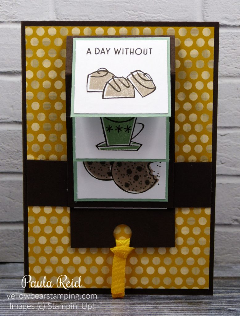
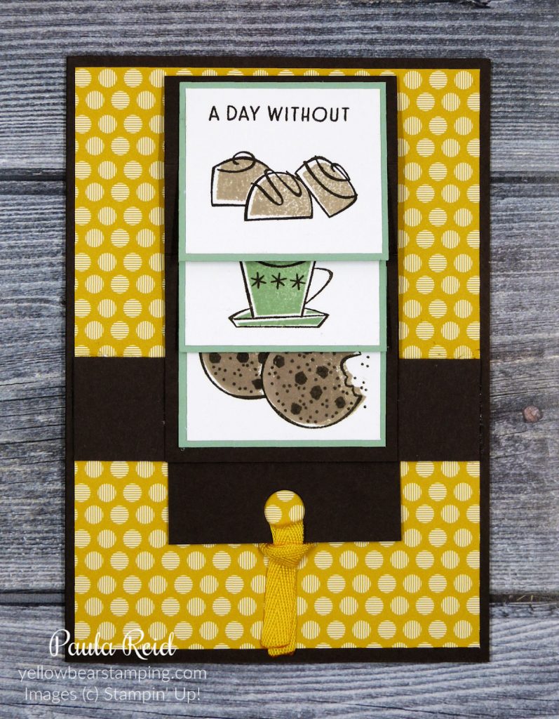
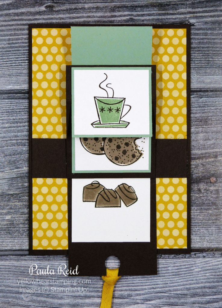
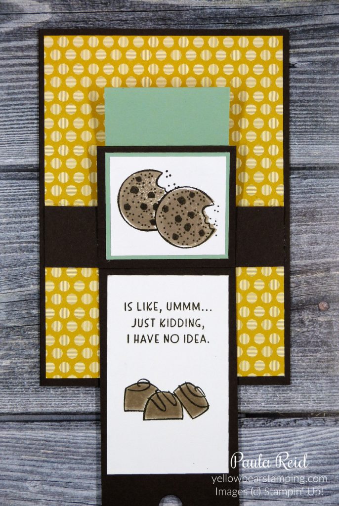
Technique Tuesday – Stamping Off

By | April 27, 2021

Hi there

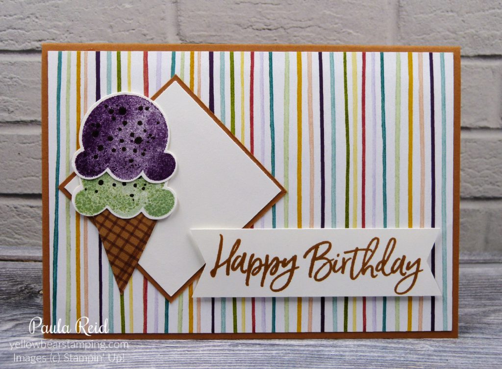
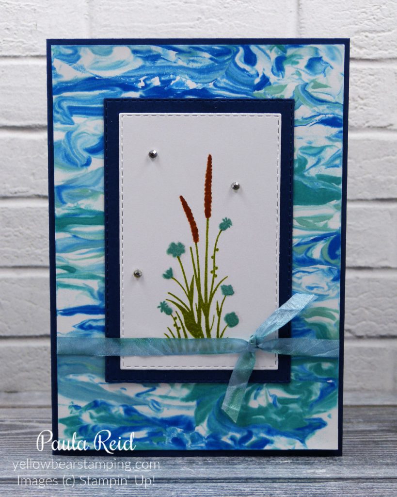
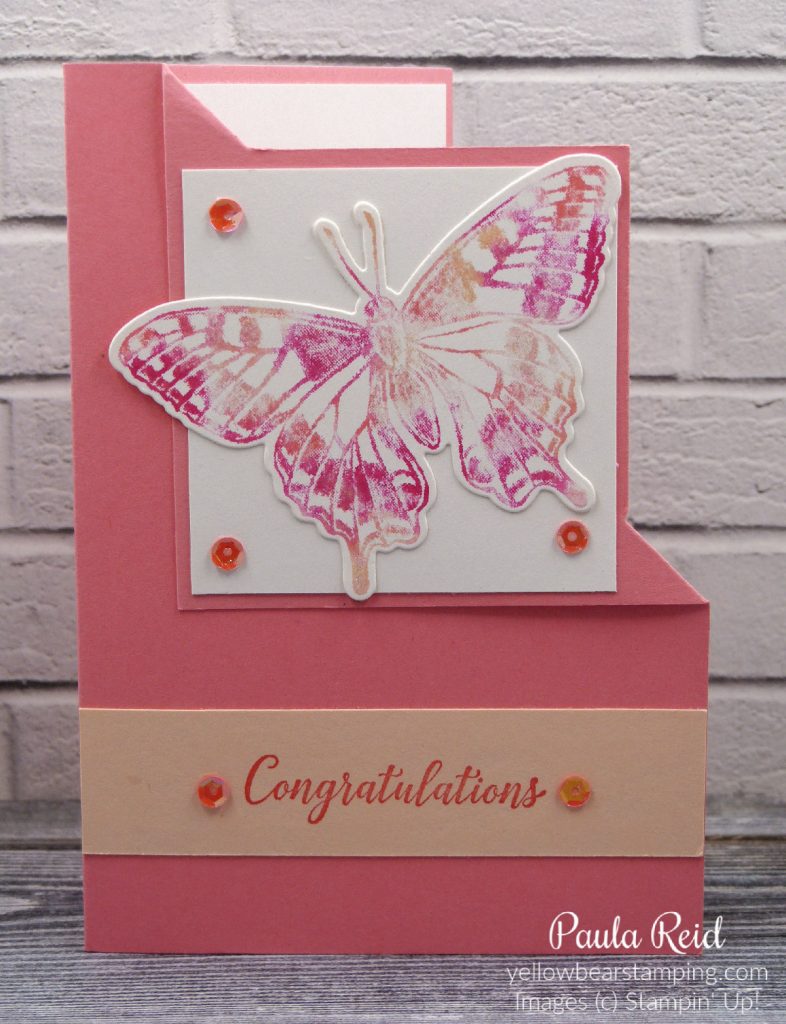
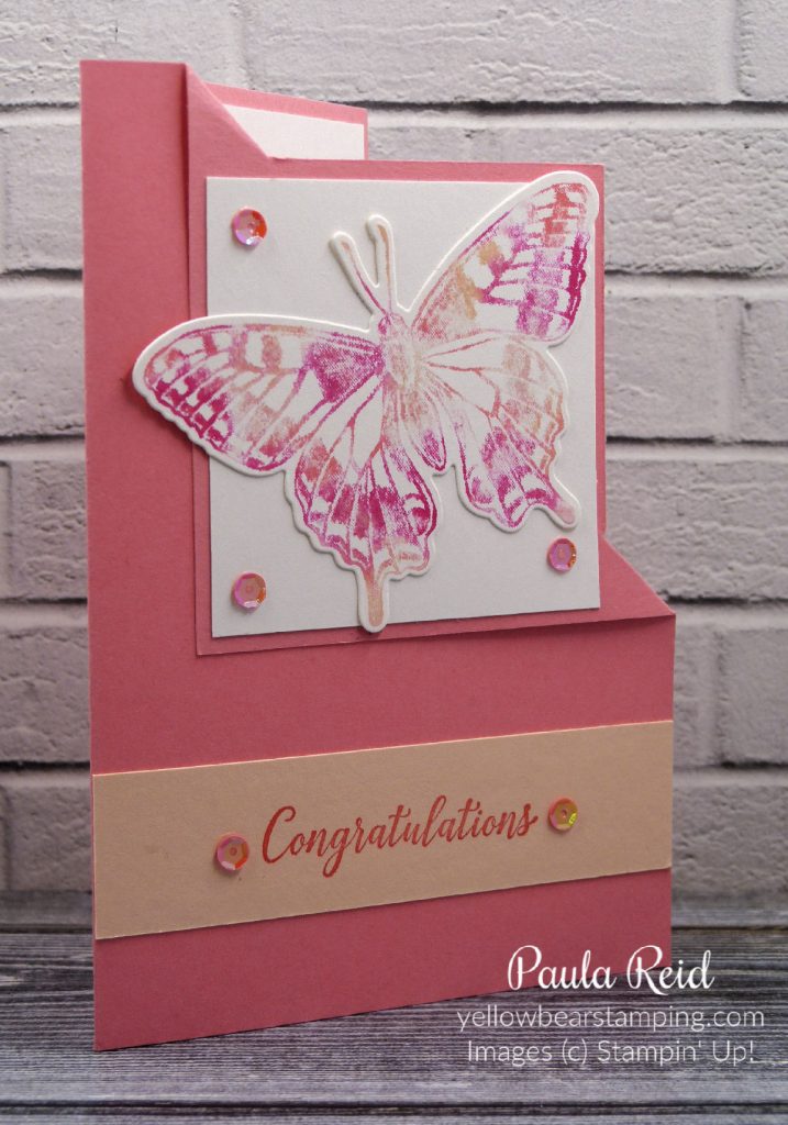
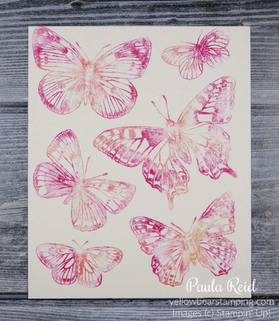
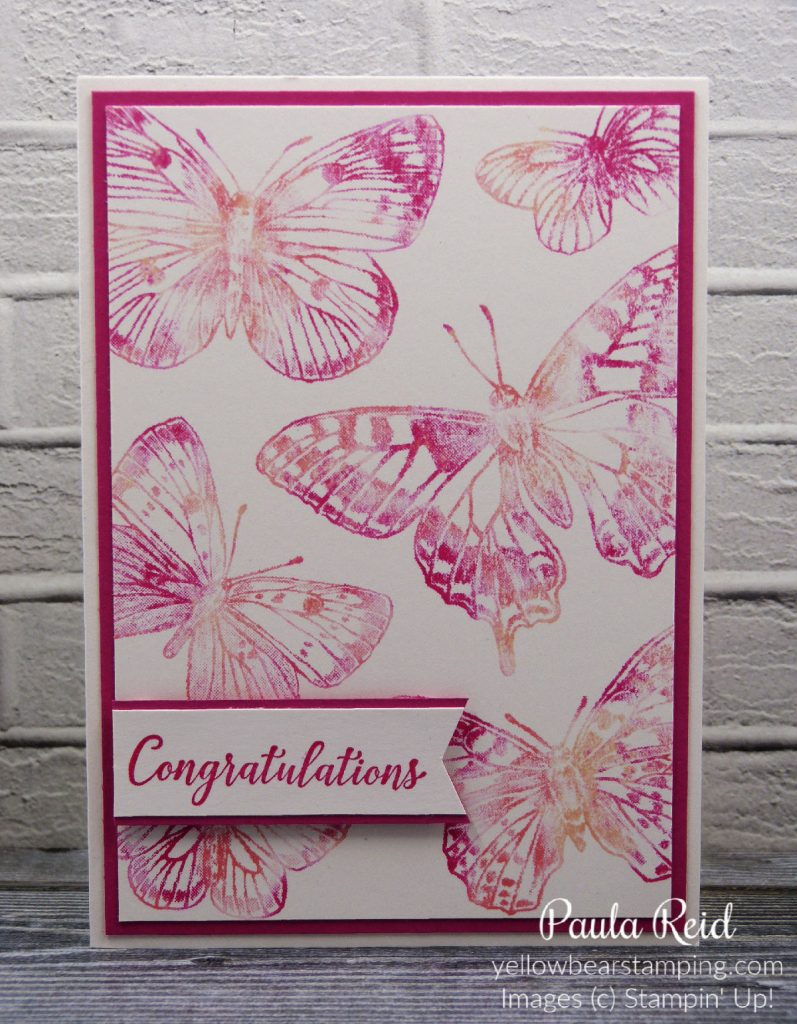
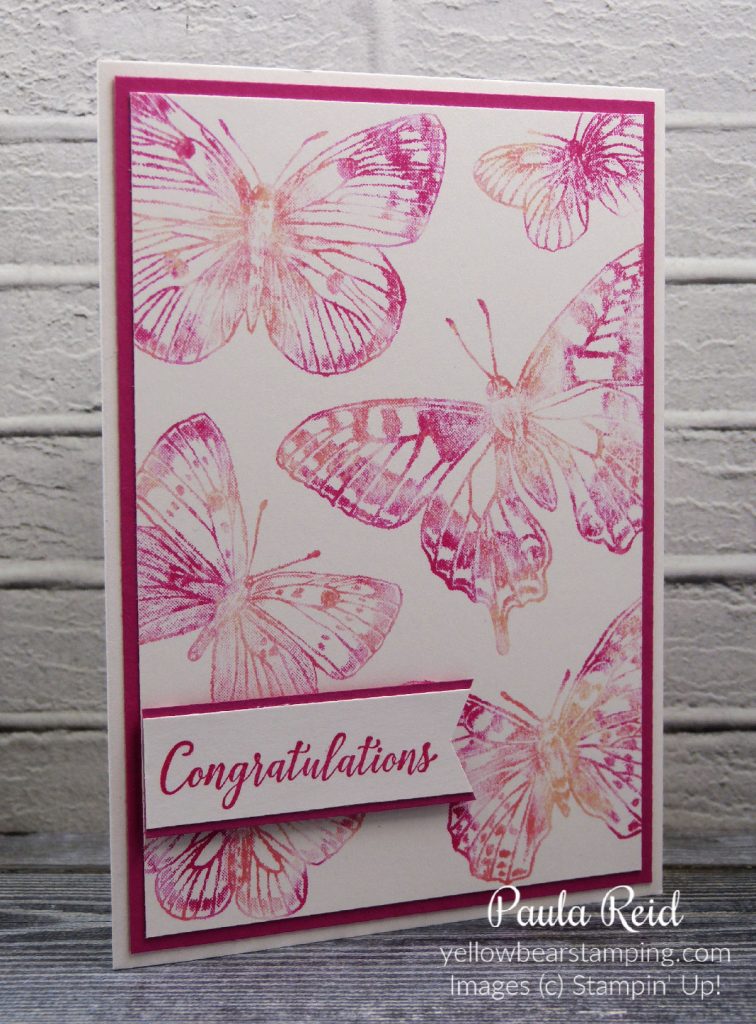
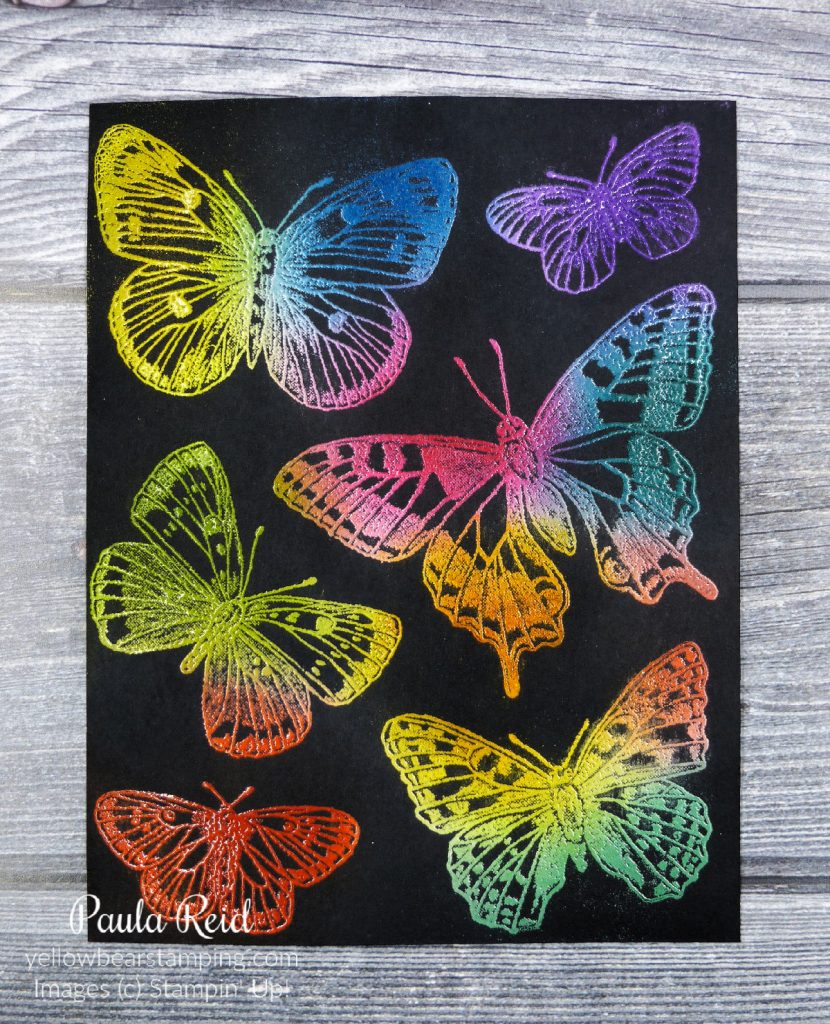
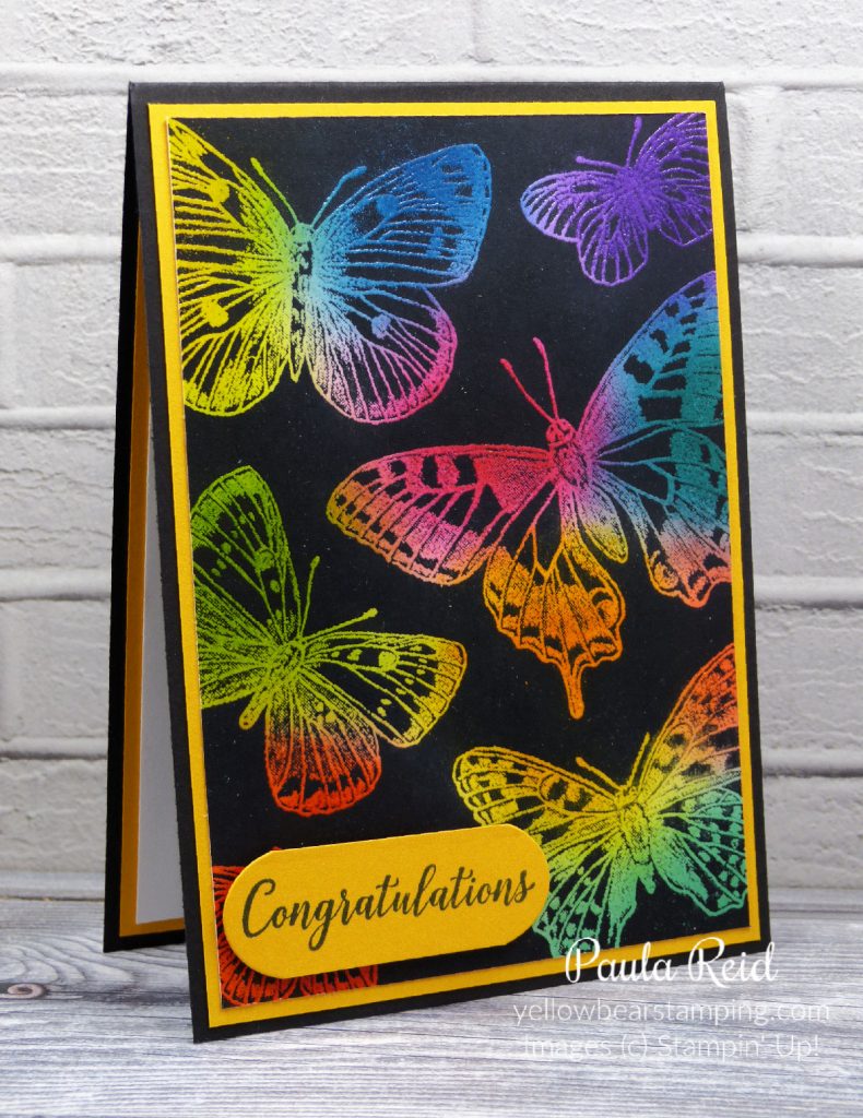
Today’s project has a few techniques in it but the main one I want to highlight is the Stamping Off technique. To get the most out of our inks – of which we have 50 colours – this is a great way to get to get multiple colours from one ink pad.

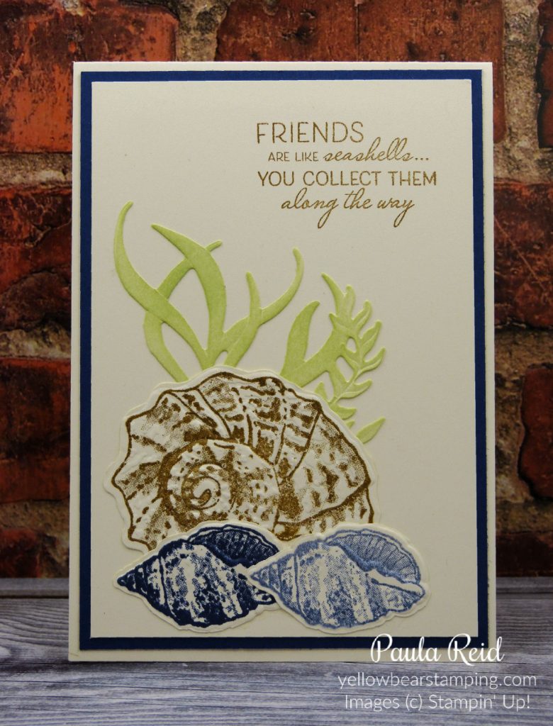
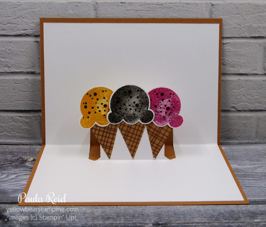
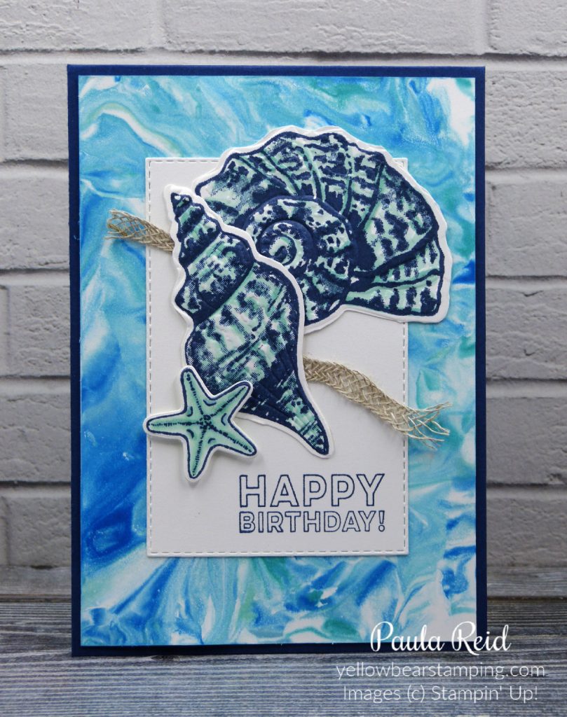
The two shells at the bottom of my card have both been stamped with the same ink – Night of Navy. Normally we ink our image, stamp it on card stock and repeat the process if we want multiple images. The Stamping Off technique allows you to create two images from just one ‘inking’ – the second image will give you a different shade of colour. Ink your image, stamp it on card stock and then stamp it again giving you a lighter toned image. This technique works really well with darker colours as there is still a good amount of ink on the stamp after the first stamping.

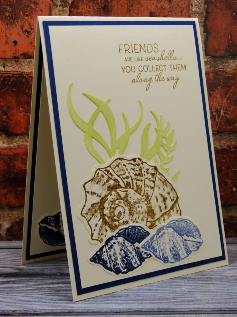
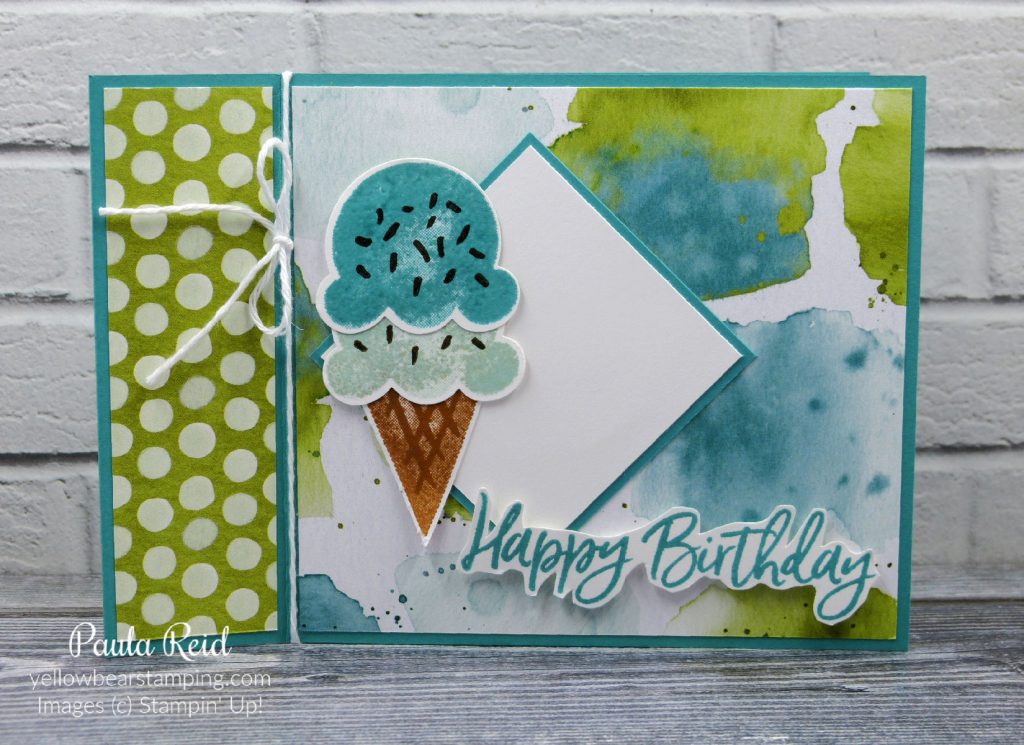
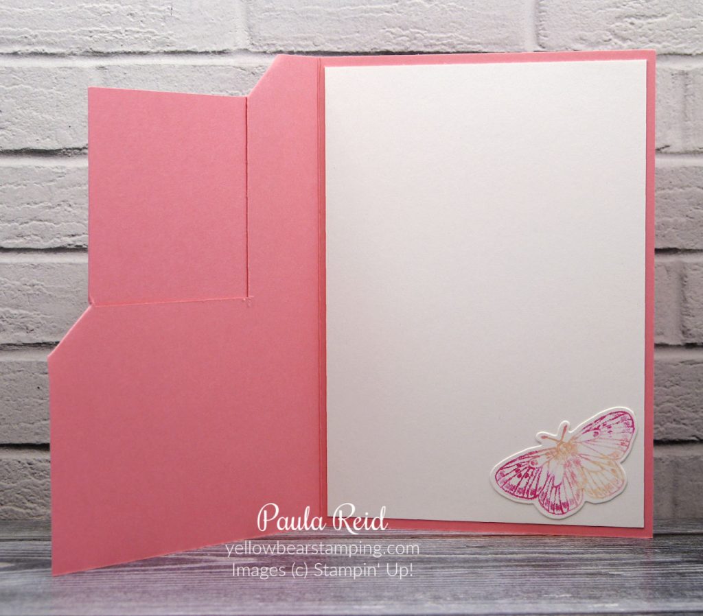
Another technique I used for this card was with the underwater ‘greenery’. If you don’t have every colour cardstock you can use your inks and a blending brush/sponge to create coloured cardstock and give it different shades. My ‘greenery’ was originally Very Vanilla cardstock to which I applied Soft Sea Foam ink with my blending brush.

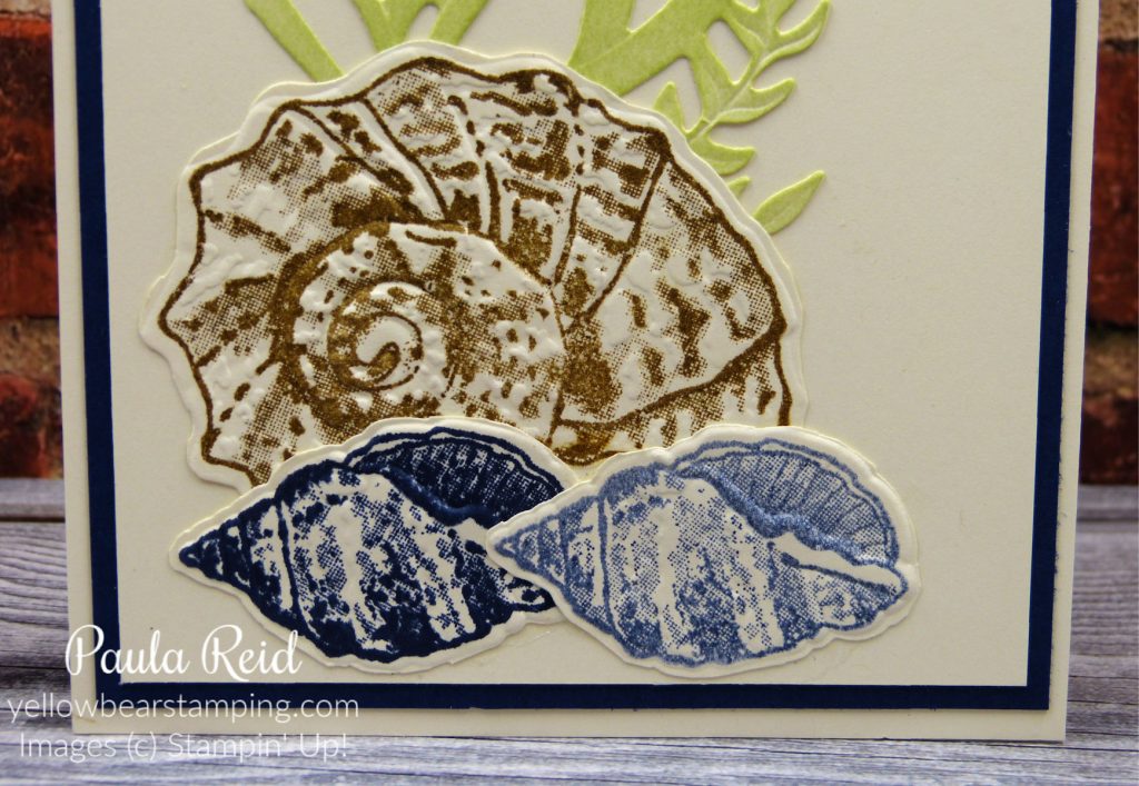
The final technique combines three products from the Sand and Sea Suite – the stamp set, dies and embossing folder. Die cut the large die from Very Vanilla or Basic White, stamp your images onto the cut out and then place the cardstock in the embossing folder to create 3D images. For my card I then ‘fussy cut’ some of the images from the large die cut to layer and create this card. The 3D embossing folder gives real depth to the card.

Don’t forget the new 2021/2022 Annual Catalogue will go live next Tuesday so if there are any retiring products you want please let me know ASAP so that I can place an order for you.

Until next time …

Fun Fold Friday – Waterfall Card

By | April 23, 2021

Hi there

Do you ever buy a stamp set thinking “I’ve got heaps of ideas for this set’ and then find it sits for ages without seeing ink? Well this is true for my ‘Nothing’s Better Than’ bundle – so I thought I’d use the stamp set for my Waterfall card and it was perfect. This bundle consists of a stamp set and coordinating dies although I haven’t used the dies for this card.

The background Designer Series Paper (DSP) is Bumble Bee from the In Color 6″ x 6″ paper stack and has the coordinating 1/4″ Twill Ribbon for the ‘pull down’ tab.

The name of this style of card is a Waterfall Card – as you pull the tab the images flip over like a waterfall to reveal the next image. The sentiment starts the story rolling – a day without milk or dark chocolate,

a cuppa – tea or coffee whichever you prefer,

or a cookie/biscuit – who has a day like that? The outlines for all images were done with Early Espresso ink, the chocolates and cookies were filled in with Crumb Cake while Mint Macaron was used for the cup.

I will try and do up a tutorial with measurements for this card. I ended up using two different tutorials – and made a few mistakes along the way – so don’t want you to go through the same issues.

This stamp set and dies are carrying over to the next Annual Catalogue – due out 4 May 2021 – so I’ll be sure to make more projects to share using this set.

Until next time …

Technique Tuesday – Colouring Vellum with Stampin Blends and Isopropyl Alcohol

By | April 20, 2021

Hi there

Lately I’ve seen some really cool backgrounds created using Vellum cardstock, Stampin Blends and Isopropyl Alcohol so I thought I’d give it a go. My first attempt didn’t make it to the card base but as the saying goes ‘ try and try again’. Here’s my second attempt and I must admit I was really pleased with this one – so much so that it made it to a card base.

I used Cinnamon Cider, Bermuda Bay and Granny Apple Green Stampin Blends. My strip of Vellum is 5.5cm x 13.8cm and matted on a piece of Basic White measuring 6cm x 14.3cm.

I will be really sad to say ‘goodbye’ to the Well Written Dies – I have used the sentiments from this set on so many cards.

I decided to have another play with this technique and changed to feminine colours – nice and bright.

I found three scraps of Vellum each measuring 3.2cm x 9.3cm. They were then adhered to a piece of Basic White measuring 9.3cm x 13.8cm and then this was mounted to a Basic Black mat of 9.8cm x 14.3cm. The card base is Magenta Madness.

Again I used the Well Written dies for the sentiment – they really stand out against the vibrant Magenta Madness.

To create this effect colour your Vellum Cardstock with your Stampin’ Blends. Here I used Magenta Madness and Pumpkin Pie – both the dark shades.

I found out – by trial and error – it’s best to use colours that compliment each other and also not to do the ‘patches’ too big. The Blends don’t take long to dry. I did the Pumpkin Pie first then coloured in the gaps with the Magenta Madness.

Using an old Aqua Painter and some Isopropyl Alcohol (needs to be a high percentage – mine was 100%) ‘dab’ the Aqua Painter to the Vellum so that the colours ‘bleed’. For this design I wanted the colours to fully blend together. For my first sample I still wanted to see the individual colours but get the edges to blend. I have also seen it where you can do one colour ‘patch’, apply the alcohol around the outside then using a straw or hand pump, blow air so that the alcohol makes the ink run giving a different look. Then you repeat with your next colour.

I’ve started using Vellum on more of my projects – it’s a great addition to your card.

Well that’s all for now.

Until next time …

Friday Fun Fold – Pop Up Card

By | April 16, 2021

Hi there

I made this card for a friends 10 year old son. I don’t have any stamps suitable for this age so went with a fold with some fun. Normally I make a 3D box to go with the card and fill it with chocolates. This time as I’ve used the Ice Cream Corner Suite I added some money so he can buy a tub of ice cream, some cones and toppings and the whole family can make their own ice creams 🙂 An activity for the school holidays.

The card front looks like a standard card – the Designer Series Paper (DSP) is from the Ice Cream Corner DSP pack and has been decorated with a ‘double scoop’ ice cream of Blackberry Bliss and Mint Macaron with Early Espresso ‘chocolate chips’. The sentiment – from the Sweet Ice Cream set – has been stamped in Cinnamon Cider and then banner cut using the Banners Pick A Punch. I used the same mat idea for behind the ice cream as I did in last weeks card.

When you open up the card, up pop three single scoop ice creams – Mango Melody, Early Espresso and Melon Mambo. The cones have been punched – using the Ice Cream Cone Builder Punch – from one of the DSP sheets that give the ‘waffle’ cone look.

Here’s a side view of how the ‘pop up’ insert looks. Keep scrolling down and you’ll find out how to create this insert.

Cut your insert – I used Basic White – to 14.3cm x 20cm and score at 10cm. Using the Classic Label Punch slide the punch in from the short side of the card as far as it will go, line up the centre of the punch with the card fold and punch. Repeat from the other side of the card base so that you end up with the above. While the card is still closed score a line between the two slots at the end.

Hopefully there will be two additional score lines to your centre fold score line as in the photo above. Fold the centre tab forward in a Valley / Mountain / Valley formation so that it looks like the below photo.

Adhere this onto the inside of your card base and decorate. This style of card could be used for all sorts of occasions and stamp sets/dies. Which stamp do you own that would suit this card design?

Well that’s all for today – don’t forget the current Annual Catalogue finishes on Monday 3rd May and the January to June Mini Catalogue finishes on Wednesday 30 June. I will have the new 2021/2022 Annual Catalogue to send out shortly so let me know if you would like a copy.

Until next time …

Bouquet of Hope – Paper Pumpkin

By | April 14, 2021

The Bouquet of Hope Paper Pumpkin Kit provides a way to offer comfort, care, and condolences to those enduring life’s challenges. With beautiful blooms and supportive sentiments, this kind-hearted kit will allow you to soothe others’ sorrow and share your sympathy in a heartfelt, handmade way! While you can create nine comforting cards—three each of three designs, plus coordinating envelopes—with the kit’s components, the versatile stamp set included in the kit can be used to uplift loved ones during trying times, any time. And, if you snagged a stack of Flower & Field Designer Series Paper during Sale-A-Bration, you can combine it with the kit’s extra elements and enjoy even more coordinated cardmaking!

BOUQUET OF HOPE

Details

  • Kit contains enough supplies to create 9 cards—3 each of 3 designs—and coordinating envelopes.
  • Card size: 4-1/4″ x 5-1/2″ (10.8 x 14 cm)
  • Envelope size: 4-1/2″ x 5-3/4″ (11.4 x 14.6 cm)
  • Coordinating colours: Basic Black, Bumblebee, Just Jade, Merry Merlot, Mossy Meadow, Rococo Rose
  • Coordinates with the Flower & Field Designer Series Paper, a Sale-A- Bration item.
ITEM NAMEITEM NUMBERPRICE
BOUQUET OF HOPE158422$37.00 AUD | $44.00 NZD

KIT CONTENTS:

  • The Bouquet of Hope Stamp Set: an exclusive stamp set not available anywhere else!
  • A Stampin’ Spot
  • Enough materials to create nine cards, including patterned card bases, decorative die-cut pieces, embellishments, and more!
  • Nine coordinating envelopes
  • Adhesive

Contact me now if you would like to order this kit or you can purchase it from my online store.

Technique Tuesday – Bokeh Technique

By | April 13, 2021

Hi there

Here’s a bit of background about what Bokeh means. In photographybokeh (/ˈboʊkə/ BOH-kə or /ˈboʊkeɪ/ BOH-kay;[1] Japanese: [boke]) is the aesthetic quality of the blur produced in out-of-focus parts of an image.[2][3][4] Bokeh has also been defined as “the way the lens renders out-of-focus points of light”. Now onto the project 🙂

Here’s the finished card. For my background I’ve used Balmy Blue, Coastal Cabana and Pool Party ink. This has been applied using the new Blending Brushes – so much easier to apply than with a Sponge. Check out the steps below on how to create this card.

Apply your ink so that the whole card front is covered. I have blending the ink more in some places than others to give a sense of depth.

Create a ‘template’ by die cutting (or punching) various sized circles from a scrap of cardstock. You could also use some Vellum Cardstock. I used the two smallest circles from the Layering Circles Dies.

Place your circle template on top of your card front then using a Sponge Dauber and White Craft Ink fill in the circles. Move the template around and repeat. Sometimes you can overlap the template on an already inked circle. If some circles aren’t dark enough place the template back over them and reink. I did this a couple of times – it helps to add more depth to your project.

Finish your card by adding a sentiment and some ‘bling’. I used Itty Bitty Birthdays and Tasteful Labels Dies to complete mine.

I trimmed my card front down to 9.3cm x 13.6cm and matted it on Basic White (9.5cm x 13.8cm) before adhering to a Basic Black card base. My trimmed off piece did not go to waste – I adhered it to the inside of the card 🙂

Well that’s all for now. Until next time …

Friday Fun Fold – Book Card

By | April 9, 2021

Hi there

I’ve recently seen a few cards made using this fold but haven’t seen them been given a ‘name’ so I’m calling it a Book Card. It uses a standard card base – 10.5cm x 29.7cm and with one extra score line you get this fun card.

On the 3rd May the current 2020/2021 Annual Catalogue will finish which means the 2019/2021 In Colors will retire. I will be sad to see them go but you never know they may return to the colour palette in the future. One colour I haven’t used much off until late has been Terracotta Tile. I found I still had a whole packet of cardstock so have been basing a number of cards around this colour. For today’s card I teamed it with the Ice Cream Corner Suite as the colour is used in the Designer Series Paper (DSP).

The ice creams for this card are stamped in Terracotta Tile and Bumble Bee. The cone is Cinnamon Cider. The coordinating Ice Cream Cone Builder Punch made short work on cutting out my stamped images. For the sentiment I decided to ‘fussy cut’ it out rather than use a label die. It is adhered with dimensionals.

Even though summer is coming to an end here in the Southern Hemisphere you can always treat yourself to an ice cream. I had fun making this card so while I had everything out I made another card but changed the colours to Bermuda Bay.

There is one more paper design in the pack featuring Blackberry Bliss – so a great selection for your favourite flavour.

The ice creams are stamped in Bermuda Bay and Pool Party with Early Espresso ‘sprinkles’. The square behind the ice cream is a 2 1/4″ mat with a 2 1/8″ piece of Basic White.

Here’s a quick step by step on how to make this card.

Cut your card base (10.5cm x 29.7cm) then score at 11.5cm and 14.8cm

Apply adhesive – I used liquid glue – between the 11.5cm and 14.8cm score lines.

Adhere to the base of the card. Now you are ready to decorate. I cut two pieces of DSP – the first 3cm x 10cm and the second 11cm x 10cm (using a different design) to decorate the front.

This is another quick and easy card and a great way to use some DSP. The front of the card lends itself to all sorts of decoration and would be a good design for masculine of feminine cards.

Until next time …

Technique Tuesday – Shaving Foam Technique

By | April 6, 2021

Hi there

Our Stampin’ Up! ink refills are great not only to reink your ink pads but to use for a number of techniques. Last Tuesday I shared the Baby Wipe technique and today I have another technique that uses the ink refills. You’ll also need some shaving foam – I use the ‘in house’ brand from the local supermarket. This technique creates a great background design or you could cut it up or die cut images from it. I’ve used mine as a background for my projects.

This was the first one I created. My stamped image is from Friend Like You. The image is stamped in Old Olive, Coastal Cabana and Cajun Craze. The ribbon is the 1/4″ Crinkled Seam Binding and I have coloured it in with Bermuda Bay and Balmy Blue Stampin’ Blends.

My second card uses a favourite stamp set – A Good Man – and has been coloured in using our Stampin’ Blends. I used Soft Suede for the shorts, Mango Melody for the T-shirt, Night of Navy (light) for the hat and (dark) for the chair, Crumb Cake for the sand and Ivory for the skin. The ribbon is the 3/8″ Denim Ribbon.

My third card uses images from Friends are like Seashells. The background goes really well with these images. The images have been stamped in Night of Navy then highlighted with Bermuda Bay and Pool Party Stampin’ Blends. The Braided Linen Trim has been slightly ‘teased’ apart to give a net effect. The sentiment is from Many Mates.

Here’s a quick step by step on how to achieve the shaving foam background.

Squirt shaving foam onto a paper tray – I used some brown paper. Smooth it out with the edge of a ruler making sure it is big enough for your card front to be placed on top.

Apply drops of ink from your reinker bottles. I used Bermuda Bay, Coastal Cabana, Pacific Point and Balmy Blue.

Using a toothpick or bamboo skewer mix the shaving foam and reinker in a swirling motion. I’ve gone from one side to the other and repeated until I was happy with my design. Don’t blend the colours too much.

Place your cardstock on top of the shaving foam giving it a gentle press so that it sinks into the shaving foam. Make sure that the cardstock has come in contact with the shaving foam. Remove the cardstock from the shaving foam and wipe any excess foam from the cardstock with a ruler. Set aside to dry.

I put the excess shaving foam back on my original ‘pad’, smooth it out and place another piece of cardstock and repeat the process. You can get a number of card fronts from the one lot of shaving foam.

Here are the three different designs I got. Each time you place cardstock down you get a different pattern – heaps of fun. You can use any colour combination you want for this technique – no end to possibilities.

I hope you give this technique a go. Until next time …

Fun Fold Friday – Corner Flip Card

By | April 2, 2021

Hi there

I hope you’ve enjoyed seeing the different ways you can use the Baby Wipe Technique for your projects. Today I have the final card using the last two butterflies from my earlier card. This is another card that uses a standard card base to create a fun fold.

I first saw this card design on a US demo’s page back in 2015. I’ve made this a couple of times since but it’s good to revisit previous folds.

To create the fold you need to make two cuts in the card front as per the diagram below. Place your card base in your trimmer so that the fold is at 3cm. Do a vertical cut from 1.5cm down to 7.5cm. Turn the card 90 degrees to the left. Line the left edge of your card at 7.5cm then cut from 1.5cm to 7.5cm. Fold the top right corner towards the bottom left corner to create the fold. Make sure you burnish your crease lines with your bone folder. Secure the flap to the base of the card with either liquid glue or glue dots.

The square mat that the butterfly is adhered to measures 7cm x 7cm. The sentiment from Happy Thoughts is stamped in Flirty Flamingo on a strip of Petal Pink cardstock measuring 2.5cm x 10.5cm. To finish off the card I added some sequins from the Woven Threads Sequin Assortment. I will be sad to see these colours go. It’s a bit hard to see in the photo but I applied some Wink of Stella to my butterfly for a bit of sparkle.

Hopefully seeing the inside of the card will help you understand how the fold works. The final small butterfly has been added to the inside.

Well that’s it for Baby Wipe Technique – I hope these four projects have inspired you to give this technique a try.

Until next time …

Baby Wipe Technique – Multi Coloured Butterfly Brilliance

By | April 1, 2021

Hi there

I had so much fun with the Baby Wipe technique that I did up another multi coloured combination with the Butterfly Brilliance bundle.

I used 9 different colours – Bermuda Bay, Blushing Bride, Just Jade, Magenta Madness, Mango Melody, Mint Macaron, Misty Moonlight, Poppy Parade and So Saffron.

After stamping the image on Shimmery White cardstock I die cut the whole image to get 6 individual butterflies. I adhered them to a standard card front of Shimmery White. After adhering them I decided my card front needed to have a mat so I trimmed the butterflies down to 9.5cm x 13.8cm and adhered this to a Bermuda Bay mat of 10cm x 14.4cm.

I love the colour variation that this technique gives – a real rainbow of colours. The sentiment is from the Happy Thoughts stamp set and has been punched with the Banners Pick A Punch similar to my Technique Tuesday card.

I kept one of the smaller butterflies for the inside of my card. I kept with the theme of the partial butterfly.

I have one more card to share using this technique so check back tomorrow for my Fun Fold Friday card.

Until then …

Colour INKspiration – CI96

By | March 31, 2021

Hi there

As mentioned in yesterday’s post I used the colour combo from the Colour INKspiration challenge site for my Baby Wipe technique card. The colours were Melon Mambo, Flirty Flamingo, Blushing Bride, Petal Pink and Granny Apple Green (not used in yesterday’s post). When I stamped my image for yesterday’s card I did another one and have used some of the images (once die cut) for the colour challenge. Check back on Friday to see how I used the remainder of the images :).

The Butterfly Brilliance stamp set is a large image stamp set that when you die cut it with the coordinating Brilliant Wings die gives you six different sized butterflies. I’ve used 4 of the 6 butterflies on this card – 3 on the front and 1 inside. The card base is Flirty Flamingo with a mat of Shimmery White that has been stamped using the Birch stamp – another large stamp set – in Granny Apple Green.

The Brilliant Wings dies consist of 12 dies – one outline die that cuts all 6 butterflies in one go, 6 detailed butterfly dies to compliment the outline dies (or can be used on their own) plus 5 accent dies. For this card I die cut the detailed dies from Vellum Cardstock and then overlaid to the stamped images. This has given the effect of the butterflies in motion. The sentiment (from Itty Bitty Birthdays) is stamped in Flirty Flamingo and die cut using the Tasteful Labels dies. Instead of using some ‘bling’ I’ve used the gold Metallic Pearls.

Here you can see the intricate cutting of the overlay die and the butterfly which has been adhered to the inside of the card.

If you have some time over this long weekend why not have a go at creating a card using these colours from the Colour INKspiration challenge on Facebook.

Until next time …

Technique Tuesday – Baby Wipe Technique

By | March 30, 2021

Hi there

Since starting my Technique Tuesday and Friday Fun Fold posts the weeks seem to go by faster :). Today I’m sharing the Baby Wipe Technique. This is a fun technique you can do with any stamp set or card design. All you need are some reinkers, a couple of baby wipes and your stamp. The colours I’ve used for this project are also for a colour challenge and I’ll share that card tomorrow night. The colours are Melon Mambo, Flirty Flamingo, Blushing Bride and Petal Pink.

Here’s the card

Doesn’t that look cool? Keep reading and I’ll share the steps on how I got to this.

It looks a bit messy but it’s fun :). Layer a couple of baby wipes on top of each other. (I found some plastic wrap from a pack of cardstock and put that underneath to save my desk). Add drops of your reinkers randomly to the baby wipes so that you have an area big enough for your stamp – this is going to be your ink pad. As I was using a large stamp I had to cover a fair size. Once you have your ‘ink pad’ ready stamp your chosen stamp onto the baby wipe and then stamp onto your cardstock.

Here’s my stamped image – you get a beautiful variegation of colour – no two images will look the same. While I had my ‘ink pad’ ready I stamped it again – I’ll share those creations with you later in the week.

I trimmed my stamped image down to 9.5cm x 13.8cm and matted it on a piece of Melon Mambo measuring 10cm x 14.3cm. This was then adhered to a standard card base. I’ve used Shimmery White for my stamped image and the card base.

The sentiment is from Happy Thoughts and is stamped in Melon Mambo. To create the banner I used the Banners Pick A Punch. The width of the Shimmery White banner is 1.9cm. I then cut another banner the same width from Melon Mambo and cut it in half lengthwise before adhering top and bottom to the stamped banner. This was then adhered to the card with Mini Dimensionals.

Check back tomorrow for another card using this technique for a colour challenge.

Until then …

Friday Fun Fold – Centre Step Card

By | March 26, 2021

Hi there

When I make a fun fold card I like to be able to start with a standard card base so that you can get two of the design from one sheet of A4 cardstock. The Centre Step card fits into this category. Centre step cards require two cuts and four score lines to create.

I’ve kept the stamping to a minimum on this card, and let the fold and Designer Series Paper (DSP) do the talking. The Snail It Suite is perfect for this fold. I’ve been able to combine three different designs on the one card.

I stamped the image with Memento Black on a piece of Basic White then die cut it using the Postage die from the Snail Dies. I then stamped it again on a scrap piece of cardstock and coloured it in using the Stampin’ Blends. The coordinating die cuts only the image which was then adhered with dimensionals on top of the original image.

Using the diagram above as a guide place your cardstock in the trimmer with the short end at the top and lined up at 3cm. Cut a vertical slit from 3cm down to 13.5cm (red line). Rotate the cardstock around and repeat for the other side. With the long edge at the top (and cutting blade well out of the way) score three lines from the edge to the slits at 3cm, 6 cm and 13.5cm (blue line). Repeat on the other side. The final score line to do is the black line. With the long edge still at the top score at 10.5cm between the two slits. Now to fold the card on the score lines. Starting with a ‘Mountain’ fold at the 3cm, ‘Valley’ at 6cm and ‘Mountain’ at the 13.5cm. The 10.5cm is also a ‘Mountain’ fold and creates the centre of the card. Make sure you use your bone folder on all score lines to give your card crisp folds. (Thanks to Di Barnes for the diagram).

From this view you can can see how the fold works. My DSP measurements are: for the 2 sides 2.5cm x 7cm, the bottom panel 2.5cm x 14.3 and the centre panel 7.8cm x 9.5cm and the mat is 8.3cm x 10cm.

This was a fun card to make.

Until next time …

Technique Tuesday – Josephs Coat

By | March 23, 2021

Hi there

I hope you’re enjoying the Technique Tuesday blog posts and are giving some of these techniques a go yourself. I must admit I hadn’t done some of these for ages so it’s good to revisit them. Today’s post uses a technique called ‘Josephs Coat’ – it uses lots of colours randomly sponged on a piece of white cardstock.

I wasn’t sure how this would turn out as it’s ages since I’ve done a card with this technique but I love the final result – the colours really ‘pop’ off the page. There’s really only three steps to this:

First colour your entire cardstock using a sponge to apply the ink – I used a piece of Basic White measuring 10cm x 14.4cm. The ‘Brights‘ family of colours is my favourite so I used all 10 colours to colour my cardstock. You don’t have to use this many but I thought ‘why not’ :).

Next wipe across the whole of the cardstock with an Embossing Buddy and then stamp your chosen image with VersaMark ink. Pour clear embossing powder over the top, remove any excess powder and heat with your heat tool. I hope you can see my stamped image – it’s the new Butterfly Brillance stamp.

Now you can see it. Using a dark ink (black or navy) and a sponge brayer cover the entire cardstock. For this card I used Memento Black and actually dragged the ink pad across the cardstock rather than using a brayer. Both methods work well. Wipe off any excess ink from your embossed images. You are now ready to assemble your card.

I decided that I wanted to mat my card front so tried a couple of options – Pacific Point, Bermuda Bay – but settled on Mango Melody as I felt it enhanced the colours of the butterflies. As I wanted to mat this I trimmed my stamped cardstock down to 9.5cm x 13.8cm – this allowed me to get rid of the excess black around the edges.

My butterfly at the bottom left was the only one that ended up being a solid colour so I covered most of it with my sentiment :). The sentiment is from the Happy Thoughts stamp set and has been die cut from with a die from Perfect Parcels. I trimmed the cutout top and bottom to create my own shape.

I hope you’ve enjoyed this technique and give it a go for one of your own projects.

Until next time …