


Hi there
Well I haven’t been good at starting my new habit for 2024 of blogging more often – oops. I must admit by the end of the day I haven’t really wanted more screen time so have been enjoying reading over the summer.
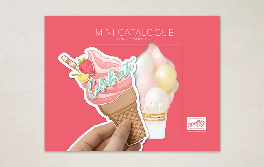
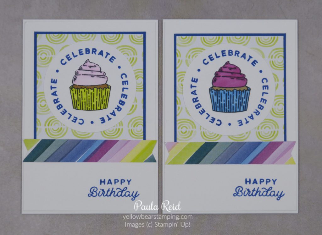
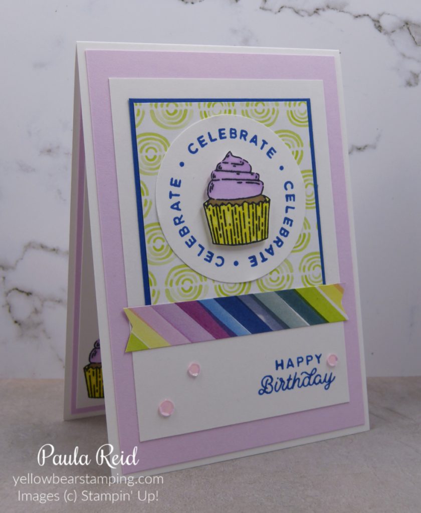
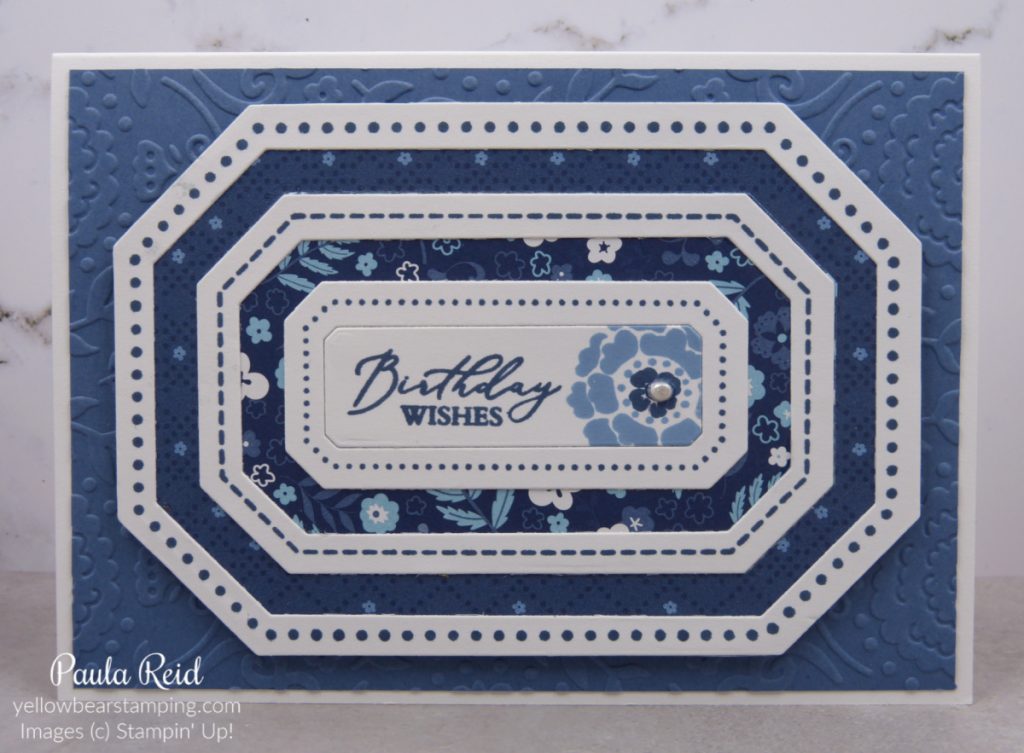
Have you seen the Bee Mine Suite in the current mini catalogue? The bees are so cute and the sentiments are perfect for not only Valentine’s Day cards but wedding anniversary cards. Phil and I celebrated our 22nd wedding anniversary last month so this was the set I used for his card. My parents have their 65th wedding anniversary on Valentine’s Day so I’ve created a card for Dad to give Mum using this same set.
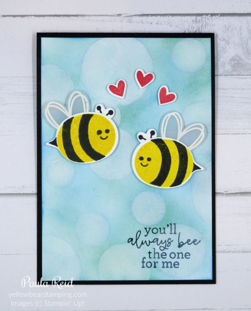
This is the card I made for Phil which features the Bokeh technique for the background. It’s been ages since I used this technique. I’ve used a mix of Balmy Blue, Pool Party, Coastal Cabana and Azure Afternoon ink applied with Blending Brushes before adding White Craft ink with a dauber to create the ‘blur’ of the technique. Check out my Facebook Live from Monday 22 January to see how I did this technique. The bees wings have been heat embossed in white on Vellum before being punched out with the Bee Builder Punch.
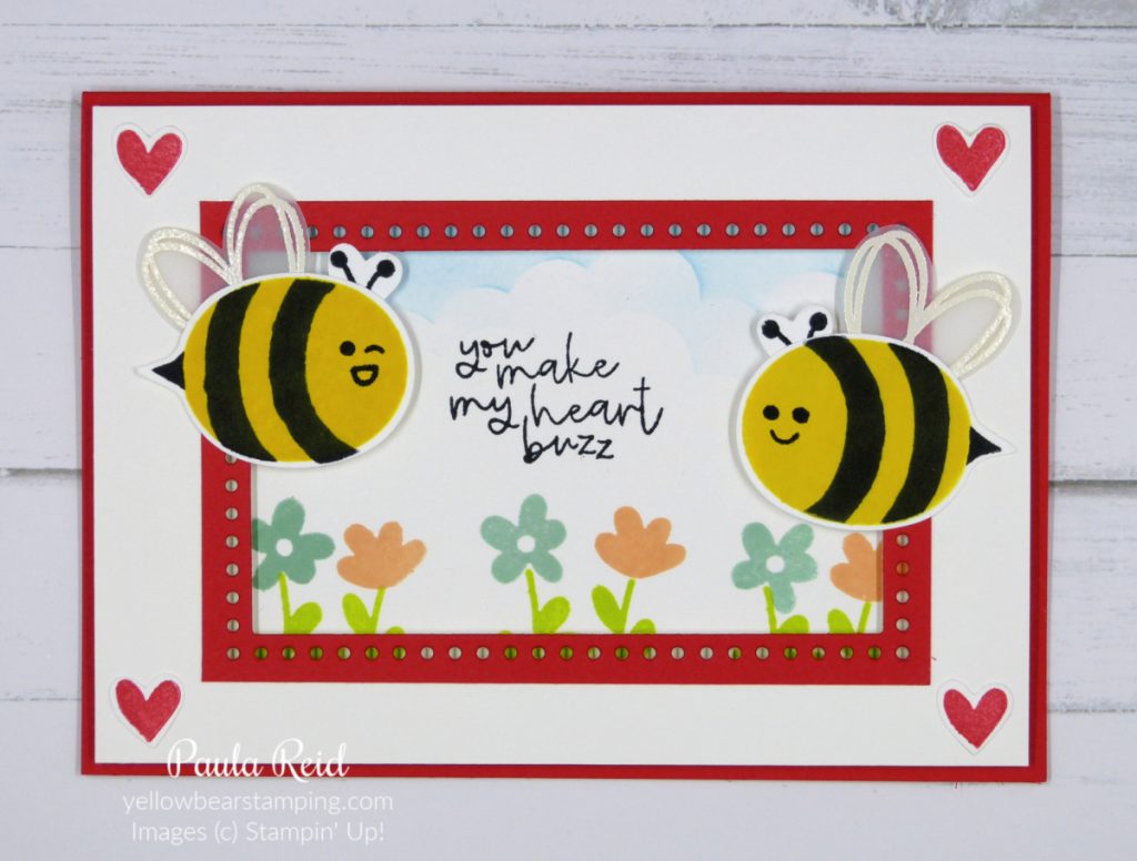
This is the card Dad chose to give to Mum – love the sentiment. I’ve used the new Everyday Details dies to create a frame for my scene in the background. The scene is stamped on a separate piece of Basic White and adhered directly to the card base. The Basic White card front has then had largest die die cut from the centre to create the window. To create the frame I cut a piece of Poppy Parade measuring 2 7/8″ x 4 3/8″ then die cut the largest die from the centre and adhered it on top of the Basic White card front. This is then adhered with dimensionals to the card base.
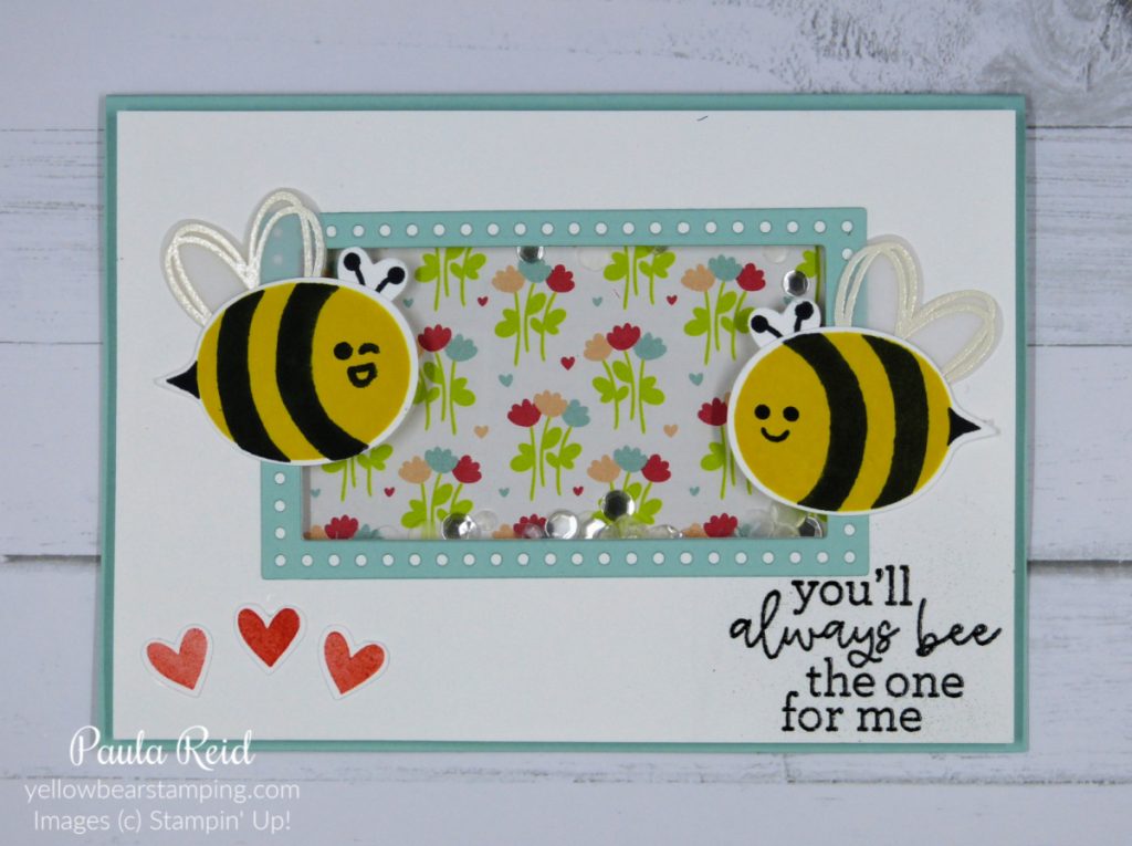
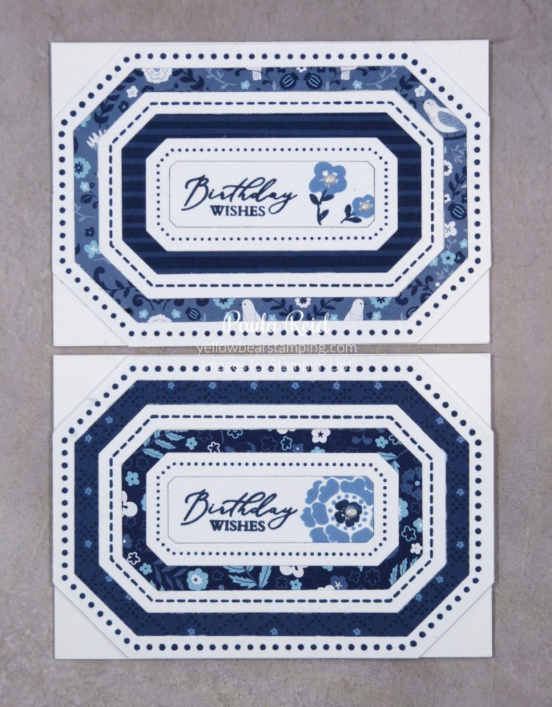
This is a similar card design although this time I’ve made it a shaker card. I’ve used Adhesive Strips and Window Sheet to keep my Loose Silver Sequins intact. The background Designer Series Paper (DSP) is from the Bee Mine Suite. If you’d like to see how I made this shaker card check out my Facebook Live for Monday 15 January.
I hope you enjoyed seeing these cards and give these techniques a go yourself. I do a regular Monday Facebook Live at 7pm NZT and would love you to join me over on my business page – Yellowbear Stamping.
Until next time …