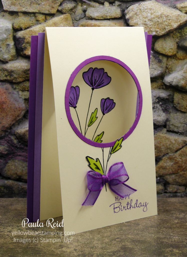
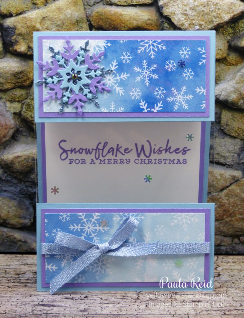
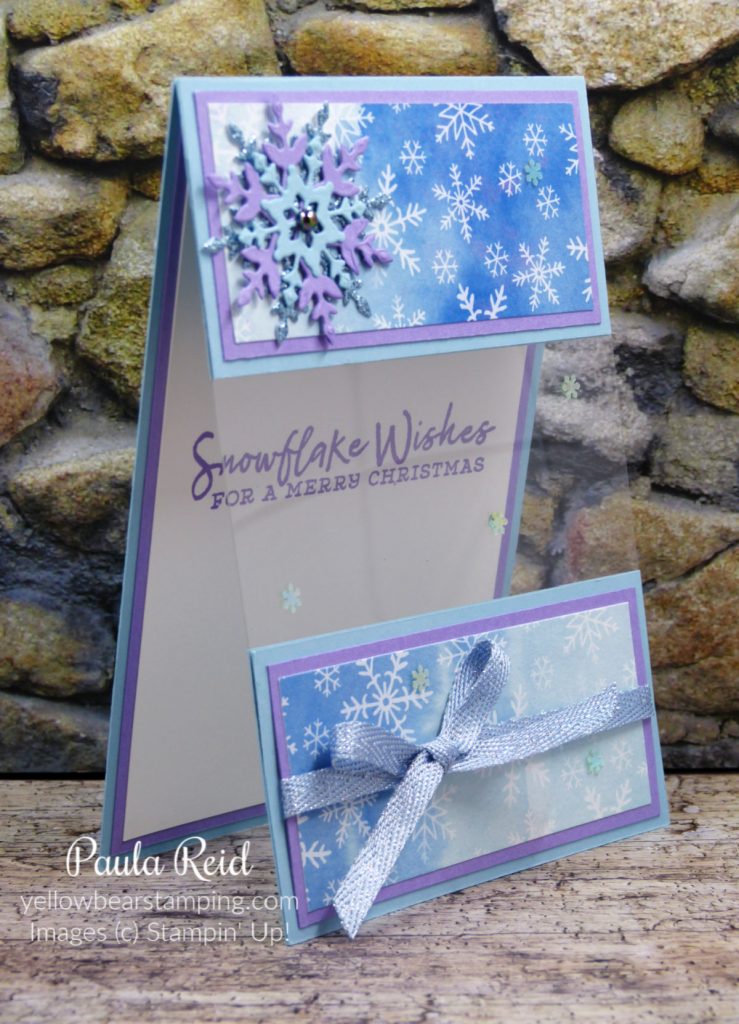
There are a number of variations for ‘Window Cards’ and this one uses a piece of Window Sheet so you can see through to the greeting on the inside of the card.
The card base measures 19.5cm x 10.5cm and is scored at 5cm – the 5cm section becomes the top front portion of your card. You will need three additional pieces that measure 5cm x 10.5cm to complete the card base. In addition you’ll need a piece of Window Sheet measuring 6.5cm x 10.5cm, two mats measuring 4.5cm x 10cm, two pieces of Designer Series Paper measuring 4cm x 9.5cm.
The Window Sheet is sandwiched between the upper and lower pieces of cardstock. Cardstock has been added on top of the Window Sheet to strengthen it and so that you don’t see the joins of the Window Sheet to the cardstock. TIP: if you want to stamp an image or sentiment onto your Window Sheet make sure you use StazOn ink.
I have one more Fun Fold card to share with you next week – that will make 52 different types of folds you now know how to make.
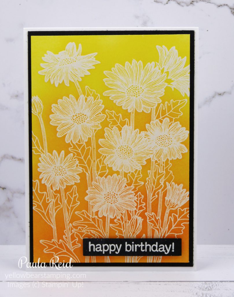
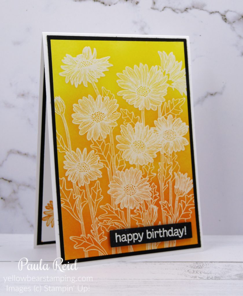
Heat embossing is one of my favourite techniques – combine it with a bit of ink blending and you have a cool variation – Emboss Resist.
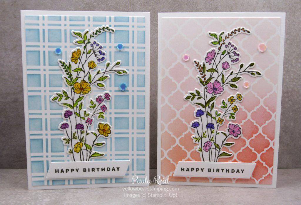
To create this card I stamped the Daisy Garden image with VersaMark, applied white embossing powder and heated it. As this is a large image I used my Stamparatus – it makes stamping so much easier than trying to hold the large block. My chosen background colours are Daffodil Delight, Mango Melody and Pumpkin Pie. Using my Blending Brush I covered the whole of the Basic White cardstock with Daffodil Delight then starting about a third of the way down I applied Mango Melody and then for the bottom third I used Pumpkin Pie. Where one colour meets the next make sure you blend the colours together so you don’t get a hard line.
I’ve kept with the heat embossing theme for the sentiment – white embossing on Basic Black cardstock to tie it all together. On the inside I stamped the image in Pumpkin Pie at the bottom.
Another great heat embossing technique is Josephs Coat – if you haven’t done heat embossing before check out the basics here.
Next Tuesday will be the last Technique Tuesday share for this year – I still have more to share so keep an eye out for those in 2022.
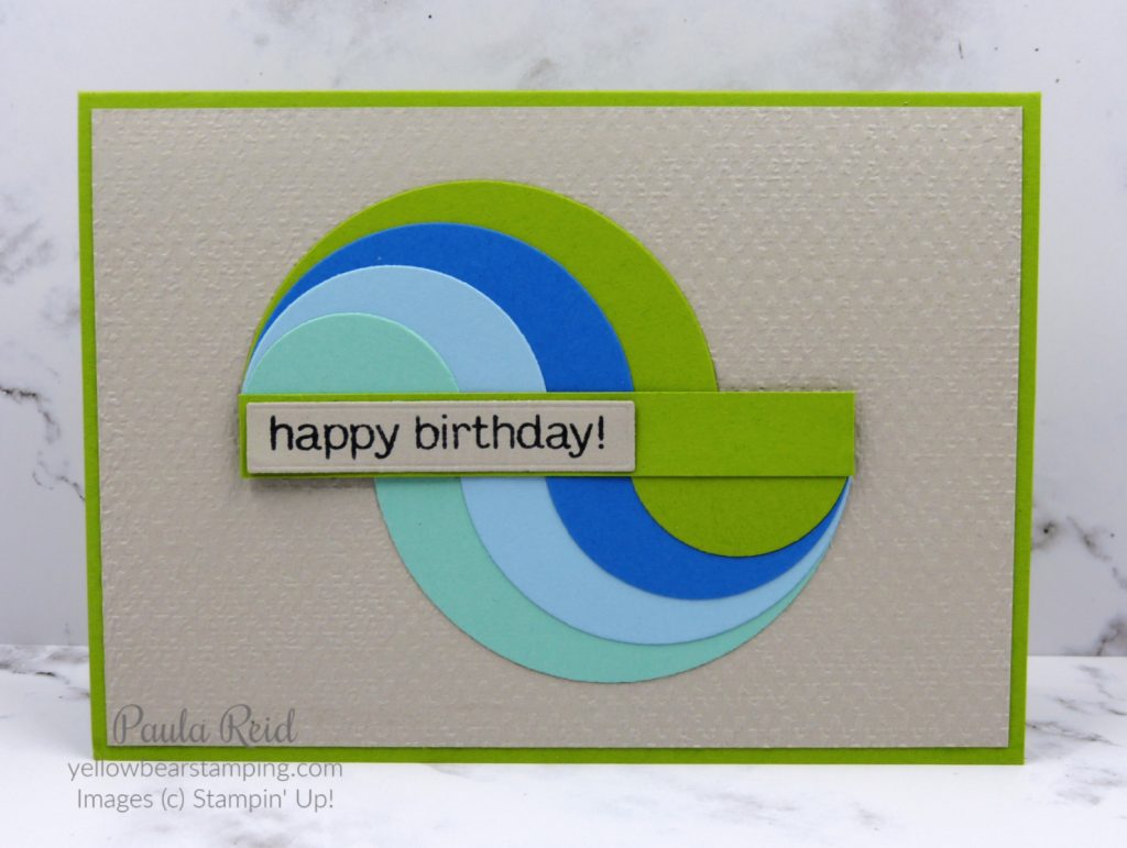
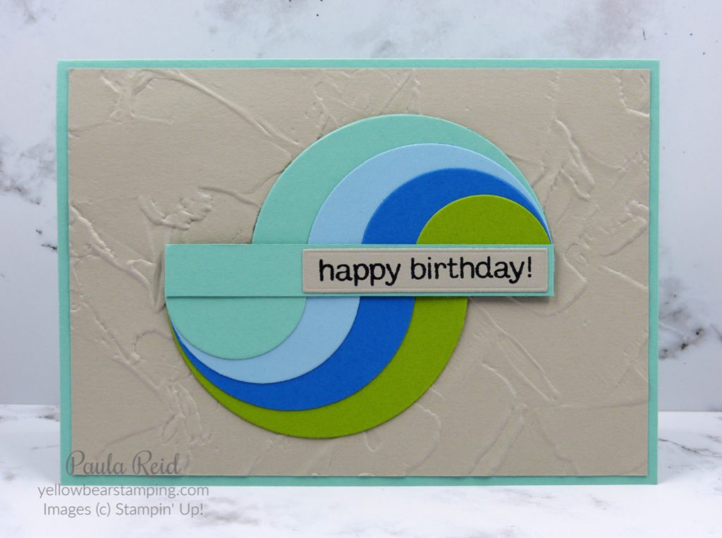
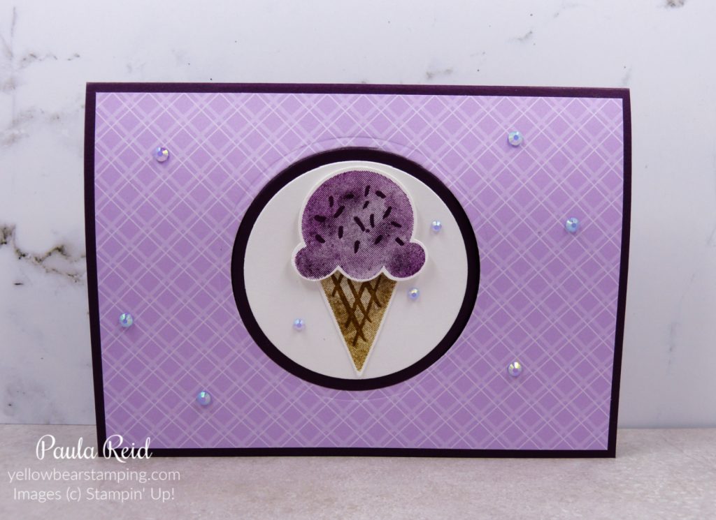
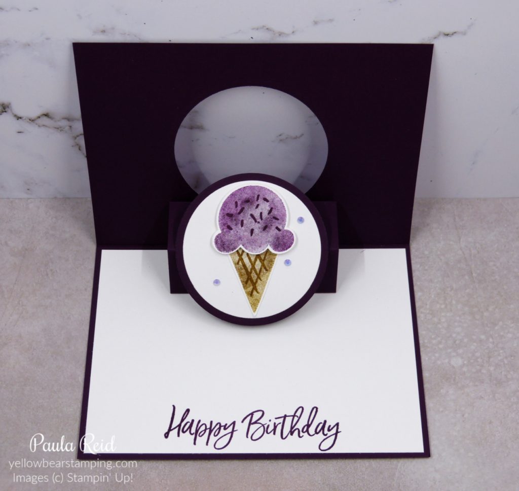
Our friends daughter turned 9 earlier this week so a fun fold card was in order. I’d seen this Pop and Flip card design on Dawn Griffith’s blog and been wanting to try it for ages. She had used the Oval dies but as they’re now retired I’ve used the Layering Circle dies.
From the front it looks like an ordinary card but when you open it the image ‘pops and flips’ through to the inside.
I used the same measurements that Dawn gives in her video to create the mechanism that ‘flips’ the image – 3″ x 4″ scored at 1″, 2″ and 3″ plus a piece 3/4″ x 2 1/4″ scored at 1 1/4″.
My ice cream is the Blackberry Bliss variety with a Soft Suede cone. The Sweet Ice Cream stamp set has a coordinating punch – Ice Cream Cone Builder – which makes light work of cutting out the stamped images. The cone is adhered directly to the Basic White circle and then I used Mini Dimensionals to adhere the ice cream.
Another demo, Rachel Tessman, has created a vertical version which shows the versatility of this card design.
After watching the video I’m sure you’ll want to give this design a go – it’s fun and an easy to make.
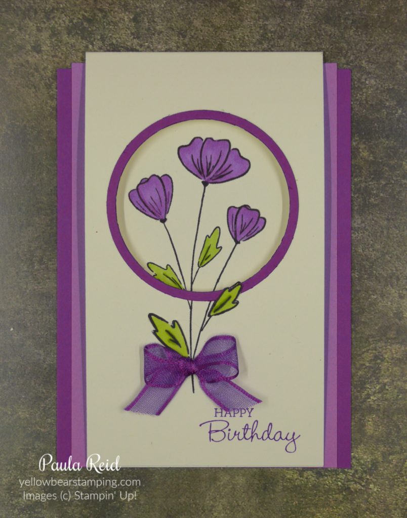
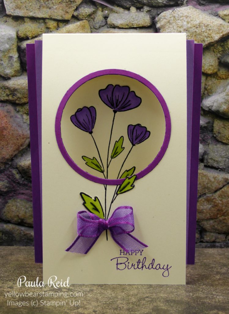
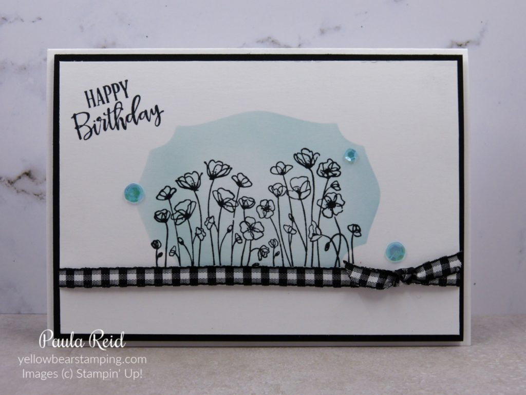
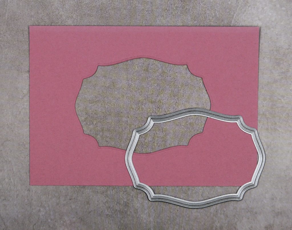
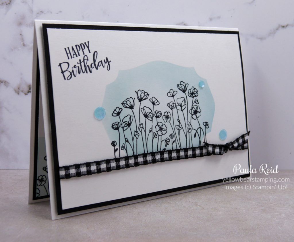
Masking is a great technique to add depth to your project. It gives the illusion that an image is behind another image – check out my blog post here on masking to see how to do this technique. Reverse Masking is the opposite of masking – rather than the mask covering an already stamped image you create a mask to protect the outside area so that you can stamp on the inside of the mask. I’ve used a die frame from the Tasteful Labels Dies.
This version of masking still gives the illusion of depth. Don’t be afraid to have ‘white’ space on your card as this also helps with the feeling of depth.
The following steps can be used with any ‘frame’ die shape you have.
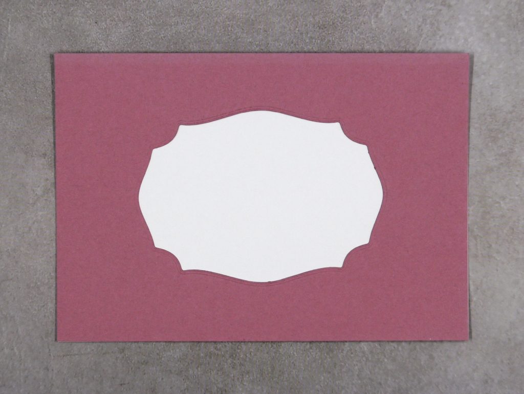
To create your mask die cut your chosen die from a scrap piece of cardstock. I find it’s easier to have this the same size as the piece of cardstock I’m going to be stamping on – in this case it’s 9.5cm x 13.8cm.
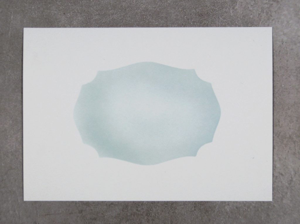
Place your mask on top of your cardstock. Use some temporary adhesive to keep it in place then select your ink and a Blending Brush and apply colour to the white space. Don’t be too ‘heavy handed’ with applying the ink otherwise you won’t see your final image. For this card I used Balmy Blue ink.
And this is the end result. Now you’re ready to add your stamped image and put your card together.
I’ve used the Painted Poppies stamp set and stamped my image in Memento Black. I added a piece of the Black & White 1/4″ Gingham Ribbon (which is carrying over) which I’ve secured only at the back of the card – this meant I could tie a knot to the ribbon and slide it along to the desired location. The final touch – adding some Artistry Blooms Adhesive Backed Sequins. You can just get a glimpse of the inside of the card where I’ve done the same technique in the bottom corner of the insert.
I hope you’ve enjoyed see this alternative masking technique and give it a go yourself.
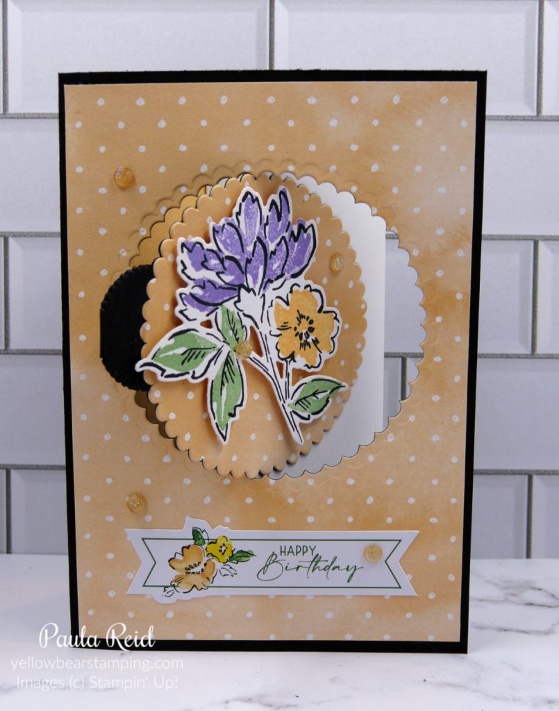
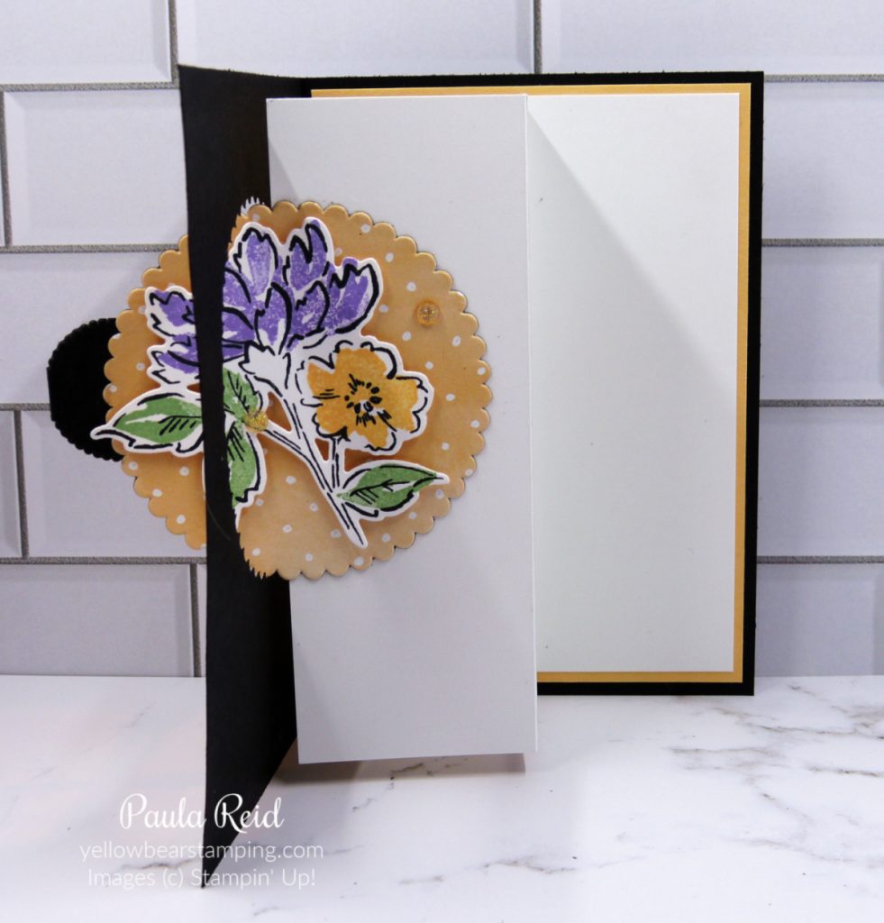
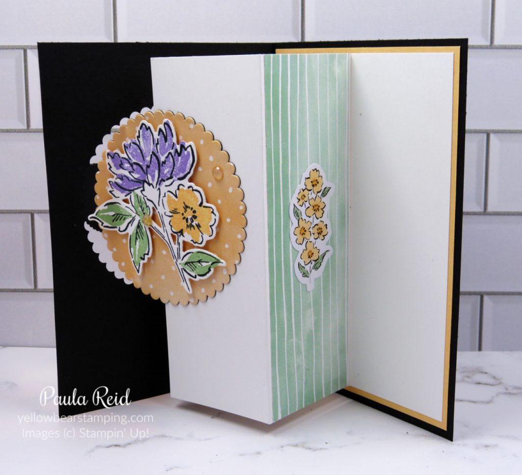
I have another quick and easy fun fold card to share with you that looks more involved than it is. When I’ve made this card previously I used the Layering Squares Dies but as these have retired I’ve gone with the Layering Circle Dies.
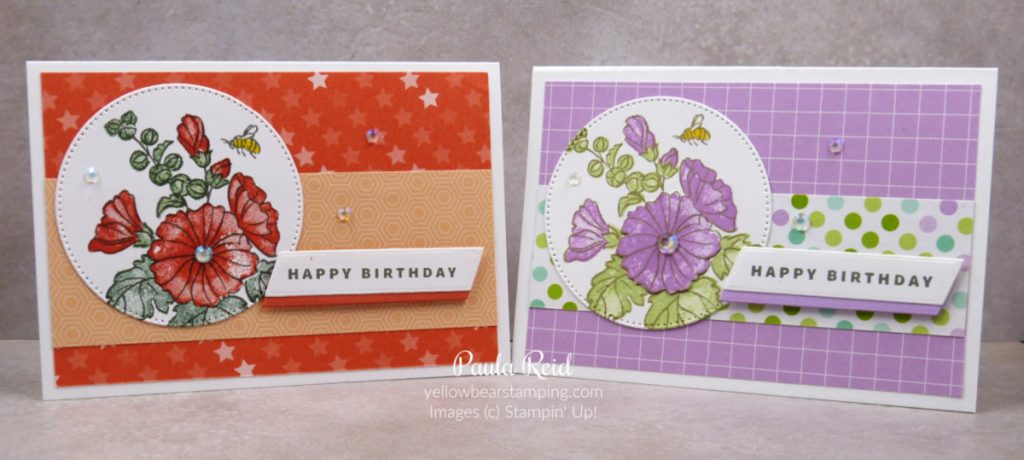
When I make my cards I don’t always have them planned out – they just evolve and this was one of those cards. I knew what fold I wanted to share but wasn’t sure which stamp set, papers etc to make it with. I pulled a few packs of Designer Series Paper (DSP) out but nothing really jumped out at me. I then saw this stamped/coloured image on my desk and decided to build the card around that. Next step was choosing the DSP design – something to coordinate with the stamped image. My paper is from the Hand-Penned 12″ x 12″ pack.
I then remembered I had the Hand-Penned Memories & More Card Pack. This card pack has double sided cards plus some sticker sheets which included the ‘Happy Birthday’ I used on the front and an image I used on the inside of the card.
The inside image was a black outline so I coloured it in with my Stampin Blend markers – Pale Papaya and Mint Macaron. The main image on the front uses the Hand-Penned stamp set which has been die cut and adhered with dimensionals. Instead of ‘sparkly bling’ I used the Pale Papaya Genial Gems.
If you would like to recreate this card for yourself check out my previous post here for measurements and instructions.
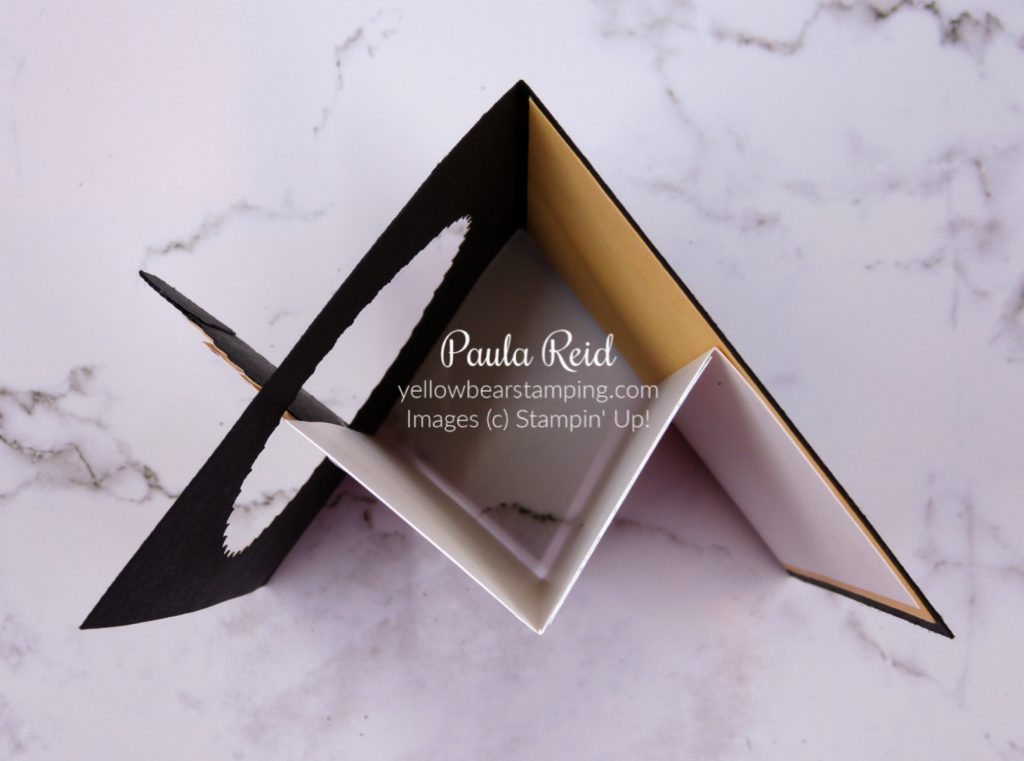
And here’s the view from the top.
Don’t forget to check out my Promotions Page for the ‘Last Chance Products’ list of retiring products from the July-December Mini Catalague.
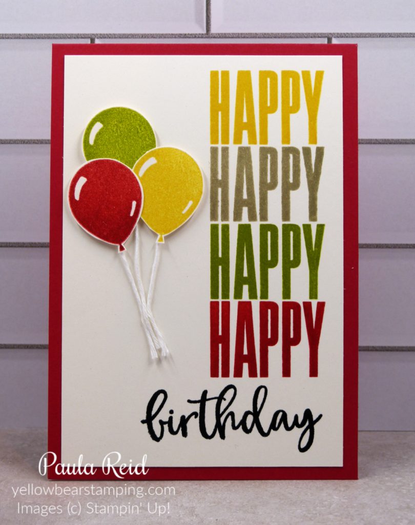
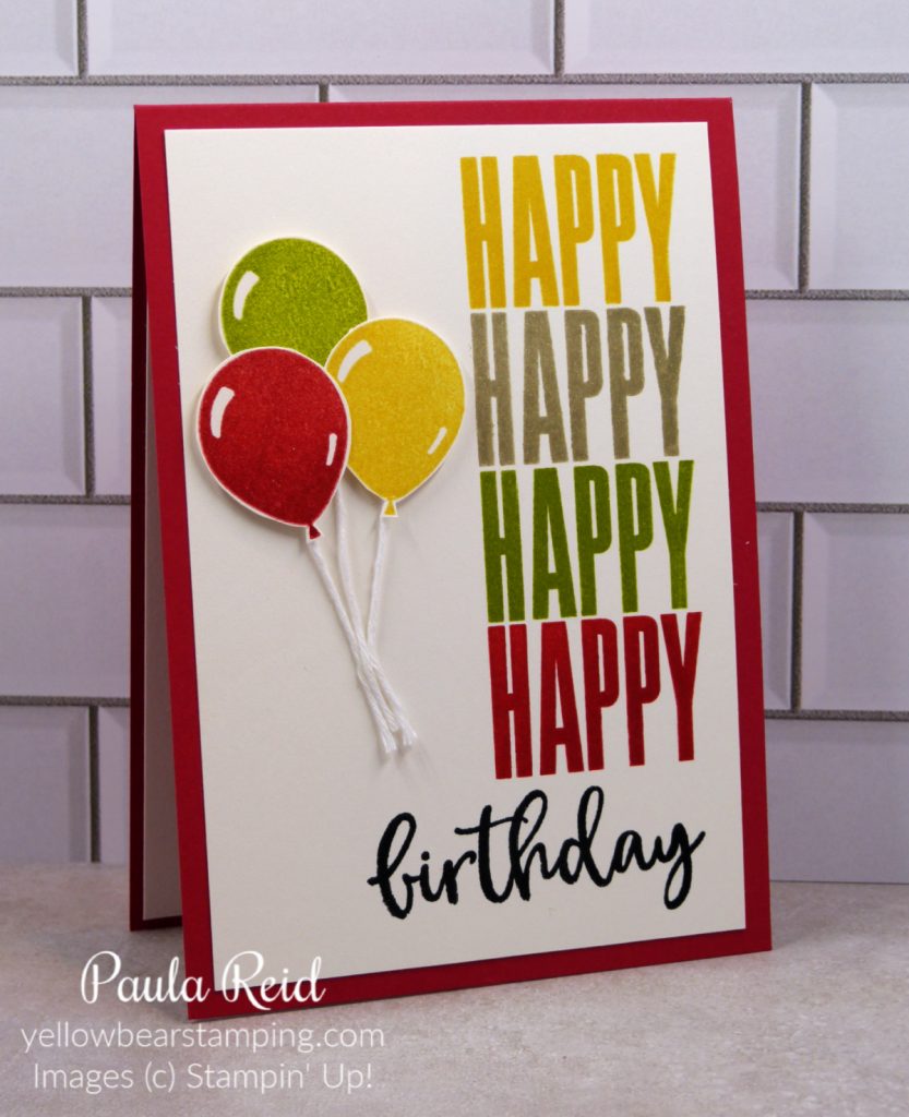
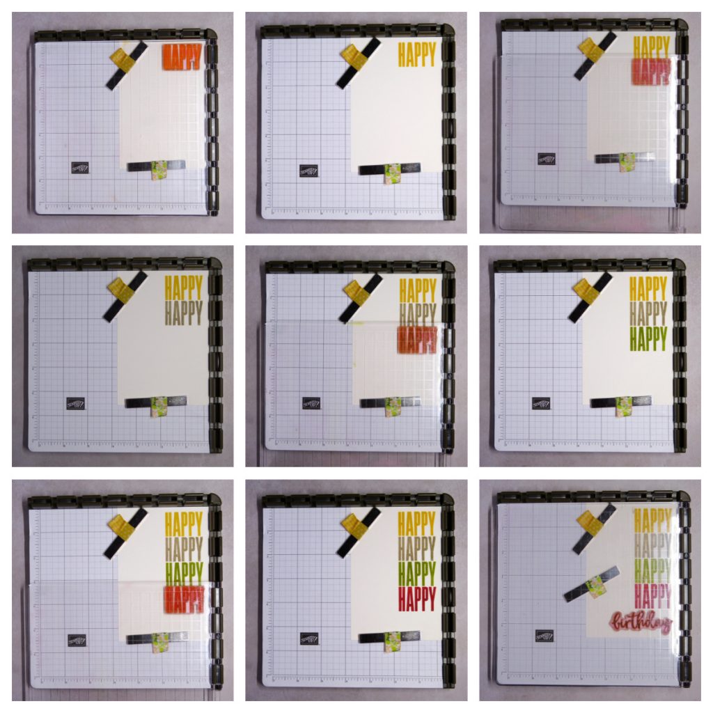
Last week I shared a card using the Stamparatus to create a circle of stamped images and today I’m using it to for the Hinge Technique. This is a great technique to use when you want the same image to be lined up across or down your card. I’ve chosen one of my favourite stamp sets to use – Biggest Wish.
This is such an easy technique to do and this set was perfect for it. My colours are So Saffron, Gray Granite, Pear Pizzazz and Real Red with Memento Black. The balloons are from the Penguin Place stamp set and ‘fussy cut’ out before being adhered with dimensionals. I used Shimmery White cardstock for these cards.
This technique is great for making sure that your words or images are perfectly straight and aligned. I had so much fun making this card I didn’t stop there. Keep reading and you’ll see more creations plus a quick step by step instruction.
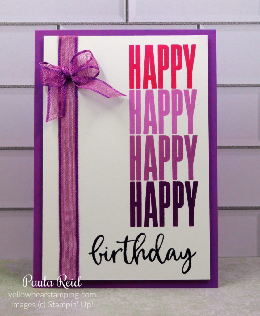
This time using Polished Pink, Fresh Freesia, Highland Heather and Gorgeous Grape. The ribbon is Gorgeous Grape Sheer Ribbon.
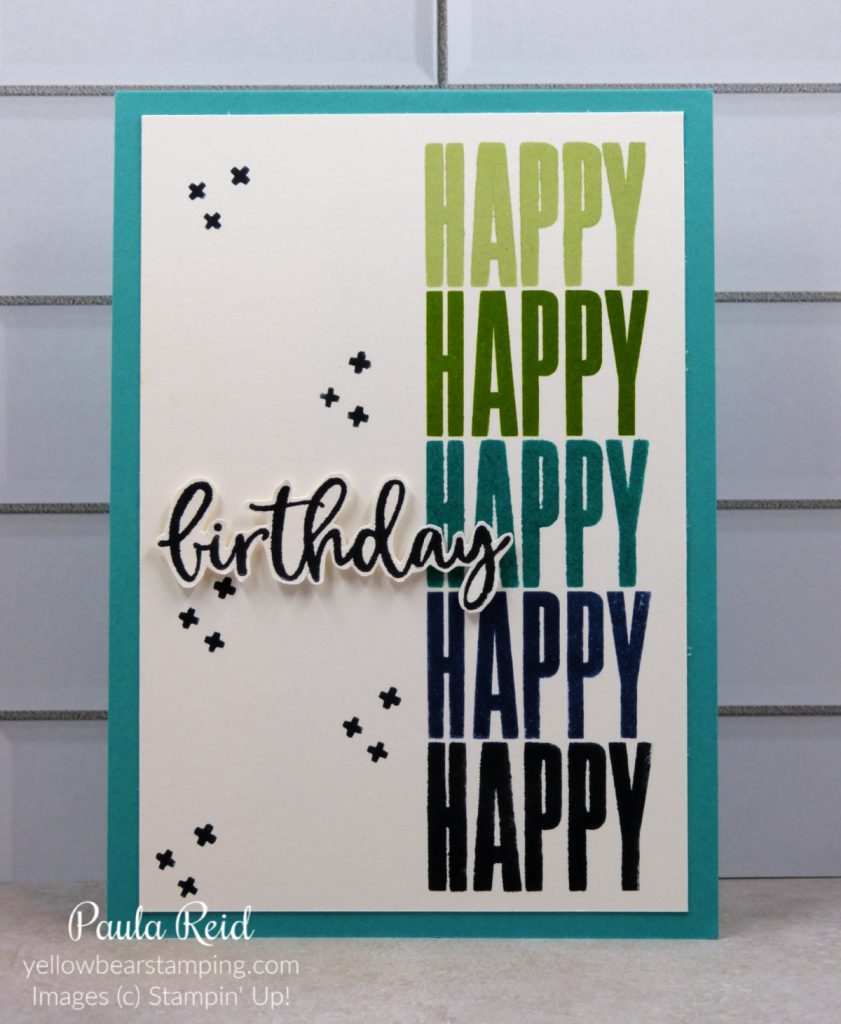
I added in an additional ‘Happy’ and then stamped the ‘birthday’ on some scrap Shimmery White and ‘fussy cut’ it out before adhering with dimesionals. The colours for this card are Soft Sea Foam (double stamped for a stronger colour), Granny Apple Green (double stamped), Bermuda Bay, Night of Navy and Memento Black.
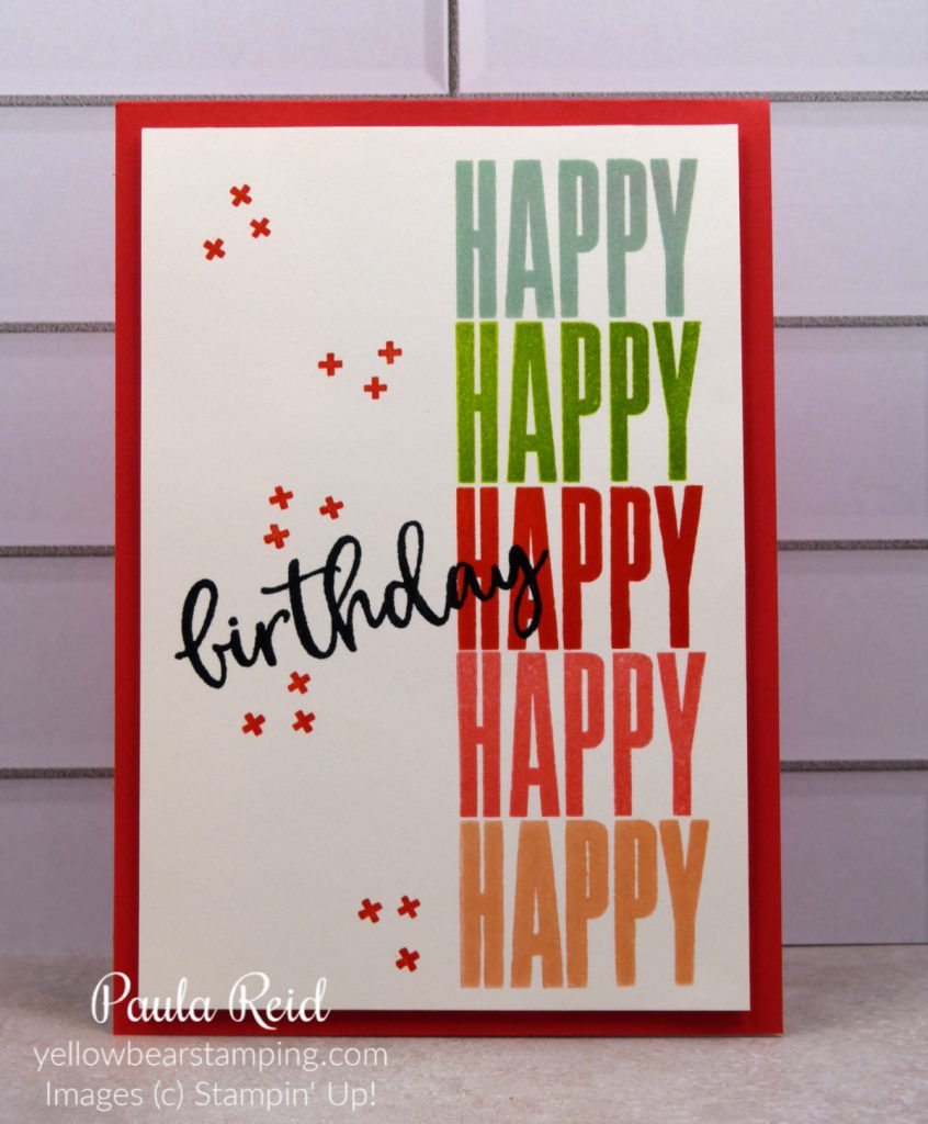
And for this one I used Pool Party (double stamped), Granny Apple Green, Poppy Parade, Flirty Flamingo and Petal Pink. The skies the limit with your colour combinations.
Place your cardstock in your Stamparatus and secure with your magnets. My cardstock measures 3 3/4″ x 5 1/2″. Place you stamp in the desired location and adhere to your plate. Stamp. Lift your plate out and place it in the next hinge slot (depending on the size of your stamp you may need to go down two slots). Reink your stamp and stamp. Repeat until you have the desired number of images.
If you don’t own a Stamparatus yet I would highly recommend you adding it to your next order. These are only a few ways to use your Stamparatus.
I had so much fun making these cards – I hope you’ve enjoyed seeing them.
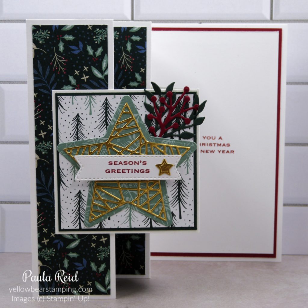
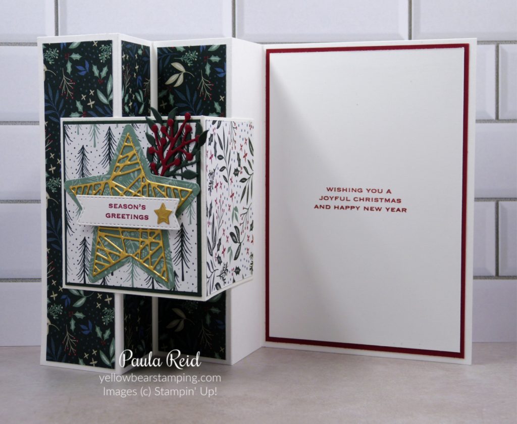
No – this is not a ‘car’ card but a card that has a ‘V’ and a ‘W’ fold in it. I CASEd this card from a US demo – Susan Campfield.
The card base measures 11 1/8″ x 14.8cm and is scored at 1 7/8, 3 1/2, 5 1/4 and 7″. When the card is folded shut it will measure a standard metric card of 10.5cm x 14.8cm. The front panel measure 7.5cm x 15cm and is scored at 7.5cm
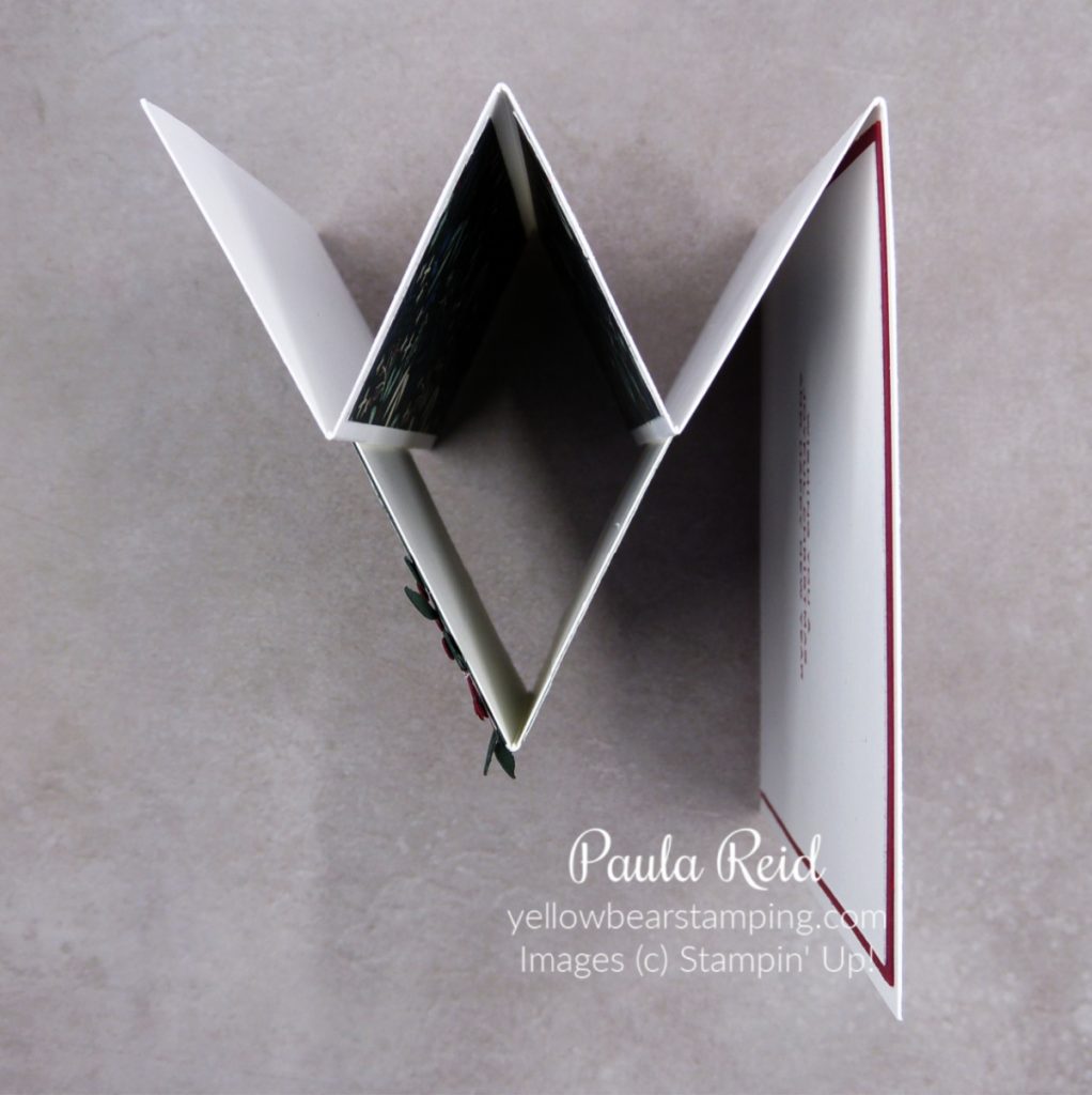
From the top view you can see why it’s called a ‘VW’ fun fold.
I’ve used the Tidings of Christmas Suite for this card – stamp, dies and Designer Series Paper (DSP). The DSP strips measure 1 1/2″ x 14.3cm and the square for the front is 7cm with a mat of Evening Evergreen measuring 7.2cm.
I really like this card design and plan to use it again to showcase some of the new products in the upcoming January to July Mini catalogue.
For today’s card I used a very useful tool – the Stamparatus – to help me create my stamped circle image. The Stamparatus is a stamp positioning tool and can be used for a number of techniques too.
I’ve been wanting to use this technique for some time and the Tidings & Trimmings set was perfect to create a wreath. You’ll need a square of cardstock (mine is 8cm square), a template (as per below), your Stamparatus and your chosen stamp/ink.
Place your square so that it is centered on the grid paper and draw around the edge then turn it 45 deg so that the corners of the square are now on the vertical and horizontal central lines of the grid paper and draw around the edge.
Place the template and the cardstock (in the square position rather than the diamond) in your Stamparatus. Stamp your first image then rotate the cardstock one position to the left and stamp again. Repeat this until you have the first circle (first photo below). Change your stamp and repeat as many times as needed until you create your circle/wreath image.
For my first image I didn’t fully ink up the stamp so that the stem stayed within the wreath. My second and third stamps are stamped in Evening Evergreen to create the base of the wreath. I then stamped the solid stamp in Soft Succulent and Soft Sea Foam to colour in the leaves.
And the finished card – my favourite fun fold. The background has been dry embossed using the Merry Melody 3D Embossing Folder – I’m loving this folder. Instead of ‘bling’ I used the Metallic Gold Pearls to add some dimension to the wreath.
Today’s fun fold is a card design I first made way back in 2014 and have CASEd it a number of times since for Christmas cards – check out my 2019 version here.
For this years design I’ve used the Tidings of Christmas Suite from page 88-89 of the Annual Catalogue. This suite uses three of our 10 In Colours – Soft Succulent, Evening Evergreen and Misty Moonlight.
To give the stockings a bit more dimension I stamped the ‘cuff’ of the stockings a second time, fussy cut them and then adhered on top of the original stamped image. The berries are rather tiny so to make adhering them easier I used some Adhesive Sheet on the back of the cardstock before die cutting them.
To strengthen the stamped stockings, I die cut additional stockings and adhered them to the back. If you had used an image that had been coloured in with Stampin Blends having a backing would also help to cover up the ‘bleed’ the shows through.
Even though I seem to use this card design for Christmas images you could use any stamp or die cut to achieve the same look.
I tried this technique a couple of years ago and wasn’t happy with the end result (I think it ended up in ‘file 13’) so I thought I’d give it another go and I’m happy with how this one turned out. Retiform is simply the crossing of lines across the cardstock.
To create the ‘base’ you’ll need ink, a blending brush and Post-It Notes (I used long ones).
Use a Post-It Note to mask off a section of the cardstock that you want to colour first. Starting off the page, lightly apply ink – I used Soft Succulent – with your blending brush to the section. I made mine darker at the edge where the Post-It Note meets the cardstock. Move your Post-It Note to create a new section adjusting the angle of the line. Apply ink with your blending brush and keep repeating this until your cardstock is divided up into sections. You can have as many or as few sections as you want.
I selected Tidings & Trimmings as my stamp set as it has it had a good number of individual stamps that would fit into my sections without going over the lines. It also meant I could use all the images on the card. If you select a set that has bigger images than your sections you will just need to mask off the sections so that you only get a partial stamped image. I will give that a go next time.
I hope you give this technique a try too. Remember – if your first attempt at a new technique doesn’t turn out how you want it to, don’t give up – give it another go. Also if you get stuck on a technique or fun fold get in touch with me – I’m here to help.
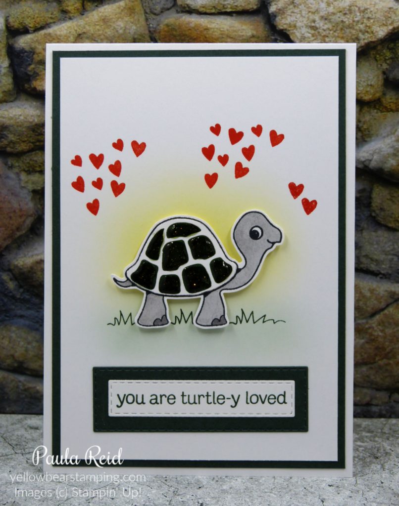
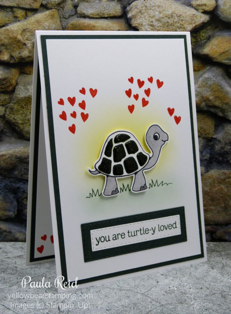
Today’s card is a fun interactive card and I’ve teamed it with a fun set – Turtle Friends. I created one of these cards a couple of years ago with a masculine theme and decided to recreate it using current products. To create this card you’ll need your Paper Trimmer, Foam Adhesive Strips and Dimensionals.
Isn’t he cute? Pull the tab on the right and Mr Turtle will slide across the card and reveal a hidden message.
Using my blending brushes I created the background and then cut out the slot. I should have taken a photo mid construction to show how the back of the card and slider mechanism works – oh well I will just have to create another card and do that step.
I already had Mr Turtle cut out on my desk but he was a different colour so I gave him a new ‘paint job’ with the Granny Apple Green Stampin Blend so that he matched his shell (which was also on my desk).
The ‘happy birthday’ is stamped on a piece of cardstock and adhered to the card base. The card front is adhered with Foam Adhesive Strips – make sure you add these to your next order as they are great for a number of projects.
I hope you’ve enjoyed this card and keep an eye out for another version soon.
Quilting is normally associated with fabric but we can achieve the same effect with our Designer Series Paper. Today’s card is a CASE from US demo Lisa Henderson. I’ve had this technique on my list for some time and after seeing her card it inspired me to make it too. I’ve used the Blackberry Beauty DSP and combined it one of my favourite ‘go to’ fun folds.
Yes – it’s the Book Fold – check out my earlier post on how I make these cards. This paper is gorgeous with the hint of gold (although I’ve found it hard to get my photos to the true colour) and even though we’re not in Autumn here the ‘leaf’ theme of the paper works for any occasion.
Below is a step by step of how I created my quilting. I started off with strips of DSP measuring 1/2″ x 12″ in 5 of the 6 designs.
Starting with a base of 11cm x 11cm I found the centre then adhered my Brushed Metallic Gold 1″ square (which I had dry embossed) lining up the corners of the square with the vertical and horizontal lines. Adhere down your first strip of DSP trimming as you go. Take your second patterned strip and adhere hard up against the existing strips. Repeat with your remaining strips until the section is complete. Repeat until all sections are filled. I then trimmer my square to fit my card front. I matted it on a piece of Brushed Metallic Gold.
Don’t forget the Seasonal Sale started today – check out my Promotions page for more details. If you would like to place an order you can do so via my online store or contact me directly. I will be placing an order tomorrow night (Wednesday 17th).
Fold, snip, layer, and stamp! During the Seasonal Sale, you can stock up and save 10% on cardstock, 15% on ink pads, and 20% on dies. Build up your collection of crafting basics—and prepare for another year of top-tier projects—with a steal of a deal on papercrafting products! Check out my Promotions page to find out which items are included in the sale. You can place an order via my online store or contact me directly.
I first shared a Front Flap card back in 2018 and then again in 2019 and today I’ve got two variations of this design – a Single Front Flap and Double Front Flap. Most Front Flap cards are of the ‘single’ variety. The ‘flap’ is adhered to a card front rather than a full card base. For my ‘double’ version I’ve adhered the flap to a standard card base hence the ‘double’.
Isn’t the Penguin cute? He’s part of the Penguin Place Bundle from page 33 of the July-December Mini Catalogue. The bundle consists of the Penguin Place stamp set and then Penguin Builder Punch.
Mr Penguin is stamped in Memento Black ink with his nose and feet stamped/punched with Mango Melody. His bow tie is Coastal Cabana to match the card base. There are 28 stamps in this set including birthday and Christmas themed sentiments and accessories. For those of us in the Southern Hemisphere we could also use the images for winter themed cards.
As an alternative to using Designer Series Paper (DSP) or dry embossing your card base you can stamp an image using VersaMark and it will pick up the colour of the card base.
For my double flap card I stamped the balloon image in Pacific Point, Mango Melody, Poppy Parade, Granny Apple Green and Daffodil Delight then ‘fussy’ cut them out. The back two balloons have been adhered with dimensionals and then the others have been adhered with ‘snail’ on top of each other.
And here’s the inside of the first flap – I’m not planning on writing anything on this layer. The flap for both cards measure the same – 8.2cm x 21cm (scored at 10.5cm) and the Basic White panels measure 7.6cm x 10cm.
And finally the inside of the card – this is where I’ll write my birthday message. This Mr Penguin is fully stamped directly onto the Basic White insert.
I had fun making these cards – my first ones using the Penguin Bundle. I’m hoping this bundle will carry over to the next catalogue as he’s super cute.
Last week I shared a project we made at our online event – I now have the next instalment – a ‘one sheet wonder’. A ‘one sheet wonder’ is a technique used to create a number of cards from a sheet of Designer Series Paper (DSP) based on a template. You can also create your own DSP by stamping images on a sheet of Basic White or Very Vanilla cardstock. There are lots of templates available to use with 6″ x 6″ or 12″ x 12″ DSP. For our template of 6″ x 6″ we made four cards. Rather than starting with one sheet of DSP I decided I would use up some of my scraps of In Good Taste paper and matched my off cuts to the measurements for each of the four designs. This meant I could mix and match my DSP.
Here’s the template that I used – I’ve included metric and imperial measurements as sometimes I find it’s easier to work in inches even though I’ve grown up with centimeters.
The first cut is at 1 1/2″ and then the second cut is at 3″ giving you three strips. Trim the first strip down to 14.8cm. With the second strip (long side against your top ruler) cut at 3″ and then cut the remaining piece at 1″ intervals to give you three pieces. For the last strip (again with the long side at the top) cut the strip into 1 1/2″ pieces.
This template is for the mats – cut it up in a similar way to the DSP then match up the coordinating pieces of cardstock and DSP. I also like to add a card front mat rather than just adhering the DSP to the card base. For my card front mats I dry embossed them with either the Tasteful Textile 3D Embossing Folder or the Brick & Mortar 3D folder. As these were masculine cards I didn’t add too many embellishments. For Card A I found the little triangle cut outs on my desk and they were in the right colour scheme and then it’s just add a sentiment. You can change the orientation of the card base and placement of the DSP to get a different look from the same template.
I’m in need of more masculine birthday cards for work so I’ll be repeating this technique. I hope you give it a go – it’s great way to use your DSP and add more cards to your stash ready to send out.