


Hi there
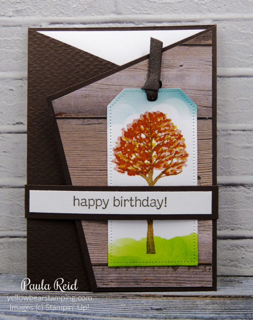
Have you tried our Gilded Leafing on page 143 of the Annual Catalogue? This was a carryover product from the January-June Mini Catalogue and I must admit I haven’t used mine much. Over the next couple of weeks I’ll share some ways you can use it with different types of adhesive. First up is using it with Tear and Tape to create a straight edged border to your projects.
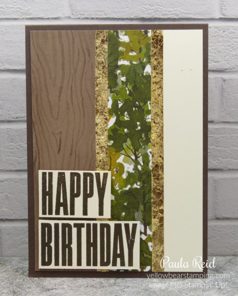
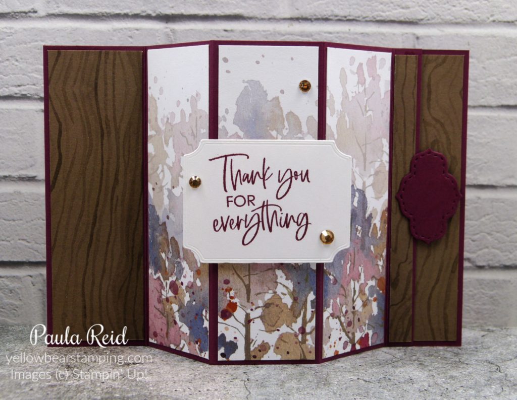
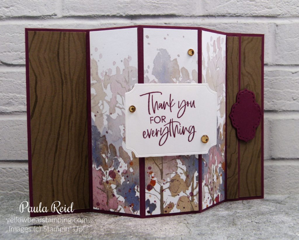
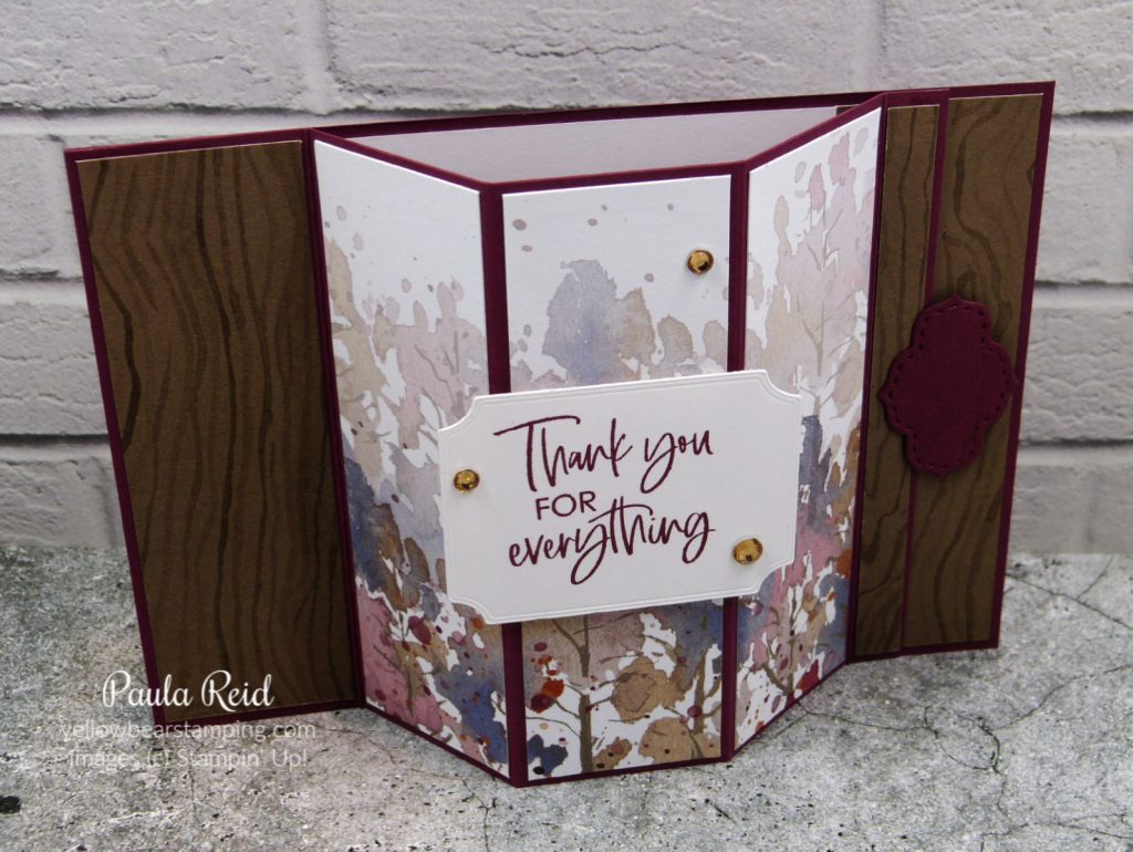
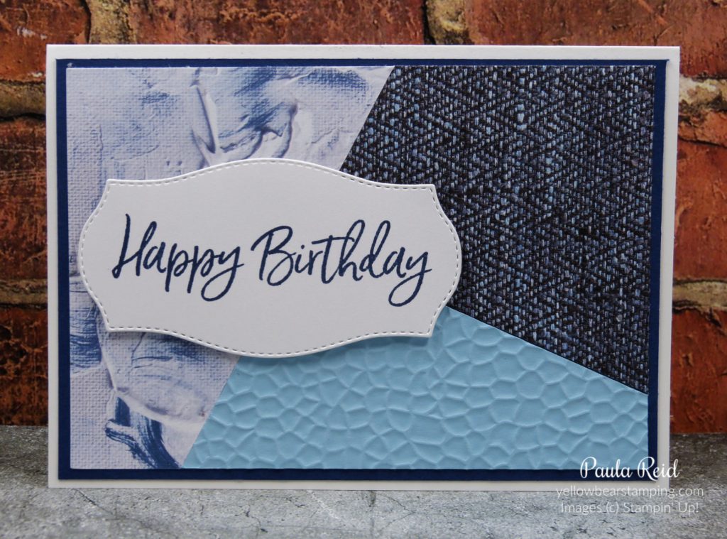
To create this look I started with a normal card front of Very Vanilla measuring 10cm x 14.3cm. My Designer Series Paper (DSP) measures 4.5cm x 14.3cm and 2.5cm x 14.3cm. I’ve been using the Beauty of the Earth paper lately for projects and this particular paper is a great design for masculine cards – I need lots of masculine birthday cards for work. The two pieces of DSP are butted up to each other leaving a strip of the Very Vanilla cardstock to lighten the front.
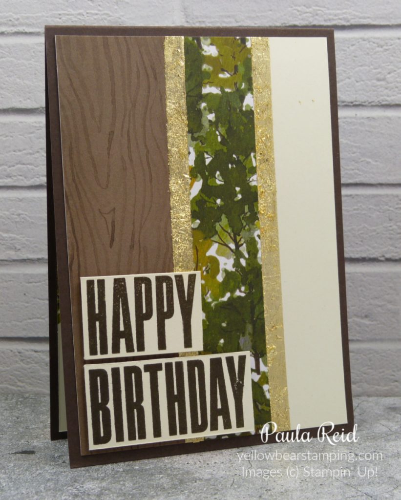
Now the fun begins. Make sure the end of your Tear and Tape has a clean cut edge then adhere on top of the DSP. I added my tape along the edge of the wider piece of DSP. Make sure you get another clean cut of the tape at the other end. I repeated this step on the edge of the other piece of DSP but this time I butted the tape up to the edge of the DSP.
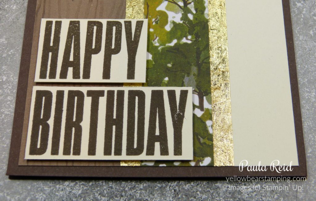
The Gilded Leafing comes in a round container but for ease of use I have put mine in a larger container which has a hinge lid. The leafing is very light weight and if you’re not careful when opening the lid you’ll end up wearing it. Before I emptied the contents into the larger container I put a dryer sheet inside and then emptied the leafing and that certainly helped and it’s not as ‘fly away’ as before. To apply the leafing to my project I then removed the backing from the Tear and Tape and placed the card front face down into the leafing making sure the leafing has adhered to the adhesive tape. Turn it over and ‘brush’ off the excess gilded leafing with a makeup brush or a sponge. I keep a piece of sponge in the container all the time.
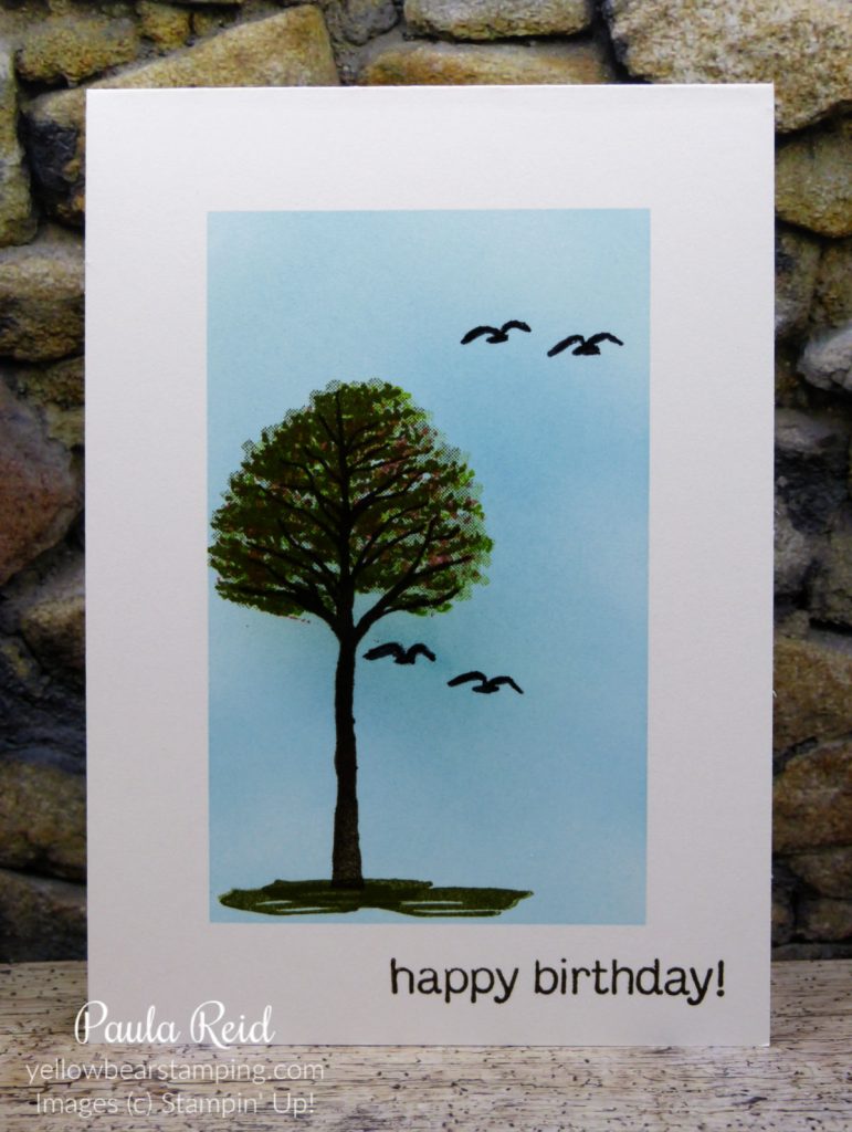
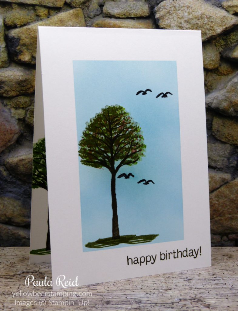
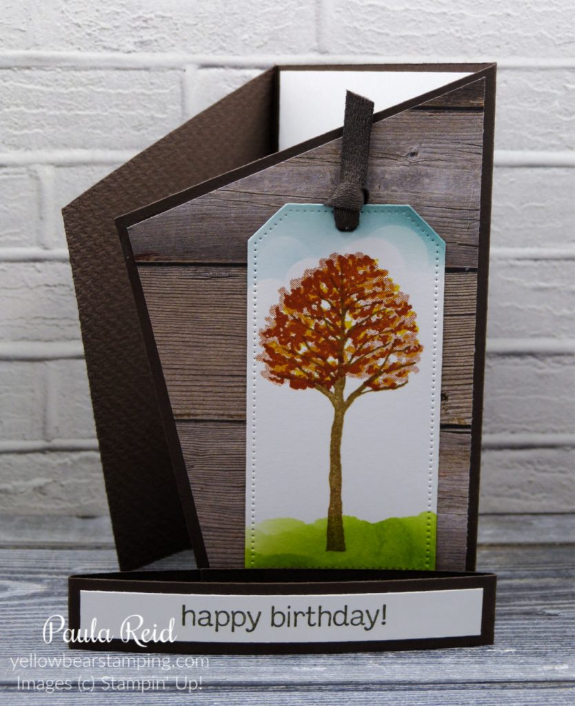
This is such a cool effect and can be achieved very easily. The sentiment is from Biggest Wish and has been added with dimensionals.
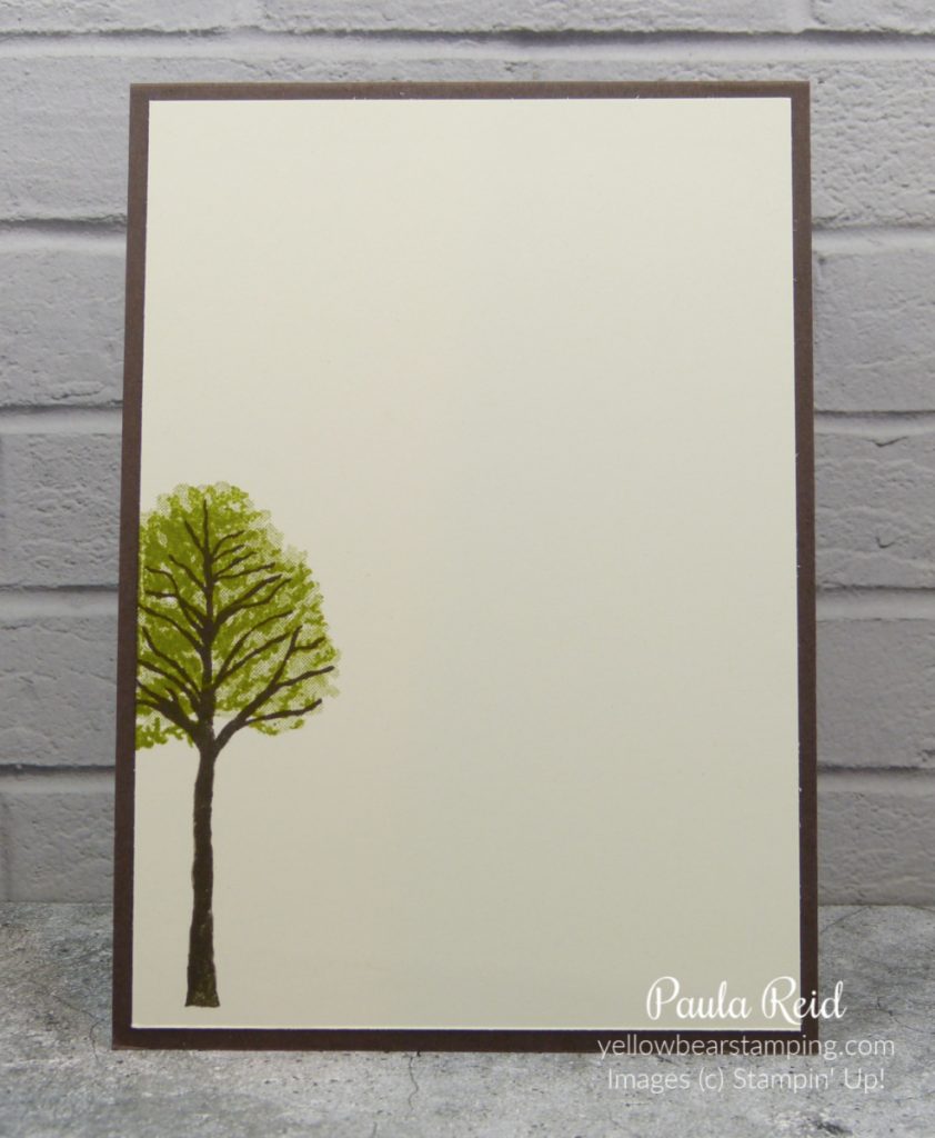
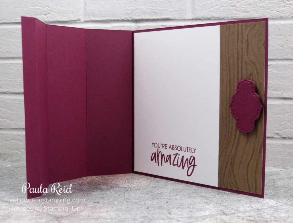
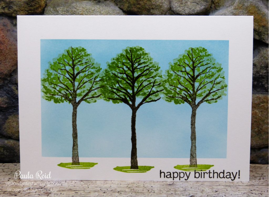
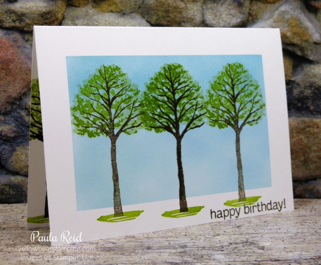
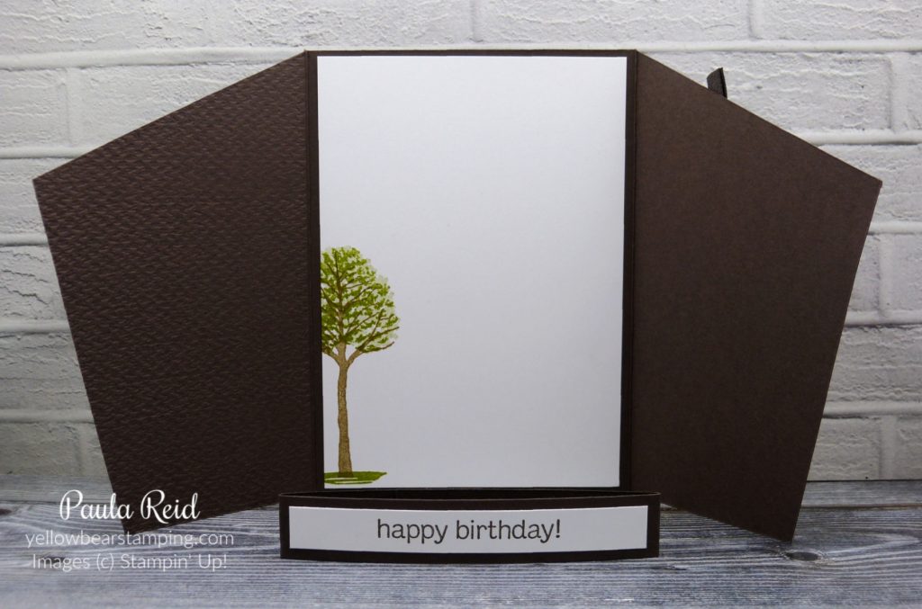
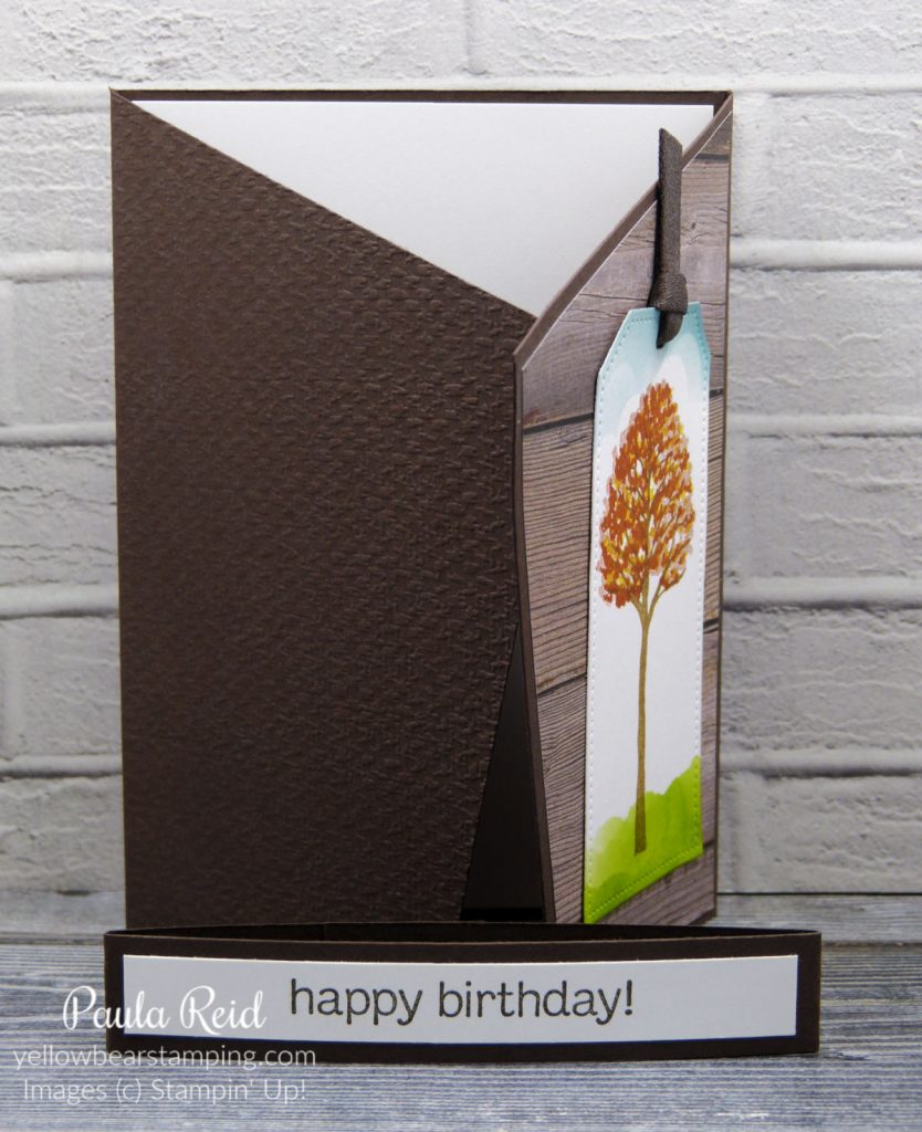
And for the inside I added the tree from the coordinating stamp set – Beauty of Friendship.
I’ll have another way for you to use this product on your projects so check back next Tuesday.
Until then …